Greenland, a land of immense ice and stark beauty, frequently captures global attention due to its critical role in our planet’s climate system. As the home to the second-largest ice body on Earth, the Greenland Ice Sheet, its contribution to sea-level rise is significant, currently accounting for 43%. Despite its global importance and status as the world’s largest island, Greenland’s size is often misrepresented in common world maps, leading to a distorted perception of its actual dimensions. Let’s delve into the true size of Greenland and compare it to regions more familiar to us, like the United States and Europe, to gain a clearer understanding.
How Does Greenland Measure Up? Beyond the Map Distortion
It’s easy to assume Greenland is continent-sized based on standard Mercator projection maps, the kind frequently used in online tools. However, the reality is quite different. While Greenland boasts a substantial area of approximately 2 million square kilometers, this number alone can be hard to visualize. Thankfully, tools like The True Size offer a practical way to compare countries and regions accurately, revealing the surprising truth about Greenland’s dimensions.
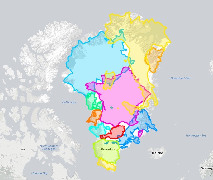
As illustrated in Figure 1, Greenland, when accurately represented, is only marginally larger than a collection of prominent European nations combined. Specifically, it’s just a bit bigger than Austria, Belgium, Denmark, France, Germany, Ireland, Italy, Poland, Portugal, the Netherlands, and the United Kingdom all put together. This comparison immediately brings Greenland’s size into a more relatable perspective for many.
To further contextualize Greenland’s size relative to the United States and other large countries, consider these comparisons (Figure 3):
- Greenland is roughly equivalent in size to the Democratic Republic of Congo.
- India could encompass Greenland approximately 1.4 times.
- The United States dwarfs Greenland, being about 4.2 times larger.
- Australia is also significantly larger, accommodating Greenland around 3.5 times.
These comparisons highlight that while Greenland is undeniably large, its size is often exaggerated by the common world maps we are accustomed to seeing. This leads us to question: why do these widely used maps distort the size of countries like Greenland?
The Mapmaking Dilemma: Distortion is Inevitable
The challenge of accurately representing the Earth on a flat map is a fundamental problem in cartography. The Earth is a sphere (or more accurately, a geoid), and projecting a curved surface onto a flat plane inevitably introduces distortions. Different map projections prioritize different properties, leading to varying types of distortions.
For instance, conformal projections, like the Mercator projection (Figure 2), are designed to preserve angles and shapes of landmasses. However, this comes at the cost of distorting the size, particularly exaggerating areas further away from the equator. Conversely, equal-area projections maintain the correct relative sizes of regions but distort shapes and angles. No single map projection can perfectly preserve all properties simultaneously; therefore, every map is inherently a compromise, serving specific purposes better than others.
The Mercator projection, the culprit behind Greenland’s inflated appearance, projects the Earth onto a cylinder wrapped around the globe (Figure 4). Unrolling this cylinder results in a flat map where lines of latitude and longitude are straight and perpendicular. This projection significantly stretches areas towards the poles, explaining why Greenland and Antarctica appear much larger than they are in reality.
Why Mercator Persists in the Digital Age
Given the size distortion, one might wonder why Mercator projection remains the standard for popular online mapping platforms like Google Maps and OpenStreetMap. The reason isn’t to intentionally misrepresent the size of Greenland or other high-latitude regions. Instead, Mercator’s strength lies in its preservation of angles and shapes, which is crucial for navigation and local-scale applications.
For city-level navigation, maintaining accurate angles is paramount. In a Mercator map, streets that are perpendicular in reality will remain perpendicular on the map. This feature is essential for route planning and local orientation within cities. Projections that prioritize area accuracy often distort angles, which can be problematic for these local-scale applications, especially at higher latitudes.
Conclusion: Greenland’s True Proportions
In conclusion, while Greenland is indeed a vast and significant landmass, its perceived size on many world maps is an illusion created by the Mercator projection. When accurately compared to other regions, particularly to the United States and Europe, Greenland’s true proportions become clearer. Understanding map projections and their inherent distortions is essential for interpreting geographical information correctly and appreciating the real dimensions of our world. The Mercator projection, while useful for specific purposes like local navigation, should not be taken as an accurate representation of relative area, especially when considering regions far from the equator like Greenland.