What Type Of Chart To Use To Compare Data? Choosing the right chart is crucial for effectively visualizing and comparing datasets, allowing for clear insights and informed decisions, and COMPARE.EDU.VN is here to help. Selecting the appropriate chart type, such as bar graphs, line charts, or pie charts, depends on the nature of your data and the specific comparisons you want to highlight. Dive into the world of comparison visuals, data analysis techniques, and visual storytelling with COMPARE.EDU.VN.
1. Understanding Comparison Charts
A comparison chart is a visual representation that facilitates the comparison and contrasting of different data sets or variables. By plotting variables in a chart, you can reveal relationships, patterns, and trends that might otherwise remain hidden within raw data. These charts are essential tools for making informed decisions across various fields.
1.1. The Essence of Comparison Charts
Comparison charts transform raw data into digestible insights. They act as a window, revealing stories hidden behind numbers and providing clarity for complex information.
1.2. Why Comparison Charts Matter
Here’s why comparison charts are integral for data analysis:
- Simplification: They simplify complex information, making patterns in variables easier to understand.
- Quick Evaluation: They enable quick selection of products or services by evaluating data points efficiently.
- Effective Visualization: They provide a clear and organized method for effective data visualization.
- Time-Saving: They save time and effort in comprehending insights from complex data.
- Highlighting Differences: They effectively highlight similarities and dissimilarities, enabling better data evaluation.
2. Top 7 Charts for Data Comparison
While numerous chart types exist for data visualization, not all are suitable for data comparison. Here are seven comparison charts trusted by industry experts:
2.1. Pie Chart
A pie chart, also known as a circle chart, is a widely used data visualization technique for comparing the sizes or percentages of different categories within a whole dataset. It’s particularly effective in marketing, finance, sales, and sports.
2.1.1. Primary Use Cases:
- Part-to-Whole Comparisons: To showcase how each part contributes to the whole.
- Highlighting Proportions: To illustrate which proportions have the most and least importance at a glance.
- Limited Categories: When dealing with a limited number of categories representing percentages or numbers.
2.2. Bar Chart
A bar chart (or bar graph) is a straightforward chart type for comparing different categorical data. It can be plotted horizontally or vertically and consists of an x-axis representing categories and a y-axis representing numerical values. Rectangular bars represent separate categories, often presented in different colors.
2.2.1. Primary Use Cases:
- Comparing Variables: When illustrating a comparison of variables across different subgroups of data.
- Analyzing Numerical Data: To analyze and compare numerical data across large categories or groups.
- Monitoring Changes Over Time: If you want to monitor changes over time, particularly if the amount is significant.
2.3. Histogram
A histogram is a popular chart for comparing numerical variables. It outlines quantitative data such as height, weight, temperature, and length by dividing the data into intervals or bins. Intervals are represented on the x-axis, and the frequency of data points in each bin is represented on the y-axis.
2.3.1. Primary Use Cases:
- Frequency of Numerical Data: When you want to show the frequency of numerical data within specific intervals.
- Process Changes Over Time: To analyze whether a process changes from one period to another.
- Large Datasets: Useful when dealing with data sets that consist of large numbers of data points.
2.4. Line Chart
A line chart visually represents information as a series of data points connected by single or multiple continuous lines. The data points depict the trend or pattern for a variable over a second variable for a specific period. The x-axis typically represents categories, while the y-axis represents numerical measurement values.
2.4.1. Primary Use Cases:
- Summarizing Trends: Useful to summarize trends and fluctuations to make future predictions.
- Illustrating Trends: Can easily illustrate positive or negative trends.
- Decision-Making Insights: To provide insights to stakeholders for decision-making through a one to one comparison.
2.5. Doughnut Chart
A doughnut chart resembles a pie chart but with a hole at the center. It allows you to slice and analyze a portion of the total value in a visually engaging way. These charts are useful for highlighting the relationship between a central category and its subcategories.
2.5.1. Primary Use Cases:
- Small Number of Categories: Useful when there is a small number of categories.
- Emphasizing Relationships: When emphasizing the relationship between a central category and its subcategories.
- Visual Representation: If you want to highlight the main categories while still providing a visual representation of the whole dataset.
2.6. Overlapping Area Chart
An overlapping area chart is a combination of a bar chart and a line chart. It has horizontal and vertical axes to represent data values, and it visually connects data points like a line chart. Shades of transparent color are used below the line to separate each area.
2.6.1. Primary Use Cases:
- Comparing Multiple Data Series: While comparing multiple data series and also showing the overall trend.
- Part-to-Whole Relationships: If you have multiple data series with part-to-whole relationships.
- Illustrating Trend Changes: Best when illustrating a change of trends among different data sets within a graph.
2.7. Combo Chart
A combo chart, also known as a hybrid chart, combines two distinct chart types into one visual representation. It typically combines elements from both bar and line charts. These charts can be designed using single or two datasets, but both datasets need to share common traits for comparison.
2.7.1. Primary Use Cases:
- One to One Comparison: If you want to illustrate one to one comparison between two different chart types.
- Categorical and Continuous Data: When you need to show both categorical data (represented by bars) and continuous data (represented by lines).
- Complex Data Patterns: To display complex data patterns that cannot be effectively shown using a single chart.
3. Selecting the Right Comparison Diagram
Choosing the right chart or diagram is vital for enhancing the effectiveness of data visualization. It helps your audience digest the valuable insights you wish to present.
3.1. Understanding Data Types
When visualizing data for comparison, consider table data visualization and data visualization charts. Assessing whether your data is categorical, numerical, or time-series will guide you in selecting the correct chart type.
3.2. Objectives of Comparison
Identify the purpose of your visualization. Ask yourself, “What story do I want to tell my audience?” There are four storytelling objectives: comparison, relation, composition, and distribution.
3.3. Data Size and Complexity
The size and complexity of your data are crucial factors to consider. Choose a bar or line chart when dealing with a massive dataset to avoid a jumbled mess.
3.4. Prioritizing Clarity
Ensure that your charts are easy to understand and interpret for the audience. Remove unnecessary elements, use clear titles and labels, and maintain consistency in colors, fonts, and design elements.
4. Pros and Cons of Comparison Charts
Comparison charts offer a simplified way to portray data stories, but they also have limitations.
4.1. Pros
- Easy to design.
- Simplest visualization method for comparative analysis.
- No specific restriction on variable types.
- Simplified data portrayal.
- Help in predicting and making informed decisions.
4.2. Cons
- Lack of standard rules may lead to misinterpretation.
- Complex variables are hard to visualize.
- Difficult to design if there are no common parameters among variables.
5. Comparison Charts FAQs
Let’s address some common questions about comparison charts.
5.1. What is the Best Comparison Chart?
The best comparison chart varies depending on the data type and complexity. Bar charts and line charts are generally suitable for simple data comparisons.
5.2. Why are Comparison Charts Important?
Comparison charts are useful for showcasing similarities, dissimilarities, trends, and patterns among different datasets, aiding in informed decision-making.
5.3. How to Make a Comparison Chart?
You can create comparison charts using tools like Excel, Google Sheets, Microsoft Power BI, or specialized plugins.
5.4. Can a Comparison Chart Be Interactive?
Yes, interactive charts can provide additional information when hovering over data points, enhancing user engagement.
5.5. What are the Best Plugins to Create Charts?
Consider using Ninja Charts or Visualizer for WordPress, as highlighted in reviews of top WP charts plugins.
6. Chart-Specific Deep Dives
Let’s delve deeper into specific chart types to understand their nuances and best-use cases. We will look at how each chart type applies to various industries and real-world scenarios.
6.1. Pie Charts in Detail
Pie charts are most effective when illustrating simple proportions. They visually represent parts of a whole, making them easy to understand at a glance.
6.1.1. Best Practices for Pie Charts:
- Limit the Number of Slices: Avoid using too many slices, as it can make the chart cluttered and hard to read. Aim for no more than five to seven slices.
- Order Slices by Size: Arrange the slices in descending order of size, starting from the largest slice at the top.
- Use Contrasting Colors: Ensure that each slice has a distinct color to make it easy to differentiate between categories.
- Label Clearly: Label each slice with its corresponding category and percentage.
6.1.2. Industry Applications:
- Marketing: Showing market share of different brands.
- Finance: Illustrating budget allocation.
- Sales: Representing sales distribution by region.
6.2. Bar Charts in Detail
Bar charts excel at comparing discrete categories. They provide a clear visual representation of differences in magnitude.
6.2.1. Best Practices for Bar Charts:
- Clear Axis Labels: Label the axes clearly with appropriate units.
- Consistent Bar Width: Maintain consistent bar widths for accurate visual comparison.
- Use Color Sparingly: Use color to highlight specific categories or trends.
- Sort Data: Sort the data in ascending or descending order for better readability.
6.2.2. Industry Applications:
- Retail: Comparing sales of different products.
- Healthcare: Showing patient counts by age group.
- Education: Illustrating student performance across different subjects.
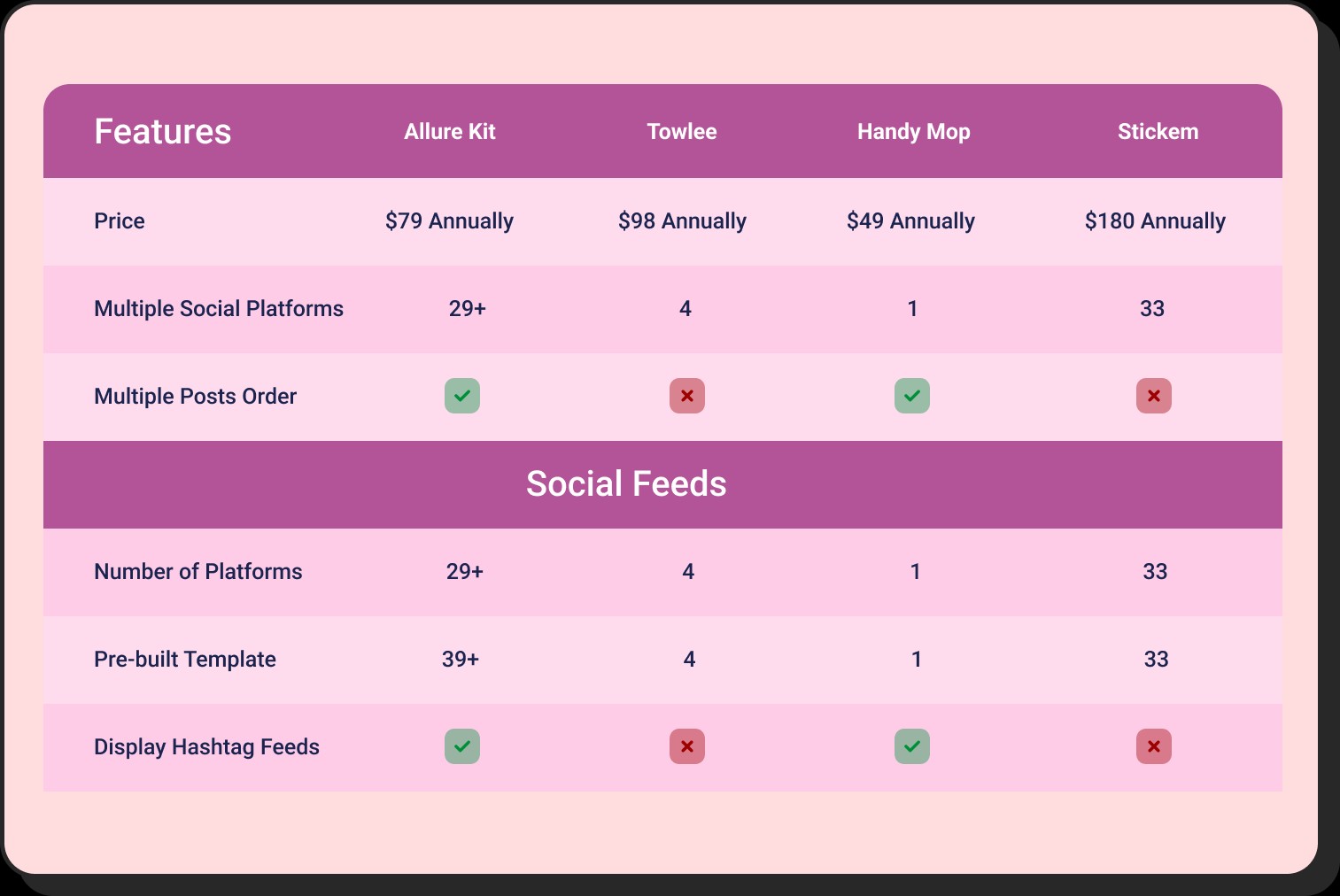 A comprehensive comparison chart detailing the features, pricing, and user reviews of various project management tools
6.3. Line Charts in Detail
Line charts are perfect for displaying trends over time. They show how a variable changes continuously, making them ideal for tracking performance and identifying patterns.
6.3.1. Best Practices for Line Charts:
- Consistent Time Intervals: Use consistent time intervals on the x-axis.
- Clear Markers: Use markers to highlight specific data points.
- Limit the Number of Lines: Avoid using too many lines on a single chart, as it can become confusing.
- Label Axes Appropriately: Label the axes with clear units and time periods.
6.3.2. Industry Applications:
- Finance: Tracking stock prices over time.
- Environmental Science: Monitoring temperature changes.
- Manufacturing: Displaying production output over months.
6.4. Histograms in Detail
Histograms are useful for understanding the distribution of a single variable. They show how frequently different values occur within a dataset.
6.4.1. Best Practices for Histograms:
- Choose Appropriate Bin Size: Select an appropriate bin size to reveal patterns without over-generalizing.
- Label Axes Clearly: Label the axes with the variable and frequency.
- Use Clear Titles: Use clear titles to explain what the histogram represents.
6.4.2. Industry Applications:
- Quality Control: Analyzing product measurements.
- Demographics: Displaying age distribution.
- Statistical Analysis: Understanding data patterns.
6.5. Doughnut Charts in Detail
Doughnut charts are similar to pie charts but can be more visually appealing. They are great for highlighting the relative sizes of different categories.
6.5.1. Best Practices for Doughnut Charts:
- Center Hole: The center hole can be used to display additional information.
- Limit Categories: Avoid using too many categories for clarity.
- Use Contrasting Colors: Use distinct colors for each segment.
6.5.2. Industry Applications:
- Market Research: Showing survey responses.
- Educational Statistics: Illustrating student demographics.
6.6. Overlapping Area Charts in Detail
Overlapping area charts are effective for showing how multiple variables change over time while also representing their combined total.
6.6.1. Best Practices for Overlapping Area Charts:
- Transparency: Use transparency to ensure each area is visible.
- Order Areas: Order the areas to highlight the most important variables.
- Label Clearly: Label each area and axis appropriately.
6.6.2. Industry Applications:
- Project Management: Displaying resource allocation over time.
- Environmental Monitoring: Showing changes in different pollutants.
6.7. Combo Charts in Detail
Combo charts combine different chart types to show relationships between variables that might not be apparent in single-chart formats.
6.7.1. Best Practices for Combo Charts:
- Choose Complementary Charts: Select chart types that complement each other.
- Use Clear Scales: Ensure each chart type has a clear and appropriate scale.
- Label Clearly: Label all axes and data series appropriately.
6.7.2. Industry Applications:
- Sales Analysis: Displaying sales revenue and customer growth.
- Financial Reporting: Showing budget versus actual spending.
- Operational Analysis: Combining production volume and cost.
7. Advanced Techniques for Data Visualization
Enhance your data visualization skills with these advanced techniques to create more compelling and informative charts.
7.1. Interactive Dashboards
Interactive dashboards allow users to explore data in real-time, providing a more engaging and insightful experience. Tools like Tableau and Power BI enable you to create dynamic visualizations that respond to user input.
7.2. Geographic Visualizations
Geographic visualizations, or maps, can be used to display data across different regions. These are particularly useful for showing spatial patterns and trends.
7.3. Network Graphs
Network graphs are used to visualize relationships between different entities. They can be used to show social networks, supply chains, and other complex relationships.
7.4. Heatmaps
Heatmaps use color to represent data values, making it easy to identify patterns and trends in large datasets. They are commonly used in fields like bioinformatics and finance.
8. Tools and Technologies for Chart Creation
Explore the various tools and technologies available for creating effective comparison charts.
8.1. Microsoft Excel
Microsoft Excel is a versatile tool for creating basic charts and graphs. Its familiar interface and wide availability make it a popular choice for many users.
8.2. Google Sheets
Google Sheets is a cloud-based spreadsheet program that offers similar charting capabilities to Excel. Its collaborative features make it ideal for team projects.
8.3. Tableau
Tableau is a powerful data visualization tool that allows you to create interactive dashboards and reports. It supports a wide range of data sources and offers advanced analytical capabilities.
8.4. Power BI
Power BI is another leading data visualization tool from Microsoft. It integrates seamlessly with other Microsoft products and offers robust data modeling and analysis features.
8.5. Python Libraries (Matplotlib, Seaborn)
Python offers powerful libraries like Matplotlib and Seaborn for creating custom charts and graphs. These libraries provide a high degree of flexibility and control over your visualizations.
9. Real-World Case Studies
Examine real-world examples of how different chart types are used to compare data effectively.
9.1. Marketing Campaign Analysis
A marketing team uses a combo chart to compare the number of website visits (bar chart) with the conversion rate (line chart) for different marketing campaigns. This helps them identify which campaigns are most effective at driving both traffic and conversions.
9.2. Sales Performance Tracking
A sales manager uses a bar chart to compare the sales performance of different team members. This allows them to identify top performers and areas where additional training may be needed.
9.3. Financial Portfolio Analysis
An investor uses a pie chart to show the allocation of their investment portfolio across different asset classes. This provides a clear view of diversification and risk exposure.
10. Future Trends in Data Visualization
Stay updated with the latest trends in data visualization to create cutting-edge and impactful charts.
10.1. Augmented Reality (AR) and Virtual Reality (VR)
AR and VR technologies are being used to create immersive data visualizations that allow users to explore data in a more intuitive and engaging way.
10.2. Artificial Intelligence (AI)
AI is being used to automate the chart creation process and generate insights automatically. AI-powered tools can analyze data and recommend the best chart types for visualizing specific patterns and trends.
10.3. Data Storytelling
Data storytelling involves combining data visualizations with narrative elements to communicate insights more effectively. This approach can help engage audiences and make data more memorable.
11. Making the Most of COMPARE.EDU.VN
COMPARE.EDU.VN offers detailed and objective comparisons across various products, services, and ideas, providing clear pros and cons, feature comparisons, and user reviews. Make the most of this resource to make well-informed decisions.
11.1. How COMPARE.EDU.VN Can Help
COMPARE.EDU.VN simplifies the decision-making process by offering comprehensive comparisons that save time and reduce the stress of evaluating multiple options. Whether you are choosing a university, selecting software, or comparing financial products, this platform helps you find the best fit for your needs.
11.2. Features of COMPARE.EDU.VN
- Detailed Comparisons: Side-by-side comparisons highlighting key differences.
- User Reviews: Insights from real users to provide a balanced perspective.
- Expert Opinions: Analysis from industry experts to guide your decisions.
- Easy Navigation: User-friendly interface to quickly find the comparisons you need.
12. Conclusion: Empowering Your Data Comparisons
Comparison charts are powerful tools for turning data into actionable insights. By understanding different chart types, following best practices, and leveraging tools like COMPARE.EDU.VN, you can make more informed decisions and communicate your findings effectively.
Are you ready to transform your data into compelling stories? Visit COMPARE.EDU.VN today and explore the world of data comparison and visualization. Whether you’re a student, professional, or simply someone looking to make better decisions, this resource is your guide to clarity and informed choices.
For more assistance and information, contact us:
- Address: 333 Comparison Plaza, Choice City, CA 90210, United States
- WhatsApp: +1 (626) 555-9090
- Website: COMPARE.EDU.VN
Empower your decision-making with compare.edu.vn – your trusted source for objective and detailed comparisons.