What Graph Is Used To Compare Data? This is a question many people ask when trying to make sense of information. COMPARE.EDU.VN provides comprehensive answers, exploring various data visualization methods to help you choose the most effective graph for your comparison needs. By understanding the strengths and weaknesses of each graph type, you can enhance data comparison, improve decision-making, and gain valuable insights. This includes selecting the proper visualization and making data comparison easier and more efficient.
1. Understanding Data Visualization for Effective Comparison
Data visualization is the graphical representation of data and information. By using visual elements like charts, graphs, and maps, data visualization tools provide an accessible way to see and understand trends, outliers, and patterns in data. In essence, it transforms raw data into actionable insights, making it easier to compare and contrast different data sets.
- What is Data Visualization? Data visualization is a method of presenting data in a pictorial or graphical format. It enables decision-makers to see analytics presented visually, so they can grasp difficult concepts or identify new patterns.
- Why is Data Visualization Important? Data visualization is essential because it helps to:
- Simplify Complex Data: It translates complex data into easily understandable visuals.
- Identify Trends: It highlights trends and patterns that might be missed in raw data.
- Enhance Decision-Making: It enables quicker and more informed decision-making.
- Improve Communication: It facilitates the communication of insights to various stakeholders.
- Common Types of Data Visualizations: There are various forms of data visualizations, each suitable for different comparison needs. These include:
- Bar Charts
- Line Charts
- Pie Charts
- Scatter Plots
- Histograms
- Box Plots
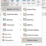
2. Bar Charts: Comparing Categories and Values
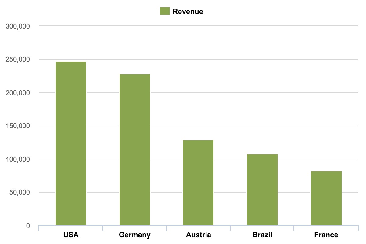
Bar charts are one of the most versatile and widely used types of graphs for data comparison. They are effective for comparing different categories or values and can be easily understood by a broad audience. Whether you need to compare sales figures, survey responses, or any other categorical data, bar charts provide a clear and concise visual representation.
- What is a Bar Chart? A bar chart is a graph that presents categorical data with rectangular bars with heights or lengths proportional to the values they represent. The bars can be plotted vertically or horizontally.
- When to Use Bar Charts:
- Comparing Categories: Use bar charts when you need to compare values across different categories.
- Showing Magnitude: They are effective for showing the magnitude of values, making it easy to identify the largest and smallest values.
- Highlighting Differences: Bar charts can clearly highlight the differences between categories.
- Types of Bar Charts:
- Vertical Bar Charts (Column Charts): The most common type, ideal for comparing values vertically.
- Horizontal Bar Charts: Best used when category names are long or when comparing a large number of categories.
- Stacked Bar Charts: Useful for showing how different categories contribute to a whole.
- Grouped Bar Charts: Allow for comparison of multiple variables across different categories.
- Best Practices for Bar Charts:
- Start the Axis at Zero: Always start the vertical axis at zero to avoid misleading representations of the data.
- Use Clear Labels: Label each bar clearly to ensure easy readability.
- Sort the Data: Sort the bars in ascending or descending order to make comparisons easier.
- Limit the Number of Categories: Avoid using too many categories in a single chart to prevent clutter.
- Examples of Bar Chart Usage:
- Sales Performance: Comparing sales figures for different products or regions.
- Survey Results: Visualizing responses to survey questions across different demographics.
- Website Traffic: Comparing website traffic from different sources.
3. Line Charts: Tracking Trends Over Time
Line charts are ideal for visualizing trends and changes in data over a period of time. They are particularly useful for identifying patterns, forecasting future values, and understanding how data evolves. Whether you’re tracking stock prices, temperature changes, or any other continuous data, line charts offer a clear and intuitive way to see the data’s trajectory.
- What is a Line Chart? A line chart is a type of chart that displays information as a series of data points connected by straight line segments. It is used to show trends over time.
- When to Use Line Charts:
- Tracking Trends: Use line charts when you need to track trends and changes over time.
- Continuous Data: They are suitable for continuous data, such as temperature, stock prices, or sales figures.
- Forecasting: Line charts can be used to forecast future values based on historical data.
- Types of Line Charts:
- Simple Line Chart: Shows the trend of a single variable over time.
- Multiple Line Chart: Compares the trends of multiple variables over the same time period.
- Stacked Line Chart: Displays the cumulative trend of multiple variables.
- Best Practices for Line Charts:
- Use a Clear Time Scale: Ensure the time scale is clearly labeled and evenly spaced.
- Limit the Number of Lines: Avoid using too many lines in a single chart to prevent confusion.
- Label the Lines: Clearly label each line to indicate which variable it represents.
- Use Consistent Colors: Use consistent colors for each variable across multiple charts.
- Examples of Line Chart Usage:
- Stock Market Trends: Tracking stock prices over time.
- Temperature Changes: Visualizing temperature fluctuations over a period of time.
- Sales Growth: Showing the growth of sales figures over time.
4. Pie Charts: Illustrating Proportions and Percentages
Pie charts are best suited for illustrating proportions and percentages of a whole. They provide a simple and intuitive way to show how different parts contribute to a total. Whether you’re displaying market share, budget allocations, or any other compositional data, pie charts offer a quick snapshot of the relative sizes of different categories.
- What is a Pie Chart? A pie chart is a circular statistical graphic that is divided into slices to illustrate numerical proportion. The entire “pie” represents 100%, and each slice represents a percentage of the whole.
- When to Use Pie Charts:
- Illustrating Proportions: Use pie charts when you want to illustrate the proportions of different categories.
- Showing Percentages: They are effective for showing how different parts contribute to a total of 100%.
- Simple Composition: Pie charts are best used for simple compositions with a limited number of categories.
- Types of Pie Charts:
- Simple Pie Chart: Shows the proportions of different categories in a single pie.
- Donut Chart: A variation of the pie chart with a hole in the center, which can be used to display additional information.
- Best Practices for Pie Charts:
- Limit the Number of Categories: Avoid using too many categories in a single chart to prevent clutter.
- Ensure Proportions Add Up to 100%: Verify that all slices add up to 100%.
- Order Slices by Size: Arrange slices in descending order by size to make comparisons easier.
- Use Clear Labels: Label each slice clearly with its category and percentage.
- Examples of Pie Chart Usage:
- Market Share: Showing the market share of different companies.
- Budget Allocation: Visualizing how a budget is allocated across different departments.
- Demographics: Displaying the distribution of demographics in a population.
5. Scatter Plots: Exploring Relationships Between Variables
Scatter plots are excellent for exploring relationships between two different variables. They help to identify correlations, clusters, and outliers in the data. Whether you’re analyzing the relationship between advertising spend and sales, or the correlation between study time and exam scores, scatter plots offer a visual representation of how two variables interact.
- What is a Scatter Plot? A scatter plot is a type of chart that displays the relationship between two numerical variables. Each point on the plot represents a pair of values for the two variables.
- When to Use Scatter Plots:
- Exploring Relationships: Use scatter plots when you want to explore the relationship between two variables.
- Identifying Correlations: They are effective for identifying correlations, whether positive, negative, or non-existent.
- Spotting Outliers: Scatter plots can help you spot outliers that deviate from the overall pattern.
- Types of Scatter Plots:
- Simple Scatter Plot: Shows the relationship between two variables.
- Bubble Chart: A variation of the scatter plot where the size of the points represents a third variable.
- Best Practices for Scatter Plots:
- Label the Axes: Clearly label both axes with the names of the variables.
- Use a Clear Scale: Ensure the scale is appropriate for the data range.
- Add a Trend Line: Consider adding a trend line to highlight the correlation between the variables.
- Use Different Colors or Sizes: Use different colors or sizes for points to represent additional variables.
- Examples of Scatter Plot Usage:
- Advertising Spend vs. Sales: Analyzing the relationship between advertising spend and sales revenue.
- Study Time vs. Exam Scores: Exploring the correlation between study time and exam scores.
- Height vs. Weight: Visualizing the relationship between height and weight in a population.
6. Histograms: Analyzing the Distribution of Data
Histograms are useful for analyzing the distribution of data and understanding the frequency of different values. They provide insights into the shape, center, and spread of the data. Whether you’re examining the distribution of ages in a population, the frequency of website visit durations, or any other continuous data, histograms offer a clear visual representation of the data’s distribution.
- What is a Histogram? A histogram is a graphical representation of the distribution of numerical data. It groups data into bins and shows the frequency of values within each bin.
- When to Use Histograms:
- Analyzing Distribution: Use histograms when you want to analyze the distribution of data.
- Understanding Frequency: They are effective for understanding the frequency of different values.
- Identifying Shape: Histograms can help you identify the shape of the data distribution, such as normal, skewed, or uniform.
- Types of Histograms:
- Simple Histogram: Shows the distribution of a single variable.
- Stacked Histogram: Compares the distributions of multiple variables.
- Best Practices for Histograms:
- Choose Appropriate Bin Sizes: Select bin sizes that are appropriate for the data range.
- Label the Axes: Clearly label both axes with the variable name and frequency.
- Ensure Bins are Equal Width: Ensure that all bins have equal width for accurate representation.
- Avoid Too Many or Too Few Bins: Avoid using too many or too few bins to prevent distortion of the data distribution.
- Examples of Histogram Usage:
- Age Distribution: Examining the distribution of ages in a population.
- Website Visit Durations: Analyzing the frequency of website visit durations.
- Exam Scores: Visualizing the distribution of scores on an exam.
7. Box Plots: Comparing Distributions and Identifying Outliers
Box plots are powerful tools for comparing the distributions of different data sets and identifying outliers. They provide a summary of the data, including the median, quartiles, and extreme values. Whether you’re comparing the performance of different products, the salaries of different job roles, or any other numerical data, box plots offer a concise visual representation of the data’s distribution and key statistics.
-
What is a Box Plot? A box plot (also known as a box-and-whisker plot) is a graphical representation of numerical data based on its five-number summary: minimum, first quartile (Q1), median (Q2), third quartile (Q3), and maximum.
-
When to Use Box Plots:
- Comparing Distributions: Use box plots when you want to compare the distributions of different data sets.
- Identifying Outliers: They are effective for identifying outliers that deviate from the overall pattern.
- Summarizing Data: Box plots provide a summary of the data, including the median, quartiles, and extreme values.
-
Types of Box Plots:
- Simple Box Plot: Shows the distribution of a single variable.
- Grouped Box Plot: Compares the distributions of multiple variables.
-
Best Practices for Box Plots:
- Label the Axes: Clearly label both axes with the variable name and scale.
- Include All Data Points: Ensure that all data points are included in the plot, including outliers.
- Use Consistent Scales: Use consistent scales for comparing multiple box plots.
- Provide Clear Explanations: Provide clear explanations of the components of the box plot, such as the median, quartiles, and outliers.
-
Examples of Box Plot Usage:
- Product Performance: Comparing the performance of different products.
- Salary Comparison: Comparing the salaries of different job roles.
- Test Scores: Visualizing the distribution of test scores across different classes.
8. Best Practices for Choosing the Right Graph
Choosing the right graph for data comparison is crucial for effective communication and decision-making. Here are some best practices to consider:
- Understand Your Data: Before selecting a graph, understand the type of data you are working with, whether it is categorical, continuous, or compositional.
- Define Your Objective: Determine what you want to communicate with the graph. Are you comparing categories, tracking trends, or exploring relationships?
- Consider Your Audience: Choose a graph that is appropriate for your audience’s level of understanding.
- Keep it Simple: Avoid using overly complex graphs that can confuse your audience.
- Use Clear Labels and Titles: Ensure that all axes, labels, and titles are clear and descriptive.
- Use Colors Wisely: Use colors to highlight important information, but avoid using too many colors.
- Test Your Graph: Before presenting your graph, test it with a small group to ensure that it is easy to understand.
By following these best practices, you can choose the right graph for data comparison and effectively communicate your insights.
9. Advanced Data Visualization Techniques
Beyond the basic graph types, there are several advanced data visualization techniques that can be used for more complex data comparison. These include:
- Heat Maps: Use color-coded matrices to display the relationship between two categorical variables.
- Network Graphs: Visualize relationships between entities in a network.
- Geographic Maps: Display data on a map to show geographic patterns.
- Parallel Coordinates: Plot multiple variables on parallel axes to compare their values.
- Sankey Diagrams: Visualize the flow of data between different states or categories.
These advanced techniques can provide deeper insights into complex data sets, but they require a higher level of expertise to create and interpret.
10. Tools for Creating Data Visualizations
There are many tools available for creating data visualizations, ranging from simple spreadsheet software to sophisticated business intelligence platforms. Some popular tools include:
- Microsoft Excel: A widely used spreadsheet software with basic charting capabilities.
- Google Sheets: A free, web-based spreadsheet software with similar features to Excel.
- Tableau: A powerful business intelligence platform with advanced data visualization capabilities.
- Power BI: Microsoft’s business intelligence platform, offering a wide range of visualization options.
- Python Libraries (e.g., Matplotlib, Seaborn): Programming libraries for creating custom visualizations.
- R (e.g., ggplot2): A statistical computing language with powerful graphing capabilities.
The choice of tool depends on your budget, technical skills, and the complexity of your data visualization needs.
11. The Role of COMPARE.EDU.VN in Data-Driven Decision Making
COMPARE.EDU.VN is dedicated to providing comprehensive and objective comparisons to assist users in making informed decisions. We recognize the critical role of data visualization in simplifying complex information and enabling effective decision-making. Whether you’re comparing products, services, or ideas, COMPARE.EDU.VN offers a wealth of resources to help you make the right choice.
- Objective Comparisons: COMPARE.EDU.VN offers objective comparisons of various options, helping users evaluate the pros and cons of each.
- Detailed Analysis: Our comparisons include detailed analysis of features, specifications, and performance metrics.
- User Reviews: We provide user reviews and ratings to give you real-world insights.
- Expert Opinions: Our team of experts offers their opinions and recommendations based on thorough research and analysis.
- Data Visualization: COMPARE.EDU.VN utilizes data visualization techniques to present complex information in an accessible and understandable format.
12. Common Data Visualization Mistakes to Avoid
Creating effective data visualizations requires attention to detail and a clear understanding of best practices. Here are some common mistakes to avoid:
- Clutter: Avoid adding too much information to a single graph, which can make it difficult to understand.
- Misleading Scales: Ensure that your scales are accurate and avoid truncating axes, which can distort the data.
- Poor Color Choices: Use colors intentionally and avoid using too many colors or colors that are difficult to distinguish.
- Lack of Context: Provide sufficient context for your graph, including clear labels, titles, and descriptions.
- Inappropriate Graph Types: Choose a graph type that is appropriate for your data and objective.
By avoiding these common mistakes, you can create data visualizations that are clear, accurate, and effective.
13. The Future of Data Visualization
Data visualization is an evolving field, with new techniques and technologies emerging all the time. Some of the trends shaping the future of data visualization include:
- Interactive Visualizations: Allowing users to interact with data and explore it in more detail.
- Data Storytelling: Combining data visualization with narrative to create compelling stories.
- Augmented Reality (AR) and Virtual Reality (VR): Using AR and VR to create immersive data visualization experiences.
- Artificial Intelligence (AI): Using AI to automate the creation of data visualizations and provide insights.
- Real-Time Data Visualizations: Visualizing data in real-time as it is generated.
These trends promise to make data visualization even more powerful and accessible in the future.
14. Real-World Examples of Effective Data Comparison Using Graphs
To illustrate the power of data comparison using graphs, here are some real-world examples:
- Healthcare: Comparing patient outcomes across different treatments using bar charts.
- Finance: Tracking investment performance over time using line charts.
- Marketing: Analyzing the effectiveness of different advertising campaigns using scatter plots.
- Education: Comparing student test scores across different schools using box plots.
- Retail: Visualizing sales trends by region using geographic maps.
These examples demonstrate how data comparison using graphs can provide valuable insights and inform decision-making in a variety of industries.
15. Frequently Asked Questions (FAQs) About Data Comparison Using Graphs
Q1: What is the best graph for comparing categorical data?
A1: Bar charts are generally the best choice for comparing categorical data. They provide a clear and concise way to compare values across different categories.
Q2: When should I use a line chart instead of a bar chart?
A2: Use a line chart when you want to track trends and changes over time. Line charts are suitable for continuous data, while bar charts are better for comparing discrete categories.
Q3: How many categories should I include in a pie chart?
A3: It is best to limit the number of categories in a pie chart to six or fewer. Too many categories can make the chart cluttered and difficult to read.
Q4: What is the purpose of a scatter plot?
A4: A scatter plot is used to explore the relationship between two numerical variables. It helps to identify correlations, clusters, and outliers in the data.
Q5: How can I make my graphs more accessible to people with disabilities?
A5: Use high-contrast colors, provide alternative text for images, and ensure that your graphs are readable by screen readers.
Q6: What tools can I use to create data visualizations?
A6: There are many tools available, including Microsoft Excel, Google Sheets, Tableau, Power BI, and Python libraries such as Matplotlib and Seaborn.
Q7: How do I choose the right graph for my data?
A7: Understand your data, define your objective, consider your audience, and keep it simple. Choose a graph type that is appropriate for your data and objective.
Q8: What is the difference between a histogram and a bar chart?
A8: A histogram is used to analyze the distribution of numerical data, while a bar chart is used to compare categorical data.
Q9: How can I avoid misleading my audience with data visualizations?
A9: Use accurate scales, avoid truncating axes, provide sufficient context, and choose appropriate graph types.
Q10: What are some advanced data visualization techniques?
A10: Advanced techniques include heat maps, network graphs, geographic maps, parallel coordinates, and Sankey diagrams.
16. Call to Action: Enhance Your Decision-Making with COMPARE.EDU.VN
Struggling to compare different options and make informed decisions? Visit COMPARE.EDU.VN today! Our website offers comprehensive and objective comparisons across a wide range of products, services, and ideas. With detailed analysis, user reviews, and expert opinions, COMPARE.EDU.VN empowers you to make the right choice.
- Explore Our Comparisons: Browse our extensive library of comparisons to find the information you need.
- Read User Reviews: Get real-world insights from other users who have experience with the products and services you’re considering.
- Get Expert Advice: Benefit from the expertise of our team of experts, who provide thorough analysis and recommendations.
- Make Informed Decisions: Use our comprehensive comparisons to make informed decisions and choose the best option for your needs.
Contact us today at 333 Comparison Plaza, Choice City, CA 90210, United States. You can also reach us via Whatsapp at +1 (626) 555-9090 or visit our website at COMPARE.EDU.VN. Let compare.edu.vn help you make the right choice!