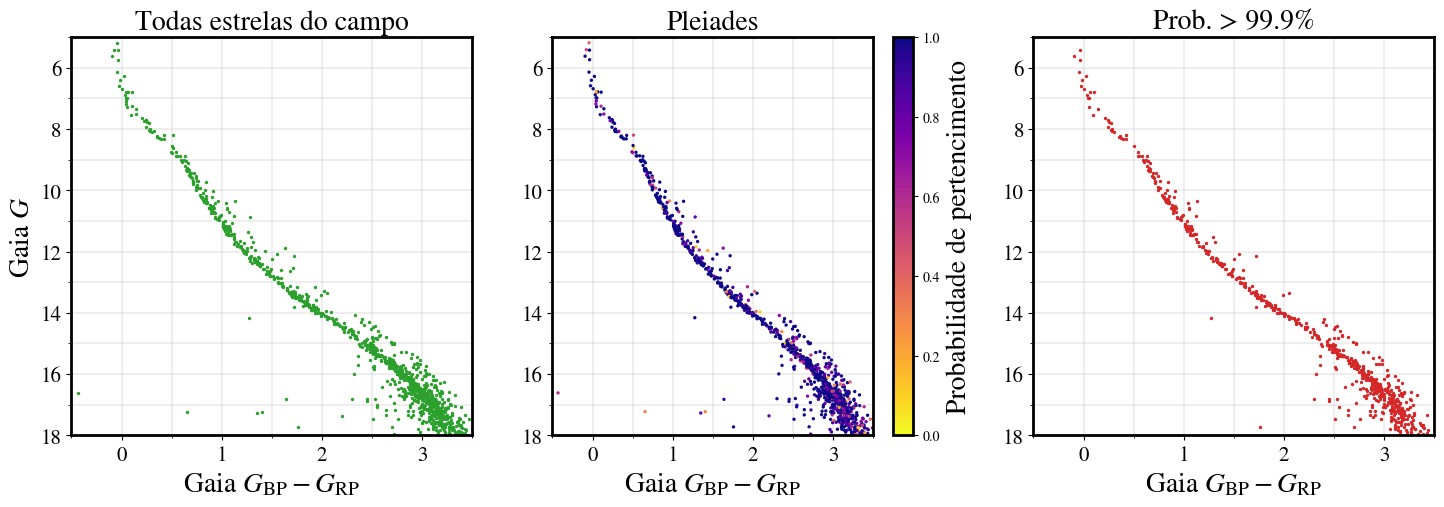
The Hertzsprung-Russell (HR) diagram is a fundamental tool in astronomy that compares the luminosity (brightness) of stars to their effective temperature (color). It’s a powerful visualization that reveals crucial information about stellar evolution, allowing astronomers to classify stars and understand their life cycles. But What Does The Hr Diagram Compare specifically, and how does it help us understand the universe?
Deciphering the Axes: Luminosity and Temperature
The HR diagram plots stars on a graph with luminosity on the vertical axis and temperature on the horizontal axis.
- Luminosity: Represents the total amount of energy a star emits per unit of time. It’s often expressed in terms of solar luminosity (the Sun’s energy output), with more luminous stars higher on the diagram.
- Temperature: Represents the surface temperature of a star, measured in Kelvin. Hotter stars are bluer and plotted towards the left of the diagram, while cooler stars are redder and plotted towards the right.
The Main Sequence: Stellar Adolescence
The most prominent feature of the HR diagram is the main sequence, a diagonal band stretching from the top left (hot and bright) to the bottom right (cool and dim). This band represents stars in their prime, fusing hydrogen into helium in their cores. Our Sun, a relatively average star, resides on the main sequence.
Beyond the Main Sequence: Stellar Evolution
As stars age and exhaust their hydrogen fuel, they evolve off the main sequence. Their position on the HR diagram shifts, reflecting changes in their luminosity and temperature. Different evolutionary paths emerge depending on the star’s initial mass:
- Giants and Supergiants: Massive stars become red giants or supergiants, expanding and cooling as they fuse heavier elements. They occupy the upper right region of the HR diagram.
- White Dwarfs: Lower-mass stars, like our Sun, eventually shed their outer layers and become white dwarfs, hot and dense remnants that gradually cool and fade. They are found in the lower left corner of the HR diagram.
Comparing Star Clusters: Open vs. Globular
The HR diagram can be used to compare different star clusters, revealing their ages and evolutionary stages.
-
Open Clusters: Young, loosely bound groups of stars found in the galactic disk. Their HR diagrams show a prominent main sequence with fewer evolved stars.
-
Globular Clusters: Old, densely packed clusters containing hundreds of thousands of stars, located in the galactic halo. Their HR diagrams show a shorter main sequence and a prominent branch of red giants, indicating their advanced age.
The differences in the HR diagrams of open and globular clusters highlight their distinct ages and locations within the galaxy. This reinforces the understanding of star formation and galactic evolution. For example, the distribution of these clusters within the Milky Way reveals crucial information about galactic structure.
Conclusion: A Window into the Cosmos
The HR diagram is a cornerstone of modern astronomy, comparing stellar luminosity and temperature to reveal the secrets of stellar evolution. By analyzing the distribution of stars on the diagram, astronomers can determine the age, composition, and evolutionary stage of individual stars and entire star clusters. This powerful tool allows us to unravel the complex history of the universe and our place within it.
