Understanding how to effectively compare and contrast ideas or objects is a crucial skill for academic and professional success. A well-structured compare and contrast chart provides a clear, visual representation of similarities and differences, facilitating deeper analysis and understanding. This article explores the structure and components of a compare and contrast chart, providing examples to illustrate its practical application.
Visualizing Similarities and Differences: The Structure of a Compare and Contrast Chart
A compare and contrast chart typically utilizes a table format to organize information. While variations exist, the most common structure includes:
- Columns: Dedicated to the items being compared (e.g., two historical periods, two novels, two scientific theories). The first column may list the specific criteria for comparison.
- Rows: Represent the specific criteria or points of comparison (e.g., causes, key figures, outcomes, themes, writing style). The first row serves as a header, labeling each item under comparison.
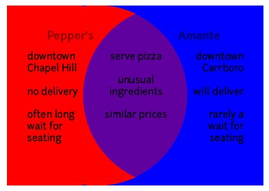 Example of a simple compare and contrast chart using a Venn Diagram.
This structure allows for a side-by-side comparison of each item based on pre-defined criteria, highlighting both commonalities and distinctions.
Practical Applications: Examples of Compare and Contrast Charts
Let’s examine a few scenarios where compare and contrast charts prove invaluable:
1. Literature Analysis: Comparing two novels might involve criteria like:
| Feature | Novel A | Novel B |
|---|---|---|
| Theme | Social injustice | Individual vs. Society |
| Setting | 19th Century London | Dystopian future |
| Protagonist | Orphaned child | Rebellious leader |
| Narrative Style | Third-person omniscient | First-person |
2. Historical Events: Comparing two historical wars could involve:
| Feature | World War I | World War II |
|---|---|---|
| Causes | Imperialism, Nationalism | Fascism, Appeasement |
| Key Figures | Woodrow Wilson, Kaiser Wilhelm | Franklin D. Roosevelt, Hitler |
| Outcomes | Treaty of Versailles | Formation of the United Nations |
3. Choosing a Product: Deciding between two laptops could use a chart like this:
| Feature | Laptop A | Laptop B |
|---|---|---|
| Price | $1000 | $1200 |
| Processor | Intel Core i5 | Intel Core i7 |
| RAM | 8GB | 16GB |
| Storage | 256GB SSD | 512GB SSD |
| Battery Life | 8 hours | 10 hours |
Beyond the Basics: Enhancing Your Compare and Contrast Chart
While the basic structure remains consistent, several strategies can enhance a compare and contrast chart’s effectiveness:
- Prioritize Key Criteria: Focus on the most relevant aspects for your specific purpose.
- Use Concise Language: Keep descriptions brief and to the point for clarity.
- Color-Coding: Employ colors to highlight similarities and differences visually.
- Add a Summary Column: Include a final column to summarize key distinctions.
By understanding what a compare and contrast chart looks like and how to use it effectively, you gain a powerful tool for critical thinking, decision-making, and effective communication. It allows for organized analysis, leading to a deeper comprehension of the nuances and relationships between complex ideas and subjects.