Web accessibility is the cornerstone of an inclusive internet, ensuring that individuals with disabilities can perceive, understand, navigate, and interact with web content effectively. Just as physical spaces are designed to be accessible to everyone, websites must also be crafted with universal usability in mind. This is especially critical for users with visual impairments, who rely on well-structured and thoughtfully designed web pages to access online information and services.
For visually impaired users, including those with color blindness, low vision, and blindness, websites that neglect accessibility considerations can present significant barriers. One of the most common challenges arises from insufficient color contrast. When foreground text and background colors lack adequate contrast, the content becomes difficult, if not impossible, to read. This not only excludes visually impaired users but also diminishes the user experience for everyone.
Imagine a user with color blindness attempting to decipher text on a website where the color combinations are indistinguishable to them. Frustration and abandonment are inevitable. This scenario highlights the importance of web design that accommodates diverse visual abilities. By prioritizing accessibility, website owners not only uphold ethical standards but also expand their reach and impact, avoiding the exclusion of potential users, customers, and audience members.
“The power of the web is in its universality. Access by everyone regardless of disability is an essential aspect.”
Tim Berners-Lee, W3C director and inventor of the World Wide Web
The Critical Issue of Color Contrast for Visually Impaired Users
Visual impairment affects a significant portion of the population. Globally, hundreds of millions of people experience some form of visual disability, ranging from mild to severe. Color blindness, low vision, and blindness are among the most prevalent categories.
Color blindness, also known as color vision deficiency, impacts the ability to distinguish between certain colors. The most common types involve difficulties differentiating between red and green or blue and yellow. It’s estimated that approximately 8% of men and 0.5% of women worldwide have some form of color blindness. This means that a substantial number of website visitors may struggle with color-dependent designs.
Low vision encompasses a range of conditions where individuals have reduced visual acuity, tunnel vision, central field loss, or clouded vision, even with corrective lenses. People with low vision can perceive colors but experience significant challenges in clarity and detail. Blindness, on the other hand, is characterized by substantial and uncorrectable vision loss in both eyes. While legal blindness does not always mean complete darkness, it signifies a level of visual impairment that necessitates assistive technologies and personal support.
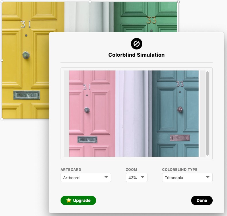
An example using Stark plugin, demonstrating how a webpage might appear to someone with tritanopia (blue-yellow color blindness).
Given these statistics, it’s evident that web designers and developers must prioritize accessibility from the outset of any project. Ignoring the needs of visually impaired users is not only unethical but also impractical in a world striving for inclusivity. Fortunately, numerous tools and techniques are available to ensure web content is accessible to everyone, with color contrast compliance being a fundamental aspect.
Web Page Compliance Test Tools: Ensuring Color Contrast for Accessibility
To address the challenge of color contrast, web page compliance test tools are indispensable. These tools are designed to evaluate the contrast ratio between foreground and background colors, ensuring they meet accessibility standards, particularly the Web Content Accessibility Guidelines (WCAG). WCAG, developed by the World Wide Web Consortium (W3C), provides internationally recognized benchmarks for web accessibility.
These compliance tools are essential for designers and developers to proactively identify and rectify color contrast issues. They streamline the process of ensuring that websites are readable and usable by individuals with visual impairments. By integrating these tools into the design and development workflow, it becomes possible to build websites that are inherently accessible, rather than retrofitting accessibility as an afterthought.
Here’s a look at how to leverage web page compliance test tools focusing on color contrast:
1. Utilizing Color Contrast Checkers
Color contrast checkers are the most fundamental tools for evaluating color accessibility. These tools allow you to input foreground and background color values (typically in HEX, RGB, or HSL formats) and instantly calculate the contrast ratio. They then assess whether the ratio meets WCAG standards.
WCAG 2.0 level AA, a widely accepted standard, requires a contrast ratio of:
- 4.5:1 for normal text (text under 18pt or 14pt bold).
- 3:1 for large text (text 18pt or 14pt bold and larger), and for graphical elements and user interface components.
Many online color contrast checkers are freely available, such as the WebAIM Contrast Checker. These tools often provide immediate pass/fail results and may even suggest color adjustments to achieve compliance.
Example of contrast ratios: black text on golden yellow passes WCAG standards, while white text on the same background fails.
2. Browser Extensions and Plugins
For real-time color contrast testing directly within the browser, extensions and plugins are incredibly efficient. Tools like the Stark plugin for Sketch, Adobe XD, and Figma, or browser extensions like WCAG Color Contrast Checker for Chrome and Firefox, allow designers and developers to check color contrast directly within their design or development environment.
These tools often feature:
- Eyedropper functionality: Select colors directly from the webpage or design interface to quickly assess contrast.
- Real-time feedback: Get immediate pass/fail results as you adjust colors.
- Color suggestions: Some tools propose accessible color alternatives.
- Color blindness simulation: Visualize how color combinations appear to users with different types of color blindness, ensuring that designs are not only compliant but also perceptually accessible.
3. Integrated Development Environment (IDE) Accessibility Features
Modern IDEs and code editors are increasingly incorporating accessibility features, including color contrast analyzers. These built-in tools provide immediate feedback within the coding environment, making it easier for developers to catch and fix contrast issues as they write code.
By integrating color contrast testing into the development workflow, teams can ensure that accessibility is considered from the beginning and throughout the project lifecycle, rather than being addressed as a separate, later stage task.
4. Automated Web Accessibility Testing Tools
For comprehensive website accessibility audits, automated web accessibility testing tools are invaluable. Services like WAVE (Web Accessibility Evaluation Tool) and others scan entire web pages and identify various accessibility issues, including color contrast failures.
These tools offer:
- Full page scans: Analyze all elements on a page for color contrast and other accessibility violations.
- Detailed reports: Provide comprehensive reports highlighting specific areas needing improvement.
- WCAG compliance checks: Verify adherence to WCAG guidelines across various aspects of accessibility.
While automated tools are powerful, it’s important to remember that they should be complemented with manual testing, especially involving users with visual impairments, to gain a holistic understanding of real-world accessibility.
Best Practices for Color Contrast and Beyond
While color contrast is paramount, achieving web accessibility for visually impaired users requires a broader approach. Here are key best practices, expanding on the original tips, to create truly inclusive web experiences:
-
Provide Sufficient Contrast: Consistently use color contrast checkers to ensure all text and interactive elements meet WCAG ratios. Don’t rely solely on color; use textures and patterns in graphs and charts to enhance differentiation for colorblind users.
-
Limit Color Use and Prioritize Information: Minimize the number of colors in your design to reduce cognitive load and potential confusion, especially for colorblind users. Use color strategically to highlight key actions and information, rather than for purely decorative purposes.
-
Enable Font Size Adjustment: Implement controls that allow users to easily adjust text size. This is crucial for users with low vision who may not be using browser zoom or assistive technologies. Clear font size controls directly on the page significantly improve usability.
Example of font size adjustment on a website, improving readability for users with low vision.
-
Don’t Rely on Color Alone for Critical Information: Never use color as the sole indicator of important information, alerts, or actions. Supplement color cues with text labels, icons, and structural elements like underlines for links. This ensures that information is accessible to everyone, regardless of color vision.
-
Ensure Keyboard Accessibility: Make all website functionality navigable via keyboard alone. Keyboard accessibility is essential for users who cannot use a mouse, including many visually impaired users who rely on screen readers.
-
Use Descriptive Link and Button Labels: Avoid generic phrases like “click here.” Use clear, descriptive link text that makes sense out of context, especially for screen reader users who may navigate websites by listing links. This also enhances SEO and overall usability.
-
Provide Alternative Text for Non-Text Content (Alt Text): Always include descriptive alt text for images and graphics. Screen readers announce alt text to convey the meaning of visual content to blind users. Keep alt text concise and informative.
-
Organize Content with Headings: Use headings (H1-H6) to structure page content logically. Screen reader users often navigate by headings to quickly understand page structure and find relevant sections. Well-structured headings improve scannability for all users.
-
Use Descriptive Page Titles: Ensure every page has a unique and descriptive title (
<title>tag). Screen readers announce page titles when a page loads, providing immediate context for visually impaired users and aiding navigation.
Conclusion: Building an Accessible Web for All
Creating websites that are truly accessible for visually impaired users, particularly regarding color contrast, is not merely a matter of compliance—it’s about fostering inclusivity and expanding the reach of your online presence. By integrating web page compliance test tools into your design and development processes, and by adhering to best practices in color contrast and overall accessibility, you can create web experiences that are usable and enjoyable for everyone.
Embrace the power of accessible design and make the web a more inclusive space for all users, regardless of their visual abilities. Start by utilizing the readily available tools and resources, and champion web accessibility within your teams and organizations. The result will be a better web for everyone.
Take Action: Evaluate your website’s color contrast accessibility today using a web page compliance test tool and begin your journey towards a more inclusive online experience.