Have you ever looked at a world map and wondered if the visual representation accurately reflects reality? Questions like, “Is Texas actually bigger than Poland?” or “Does Russia truly dwarf Africa east to west more than Africa spans north to south?” might have crossed your mind. If geographical curiosity keeps you up at night, then TheTrueSize.com offers a fascinating solution to visually compare the real sizes of countries and even U.S. states.
Inspired by a thought-provoking episode of The West Wing, where the fictional Organisation of Cartographers for Social Equality (OCSE) advocates for the use of the Peters projection over the traditional Mercator projection in schools, TheTrueSize.com, created by James Talmage and Damon Maneice, tackles the inherent distortions present in conventional world maps.
The core issue lies in the widespread use of the Mercator projection. As highlighted in The West Wing episode, this projection, while useful for navigation, significantly distorts the size of countries depending on their latitude. Nations further from the equator appear disproportionately larger than those closer to it. This distortion, as argued by the OCSE, isn’t just a cartographical quirk; it has historical and even political implications. While Gerardus Mercator designed his projection as a navigational aid for sailors by maintaining straight lines of constant bearing, this came at the cost of area accuracy, especially towards the poles.
The implications of the Mercator projection are striking:
- Greenland vs. Africa: On a Mercator map, Greenland often seems comparable in size to Africa. In reality, Africa is a colossal continent, approximately 14 times larger than Greenland.
- Europe vs. South America: Europe visually dominates South America on many Mercator maps. However, South America is nearly double the size of Europe in landmass.
- Alaska vs. Mexico: Alaska appears significantly larger than Mexico on Mercator maps. In reality, Mexico is slightly larger than Alaska.
While the Peters projection offers an area-accurate alternative, it dramatically alters the familiar shapes of countries, often appearing unfamiliar and less intuitive to many. As a character in The West Wing aptly puts it upon seeing a Peters projection, “What the hell is that?”
This is where TheTrueSize.com excels. This user-friendly web application allows you to directly compare country sizes without the jarring visual shift of the Peters projection. Talmage and Maneice envisioned it as an educational tool, stating, “We hope teachers will use it to show their students just how big the world actually is.”
Using TheTrueSize.com is an engaging and enlightening experience. Drag and drop countries from their geographical locations and witness the distortions of the Mercator projection in real-time. Move equatorial countries towards the poles and watch them inflate, mirroring the “house of mirrors” effect described in the original article. Conversely, drag countries from high latitudes towards the equator to see them shrink to their true proportions.
Let’s explore some compelling examples using TheTrueSize.com to understand the real Maps Comparing Country Sizes:
Greenland’s True Size
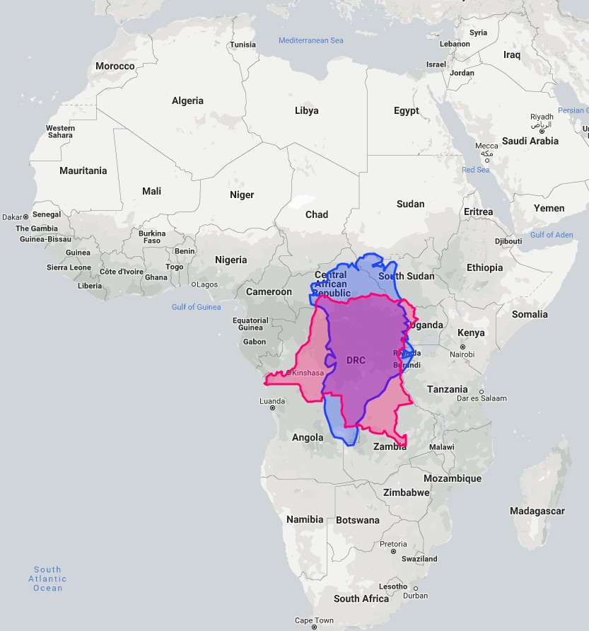
The Mercator projection dramatically exaggerates Greenland’s size. When positioned near Africa on TheTrueSize.com, Greenland shrinks considerably, revealing its actual size relative to the African continent. While Greenland is indeed a large island with an area of 836,000 square miles (2.16 million km2), it is smaller than the Democratic Republic of the Congo, which covers 857,000 sq. mi (2.22 million km2).
United Kingdom vs. Tanzania Size Comparison
Traditional maps might lead you to believe that the United Kingdom and Tanzania are roughly similar in size. However, by using TheTrueSize.com, the stark difference becomes immediately apparent. Dragging the UK over Tanzania reveals that Tanzania dwarfs the UK. The entire United Kingdom fits comfortably within Tanzania, highlighting the Mercator projection’s distortion, especially when comparing countries at different latitudes.
Russia and Africa: A Continent’s True Scale
Russia, the world’s largest country by land area at 6.6 million sq. mi (17 million km2), appears immense on Mercator projection maps, sometimes even seeming larger than Africa. However, by dragging Russia to the equator on TheTrueSize.com and placing it over Africa, the true scale of the African continent is revealed. Africa, with an area of 11.73 million sq. mi (30.37 million km2), is almost double the size of Russia, a fact often obscured by standard world maps.
Texas vs. Poland Size Comparison
The saying “Everything’s bigger in Texas” takes on a geographical dimension when comparing Texas to European countries. Using TheTrueSize.com, you can easily see that Texas is indeed larger than Poland. Dropping the outline of Texas over Poland on the map demonstrates that Texas encompasses the entirety of Poland with significant area to spare.
United States vs. Europe Size Comparison
Comparing the contiguous United States (“Lower 48”) to Europe on TheTrueSize.com offers another eye-opening perspective on maps comparing country sizes. Positioning the U.S. over Europe reveals a striking size comparison. If Seattle were located in western Ireland, Istanbul would still fall within the U.S. outline in southern Texas. Los Angeles would align with the Franco-Spanish border, and Chicago would be situated just north of Moscow, illustrating the vastness of both landmasses and their relative sizes.
Germany in the Midwest, USA Size Comparison
For a more localized comparison, TheTrueSize.com allows you to compare regions. Placing Germany over the American Midwest demonstrates a fascinating size equivalence. Cities like Milwaukee, Nashville, St. Louis, and Fort Wayne roughly align with Flensburg, Munich, Cologne, and Berlin respectively. The combined area of Illinois, Indiana, and Kentucky (135,000 sq. mi) is nearly identical to Germany’s area (just under 138,000 sq. mi), providing a tangible sense of scale.
TheTrueSize.com is more than just a fun geographic tool; it’s a valuable resource for education and a powerful visual aid to understand the distortions inherent in maps comparing country sizes. By allowing users to interactively explore and compare the true sizes of countries, it fosters a more accurate global perspective and challenges preconceived notions shaped by traditional map projections. Explore TheTrueSize.com today and reshape your understanding of the world map.
Images from The True Size and Bored Panda.