Comparative analysis is a powerful technique for uncovering insights from data. It involves comparing different data sets to identify similarities, differences, trends, and patterns. Excel, with its robust features and widespread availability, provides an excellent platform for conducting comparative analyses. This guide will delve into how to leverage Excel for effective comparative analysis, empowering you to make data-driven decisions.
Understanding Comparative Analysis
Comparative analysis aims to understand the relationships between different data points by examining them side-by-side. This method helps in:
- Identifying Trends: Spotting increases, decreases, or fluctuations in data over time or across different categories.
- Benchmarking: Comparing your performance against competitors or industry standards.
- Decision Making: Providing evidence-based insights for informed choices.
Leveraging Excel for Comparative Analysis
Excel offers several features that facilitate comparative analysis:
1. Organizing Data:
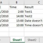
- Consolidated Worksheets: Combine data from multiple worksheets into a single view for easy comparison. Use the
Data > Consolidatefeature to summarize data by sum, average, count, etc. - Pivot Tables: Summarize and analyze large datasets, enabling dynamic comparisons across different categories and variables. Explore different aggregations and filters to gain deeper insights.
2. Visualizing Comparisons:
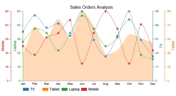
- Charts and Graphs: Create visual representations of your data using bar charts, line charts, scatter plots, and more. This allows for quick identification of trends and outliers. Utilize combo charts to compare different data series with varying scales.
- Conditional Formatting: Highlight cells based on specific criteria, such as top/bottom values, differences between cells, or data exceeding a threshold. This visually emphasizes key comparisons. Explore color scales, data bars, and icon sets for enhanced visualization.
- Sparklines: Insert miniature charts within individual cells to visualize trends within a row or column. These compact visualizations offer a quick overview of data changes.
Example: A multi-axis line chart comparing sales of different products over time. This chart effectively visualizes trends and allows for easy comparison of performance.
3. Performing Calculations:
- Formulas and Functions: Utilize built-in formulas like
IF,SUMIF,COUNTIF, andAVERAGEIFto perform conditional calculations and comparisons. Leverage functions likeVAR.PandSTDEV.Pfor statistical analysis and comparison of data variability. - Data Analysis Toolpak: Access advanced statistical tools for hypothesis testing, regression analysis, and more. This add-in provides powerful capabilities for in-depth comparative analysis.
Enhancing Comparative Analysis with Add-ins
While Excel provides a solid foundation, add-ins like ChartExpo can significantly enhance your comparative analysis capabilities:
- ChartExpo: Offers a wide array of specialized charts like Radar Charts and Matrix Charts, specifically designed for comparative visualization. These charts provide unique perspectives on data relationships and facilitate more comprehensive comparisons.
Example: Using ChartExpo to create a Radar Chart comparing the features of different products.
Conclusion
Mastering comparative analysis in Excel empowers you to extract meaningful insights from your data. By leveraging Excel’s features and exploring powerful add-ins, you can transform raw data into actionable knowledge, enabling informed decision-making and driving business success. Remember to choose the visualization and calculation methods that best suit your specific data and analysis goals.