Making a comparative bar chart in Excel is a powerful way to visualize and compare data. COMPARE.EDU.VN shows you the step-by-step instructions to create an effective chart for understanding trends and making informed decisions. Learn to leverage this valuable tool for your data analysis and enhance your data presentation skills.
1. Understanding Comparative Bar Charts
A comparative bar chart, also known as a multiple bar chart or grouped bar chart, is a graphical representation used to compare two or more sets of data side-by-side. Each set of data is represented by a bar, and the bars are grouped together by category. This type of chart allows for easy visual comparison of different data sets within the same category. These data visualizations helps make better informed decisions based on data insights.
1.1. Benefits of Using Comparative Bar Charts
Comparative bar charts offer several advantages:
- Clear Visual Comparison: They provide a straightforward way to compare data sets.
- Easy Identification of Trends: Makes it easy to spot trends and patterns across different categories.
- Enhanced Data Understanding: Simplifies complex data sets for better understanding.
- Effective Communication: Helps communicate data insights to a wider audience.
- Improved Decision-Making: Provides a solid basis for making informed decisions.
1.2. Use Cases for Comparative Bar Charts
Comparative bar charts are used in various fields, including:
- Business: Comparing sales figures, market share, or revenue across different products, regions, or time periods.
- Education: Comparing student performance, test scores, or enrollment numbers across different schools or programs.
- Science: Comparing experimental results, research data, or statistical findings across different groups or conditions.
- Finance: Comparing stock prices, investment returns, or financial performance across different companies or sectors.
- Marketing: Comparing the performance of different marketing campaigns, customer demographics, or website traffic across different channels.
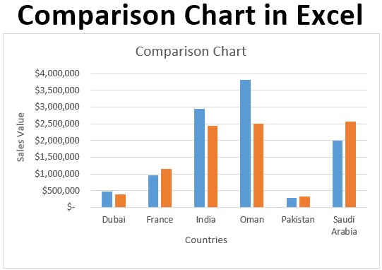
Alt Text: Sales comparison chart in Excel displaying clustered columns representing sales data for different products across multiple periods.
2. Setting Up Your Data in Excel
Before creating a comparative bar chart, you need to organize your data in a way that Excel can easily understand. Here’s how to set up your data:
2.1. Data Structure
Your data should be structured with categories in the first column and data series in subsequent columns. For example, if you want to compare sales data for different products across different months, your data should look like this:
| Product | January | February | March |
|---|---|---|---|
| Product A | 100 | 120 | 150 |
| Product B | 80 | 90 | 110 |
| Product C | 110 | 130 | 140 |
2.2. Data Preparation Tips
- Clear Labels: Ensure your categories and data series have clear and concise labels.
- Consistent Units: Use consistent units for all data values.
- Avoid Empty Cells: Fill any empty cells with appropriate values (e.g., zero or N/A).
- Sort Data (Optional): Sorting your data can make it easier to identify trends and patterns.
2.3. Example Data Set
Let’s consider an example where we want to compare the sales performance of three products (Product A, Product B, and Product C) over three months (January, February, and March). Our data set in Excel would look like this:
| Product | January | February | March |
|---|---|---|---|
| Product A | 100 | 120 | 150 |
| Product B | 80 | 90 | 110 |
| Product C | 110 | 130 | 140 |
3. Step-by-Step Guide: Creating a Comparative Bar Chart in Excel
Follow these steps to create a comparative bar chart in Excel:
3.1. Select Your Data
- Open your Excel workbook and select the data you want to include in your chart, including the category labels and data series. In our example, select the range
A1:D4.
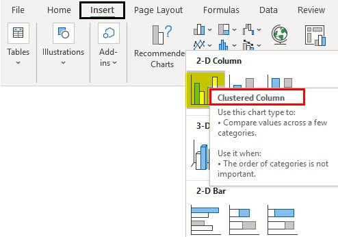
3.2. Insert a Clustered Bar Chart
- Go to the “Insert” tab in the Excel ribbon.
- In the “Charts” group, click on the “Insert Column or Bar Chart” dropdown menu.
- Choose “Clustered Bar” under the “2-D Bar” section.
Alt Text: Inserting a clustered bar chart in Excel from the ‘Insert Column or Bar Chart’ options under the ‘Insert’ tab.
3.3. Customize the Chart
- Chart Title:
- Click on the chart title to edit it.
- Enter a descriptive title for your chart (e.g., “Sales Comparison by Product and Month”).
- Axis Titles:
- Click on the “+” button next to the chart to add chart elements.
- Check the “Axis Titles” box.
- Edit the axis titles to describe what each axis represents (e.g., “Product” for the horizontal axis and “Sales” for the vertical axis).
- Data Labels:
- Click on the “+” button next to the chart.
- Check the “Data Labels” box to display values on each bar.
- Customize the position of the data labels by clicking the arrow next to “Data Labels” and choosing an option (e.g., “Outside End”).
- Legend:
- The legend identifies each data series in the chart.
- Adjust the position of the legend by clicking the “+” button next to the chart and choosing “Legend.”
- Select a position option (e.g., “Right,” “Top,” “Left,” “Bottom”).
3.4. Formatting the Chart
- Color Scheme:
- Click on a data series (e.g., the January bars) to select all bars in that series.
- Go to the “Format” tab in the Excel ribbon.
- Click on “Shape Fill” to change the color of the bars.
- Choose a color from the color palette or select “More Fill Colors” for additional options.
- Repeat this process for each data series to assign different colors to each.
- Axis Formatting:
- Double-click on an axis to open the “Format Axis” pane.
- Adjust the axis bounds (minimum and maximum values) to better display your data.
- Modify the number format to display values as currency, percentages, or other formats.
- Gridlines:
- Adjust the visibility of gridlines by clicking the “+” button next to the chart and checking or unchecking the “Gridlines” box.
- Chart Styles:
- Select your chart.
- Go to the “Chart Design” tab.
- Use the “Chart Styles” gallery to apply a pre-designed style to your chart.
3.5. Adding Data Labels and Legends
- Data Labels:
- Right-click on a data series in your chart.
- Select “Add Data Labels.”
- Choose “Add Data Labels” to display the values on each bar.
- Legend:
- The legend identifies each data series in the chart.
- Adjust the position of the legend by clicking the “+” button next to the chart and choosing “Legend.”
- Select a position option (e.g., “Right,” “Top,” “Left,” “Bottom”).
4. Advanced Techniques
To further enhance your comparative bar charts, consider these advanced techniques:
4.1. Adding Error Bars
Error bars can be used to show the variability or uncertainty in your data.
- Select a data series in your chart.
- Go to the “Chart Design” tab.
- Click on “Add Chart Element,” then “Error Bars.”
- Choose an error bar option (e.g., “Standard Error,” “Percentage,” or “Standard Deviation”).
- Customize the error bars in the “Format Error Bars” pane.
4.2. Adding Trendlines
Trendlines can help you identify trends and patterns in your data.
- Select a data series in your chart.
- Go to the “Chart Design” tab.
- Click on “Add Chart Element,” then “Trendline.”
- Choose a trendline option (e.g., “Linear,” “Exponential,” or “Moving Average”).
- Customize the trendline in the “Format Trendline” pane.
4.3. Using Conditional Formatting
Conditional formatting can highlight specific data points or trends in your chart.
- Select the data range you want to format.
- Go to the “Home” tab.
- Click on “Conditional Formatting.”
- Choose a formatting rule (e.g., “Highlight Cells Rules” or “Top/Bottom Rules”).
- Customize the formatting options.
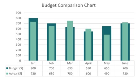
Alt Text: Example of a budget comparison chart in Excel, displaying actual expenses versus budgeted amounts in clustered column format.
5. Examples of Comparative Bar Charts in Different Scenarios
Here are some examples of how comparative bar charts can be used in different scenarios:
5.1. Sales Performance Comparison
Compare the sales performance of different products, regions, or sales representatives over a specific period.
| Product | Q1 | Q2 | Q3 | Q4 |
|---|---|---|---|---|
| Product A | 1000 | 1200 | 1500 | 1300 |
| Product B | 800 | 900 | 1100 | 1000 |
| Product C | 1100 | 1300 | 1400 | 1200 |
5.2. Budget vs. Actual Expenses
Compare budgeted expenses to actual expenses for different categories.
| Category | Budgeted | Actual |
|---|---|---|
| Marketing | 5000 | 5500 |
| Sales | 3000 | 2800 |
| Operations | 2000 | 2200 |
| R&D | 4000 | 3800 |
5.3. Website Traffic Comparison
Compare website traffic from different sources or channels.
| Source | January | February | March |
|---|---|---|---|
| Organic | 5000 | 5500 | 6000 |
| Paid | 3000 | 2800 | 3200 |
| Social | 2000 | 2200 | 2500 |
| Referral | 4000 | 3800 | 4200 |
6. Best Practices for Creating Effective Comparative Bar Charts
To create effective comparative bar charts, keep the following best practices in mind:
6.1. Choose the Right Chart Type
Ensure that a comparative bar chart is the most appropriate chart type for your data and analysis goals. Consider other chart types, such as line charts, pie charts, or scatter plots, if they are better suited for your data.
6.2. Keep It Simple
Avoid cluttering your chart with too much information or unnecessary formatting. Focus on presenting the most important data points and trends clearly and concisely.
6.3. Use Clear and Concise Labels
Use clear and concise labels for your categories, data series, and axes. Ensure that your labels are easy to read and understand.
6.4. Choose Appropriate Colors
Use a color scheme that is visually appealing and easy to distinguish. Avoid using too many colors or colors that are too similar.
6.5. Provide Context
Provide context for your chart by including a descriptive title, axis labels, and a legend. Explain the data and trends shown in the chart in a brief narrative.
6.6. Ensure Accuracy
Ensure that your data is accurate and up-to-date. Double-check your data and chart for errors.
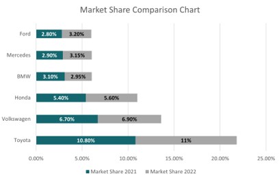
Alt Text: Market share comparison chart in Excel, comparing market share percentages of different companies across two years with clustered bars.
7. Common Mistakes to Avoid
Here are some common mistakes to avoid when creating comparative bar charts:
7.1. Using Too Many Categories
Avoid using too many categories in your chart, as this can make it difficult to read and understand. Focus on the most important categories.
7.2. Using Non-Zero Baseline
Always start your vertical axis at zero, as this can distort the data and mislead the audience.
7.3. Using 3D Charts
Avoid using 3D charts, as they can distort the data and make it difficult to compare values accurately.
7.4. Overusing Special Effects
Avoid overusing special effects, such as shadows, gradients, or textures, as they can distract from the data and make the chart look unprofessional.
8. Optimizing Charts for Readability
Optimizing your comparative bar charts for readability is crucial to ensure your audience can easily understand the data you’re presenting. Here are some key strategies:
8.1. Font and Text Size
Choose a clear, readable font and use an appropriate text size for all labels, titles, and data values. Avoid using decorative or overly stylized fonts that can be difficult to read.
8.2. Label Placement
Ensure that your labels are placed in a way that is easy to see and understand. Avoid overlapping labels or labels that are too close together.
8.3. Spacing and Margins
Use appropriate spacing and margins to create a clean and uncluttered chart. Avoid crowding the chart with too much information.
8.4. Contrast
Use sufficient contrast between the bars and the background to make the chart easy to see. Avoid using colors that are too similar or colors that clash.
8.5. Order of Bars
Consider ordering the bars in your chart in a way that makes it easier to compare values. For example, you can sort the bars by value or by category.
9. Using Excel Templates for Comparative Bar Charts
Using Excel templates can save time and effort when creating comparative bar charts. Many pre-designed templates are available online that you can download and customize with your own data.
9.1. Finding Templates
You can find Excel templates for comparative bar charts on the Microsoft Office website or on other websites that offer Excel templates.
9.2. Customizing Templates
Once you have downloaded a template, you can customize it with your own data, labels, and formatting options. Ensure that the template is appropriate for your data and analysis goals.
9.3. Benefits of Using Templates
- Saves Time: Templates save time by providing a pre-designed chart layout.
- Ensures Consistency: Templates ensure consistency in formatting and design.
- Provides Inspiration: Templates can provide inspiration for creating effective charts.
10. Sharing and Presenting Your Charts
Once you have created your comparative bar chart, you can share it with others or present it in a report or presentation.
10.1. Exporting Charts
You can export your chart as an image file (e.g., JPEG or PNG) or as a PDF file. To export a chart, right-click on the chart and select “Save as Picture” or “Export as PDF.”
10.2. Embedding Charts
You can embed your chart in a report, presentation, or website. To embed a chart, copy the chart from Excel and paste it into the target document or web page.
10.3. Presenting Charts
When presenting your chart, be sure to explain the data and trends shown in the chart clearly and concisely. Use visual aids and storytelling techniques to engage your audience and help them understand your message.
11. Advanced Chart Types for Comparison
While comparative bar charts are highly effective, other advanced chart types can also be used for comparison. These include:
11.1. Stacked Bar Charts
Stacked bar charts are useful for showing how different categories contribute to a total. Each bar represents a total, and the bar is divided into segments that represent the different categories.
11.2. 100% Stacked Bar Charts
100% stacked bar charts are similar to stacked bar charts, but each bar represents 100%. These charts are useful for showing the relative proportion of different categories.
11.3. Bubble Charts
Bubble charts are useful for showing the relationship between three variables. Each bubble represents a data point, and the size of the bubble represents the value of the third variable.
11.4. Radar Charts
Radar charts are useful for comparing multiple variables across different categories. Each axis represents a variable, and the chart shows the values of each variable for each category.
12. Integrating Comparative Charts with Dashboards
Comparative charts can be integrated into dashboards to provide a comprehensive overview of key performance indicators (KPIs) and trends.
12.1. Creating a Dashboard
To create a dashboard in Excel, you can use the “Power Pivot” and “Power View” add-ins. These add-ins allow you to create interactive dashboards with charts, tables, and other visual elements.
12.2. Adding Charts to a Dashboard
To add a comparative chart to a dashboard, copy the chart from Excel and paste it into the dashboard. You can then customize the chart and add other visual elements to create a comprehensive dashboard.
12.3. Updating Dashboards
To keep your dashboard up-to-date, you can connect it to a data source and refresh the data periodically. This will ensure that your dashboard always shows the latest information.
13. Enhancing Data Storytelling with Comparative Charts
Comparative charts are not just about displaying data; they are powerful tools for telling a story. By using comparative charts effectively, you can convey insights, highlight trends, and support decision-making. Here’s how to enhance your data storytelling with comparative charts:
13.1. Defining the Narrative
Before creating a comparative chart, define the narrative you want to convey. What are the key insights you want your audience to take away from the data?
13.2. Highlighting Key Insights
Use formatting techniques, such as color-coding, data labels, and annotations, to highlight key insights in your chart. Draw attention to the most important data points and trends.
13.3. Adding Context and Explanation
Provide context and explanation for the data shown in your chart. Explain the significance of the data and how it relates to the narrative you are trying to convey.
13.4. Using Visual Aids
Use visual aids, such as icons, images, and illustrations, to enhance the visual appeal of your chart and make it more engaging for your audience.
13.5. Practicing Your Delivery
Practice your delivery to ensure that you can explain the data and trends shown in your chart clearly and concisely. Use storytelling techniques to engage your audience and help them understand your message.
14. Accessibility Considerations for Comparative Charts
When creating comparative charts, it’s important to consider accessibility for people with disabilities. Here are some tips:
14.1. Color Contrast
Use sufficient color contrast between the bars and the background to make the chart easy to see for people with low vision.
14.2. Alt Text for Images
Provide alt text for your chart images so that people who use screen readers can understand the content of the chart.
14.3. Chart Descriptions
Provide a chart description that explains the data and trends shown in the chart in a clear and concise way.
14.4. Keyboard Navigation
Ensure that your chart can be navigated using a keyboard so that people who cannot use a mouse can access the data.
14.5. Screen Reader Compatibility
Test your chart with a screen reader to ensure that it is compatible and that people with visual impairments can access the data.
15. Troubleshooting Common Issues
Even with careful planning, you might encounter issues when creating comparative bar charts in Excel. Here are some common problems and their solutions:
15.1. Incorrect Data Display
If your chart displays the data incorrectly, double-check your data range and ensure that you have selected the correct data series.
15.2. Missing Labels
If your chart is missing labels, ensure that you have added axis titles and data labels.
15.3. Formatting Problems
If your chart has formatting problems, such as incorrect colors or font sizes, use the formatting options in Excel to customize the chart.
15.4. Chart Not Updating
If your chart is not updating when you change the data, ensure that the chart is linked to the data source and that the data source is up-to-date.
15.5. Compatibility Issues
If you are having compatibility issues, such as the chart not displaying correctly in other programs, try exporting the chart as an image file or as a PDF file.
Creating comparative bar charts in Excel is a valuable skill that can help you analyze data, identify trends, and communicate insights effectively. By following the steps and best practices outlined in this guide, you can create professional-looking charts that are easy to understand and visually appealing.
Remember, data visualization is a powerful tool for storytelling and decision-making. Use it wisely to inform and engage your audience.
COMPARE.EDU.VN is dedicated to providing you with the tools and knowledge you need to make informed decisions. For more comprehensive comparisons and data analysis, visit COMPARE.EDU.VN, your go-to source for objective and detailed comparisons. Contact us at 333 Comparison Plaza, Choice City, CA 90210, United States, or via Whatsapp at +1 (626) 555-9090.
FAQ: Comparative Bar Charts in Excel
-
What is a comparative bar chart?
- A comparative bar chart is a type of graph that compares two or more sets of data side-by-side, making it easy to visualize differences and trends.
-
Why use a comparative bar chart?
- Comparative bar charts provide clear visual comparisons, making it easier to identify trends, understand data, and communicate insights effectively.
-
How do I create a comparative bar chart in Excel?
- Select your data, insert a clustered bar chart, customize the chart title, axis titles, data labels, and legend, and format the chart with appropriate colors and styles.
-
What data structure is required for a comparative bar chart?
- The data should be structured with categories in the first column and data series in subsequent columns, with clear labels and consistent units.
-
Can I add error bars to a comparative bar chart?
- Yes, error bars can be added to show the variability or uncertainty in your data.
-
How do I add data labels to a comparative bar chart?
- Right-click on a data series, select “Add Data Labels,” and choose “Add Data Labels” to display values on each bar.
-
What are some common mistakes to avoid when creating comparative bar charts?
- Avoid using too many categories, using a non-zero baseline, using 3D charts, and overusing special effects.
-
How can I optimize my chart for readability?
- Use a clear font, appropriate text size, label placement, spacing, contrast, and consider the order of bars.
-
Are there Excel templates for comparative bar charts?
- Yes, many pre-designed templates are available online that you can download and customize with your own data.
-
How can I make my comparative charts accessible?
- Use sufficient color contrast, provide alt text for images, chart descriptions, keyboard navigation, and test for screen reader compatibility.
By mastering the creation and customization of comparative bar charts in Excel, you can enhance your data analysis skills and effectively communicate your findings to others. Remember to visit compare.edu.vn for more comprehensive comparisons and tools to aid your decision-making process.