Box plots, also known as box and whisker plots, are a powerful visual tool for comparing the distributions of one or more datasets. They provide a concise summary of key statistical measures, including the median, quartiles, and potential outliers. This article will guide you on how to effectively compare distributions using box plots.
Understanding Box Plot Components
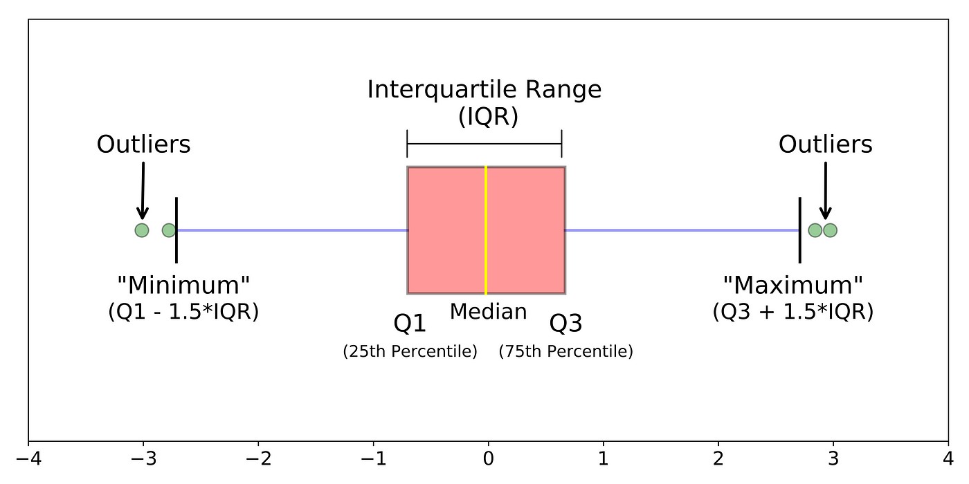
Before diving into comparisons, let’s review the key components of a box plot:
- Box: The rectangular box represents the interquartile range (IQR), containing the middle 50% of the data. The bottom edge of the box marks the first quartile (Q1), while the top edge represents the third quartile (Q3).
- Median Line: The line inside the box indicates the median (Q2), the middle value of the dataset. A median line closer to the bottom of the box suggests a right-skewed distribution and vice-versa.
- Whiskers: The lines extending from the box (whiskers) typically represent the range of the data, excluding outliers. Different conventions exist for whisker length; some extend to the minimum and maximum values, while others extend to 1.5 times the IQR from the box edges. Longer whiskers indicate greater variability in the data.
- Outliers: Data points that fall outside the whiskers are plotted as individual points and are considered potential outliers. Outliers can significantly influence statistical measures and should be investigated. Numerous outliers suggest a distribution significantly different from normal.
Comparing Distributions: A Step-by-Step Guide
Here’s how to compare distributions using box plots:
1. Compare Medians:
The median provides a measure of central tendency. Compare the positions of the median lines across different box plots. A higher median line indicates a generally higher set of values in that dataset. Significant differences in median positions suggest differing central tendencies between the datasets.
2. Compare IQRs:
The IQR represents the spread of the middle 50% of the data. Compare the heights of the boxes. A taller box indicates a larger IQR and greater variability within that dataset’s central values.
3. Compare Whiskers and Ranges:
Examine the lengths of the whiskers. Longer whiskers suggest a wider range of values and potentially greater variability across the full dataset. Compare the overall range, including outliers, to get a sense of the extreme values in each dataset.
4. Analyze Outliers:
Note the presence and location of outliers. A large number of outliers in one direction suggests a skewed distribution. Comparing the frequency and magnitude of outliers across box plots provides insights into the extreme values and potential differences in data distributions. If outliers are numerous, consider why and whether they need to be addressed with robust statistical methods.
5. Consider Skewness and Symmetry:
- Symmetry: If a box plot is symmetrical, the median line is in the center of the box, and the whiskers are approximately equal in length. This suggests a roughly symmetrical distribution of the data.
- Skewness: If the median line is closer to one end of the box and one whisker is noticeably longer than the other, the distribution is skewed. A right skew has a longer right whisker, and a left skew has a longer left whisker.
 Skewed Box Plots
Conclusion
By systematically comparing the medians, IQRs, whiskers, ranges, and outliers across different box plots, you can gain valuable insights into the similarities and differences between data distributions. This understanding can inform further statistical analysis and decision-making. Remember to consider the context of the data and the specific questions you are trying to answer when interpreting box plot comparisons.