Pivot tables are powerful tools in Excel that allow you to summarize, analyze, and compare large datasets quickly and efficiently. This guide will show you how to leverage pivot tables to compare data in various ways.
Understanding Pivot Table Basics
Before diving into comparisons, let’s quickly review the core components of a pivot table:
- Values Area: This section holds the data you want to analyze, typically numerical values that can be summarized. By default, Excel sums the values, but you can change this to other calculations like Count, Average, Max, Min, etc.
- Rows and Columns: These areas categorize your data. Dragging fields here creates groups and sub-groups, allowing you to view data from different perspectives.
- Filters: This area allows you to narrow down your data by selecting specific criteria.
Comparing Data with Summarization
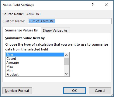
The default behavior of a pivot table is to summarize values by summing them. However, you can customize this:
-
Accessing Value Field Settings: Click the dropdown arrow next to a field name in the “Values” area and select “Value Field Settings.”
-
Changing Summarization Method: Under the “Summarize Values By” tab, choose a different calculation method like Average, Count, Max, Min, Product, etc. Excel will automatically update the field name to reflect the change (e.g., “Sum of Sales” becomes “Average of Sales”). You can customize this name as needed.
-
Number Formatting: In the “Value Field Settings” dialog box, you can also adjust the number format for the field under the “Number Format” tab. This allows you to display values as currency, percentages, decimals, etc.
Tip: Rename your pivot table fields after configuring summarization and number formatting to avoid unnecessary manual renaming. You can use Find & Replace (Ctrl+H) to quickly update multiple field names at once.
Comparing Data with Percentages
Pivot tables can display data as percentages of various totals:
-
Showing Values as Percentages: In the “Value Field Settings” dialog box, navigate to the “Show Values As” tab.
-
Percentage Options: Choose from options like “% of Grand Total,” “% of Row Total,” “% of Column Total,” or “% of Parent Row Total” to compare values relative to different parts of your data.
Comparing with Multiple Calculations
You can compare data using multiple calculations simultaneously:
-
Duplicate the Field: Drag the same field into the “Values” area twice.
-
Configure Each Instance: For each instance of the field, open the “Value Field Settings” and configure different summarization methods and/or “Show Values As” options. For example, you could have one instance showing the sum of sales and another showing sales as a percentage of the grand total.
Conclusion
Pivot tables offer a versatile way to compare data in Excel. By understanding how to manipulate summarization methods, utilize percentage views, and display multiple calculations, you can gain valuable insights from your data and make informed decisions. Experiment with different configurations to uncover the comparisons most relevant to your needs.