Comparing two pivot tables can unlock deeper insights in your data. At COMPARE.EDU.VN, we provide you with a comprehensive guide on “How To Compare 2 Pivot Tables” effectively. Learn techniques to compare data sets, analyze trends, and gain actionable intelligence, ensuring you make informed decisions with data comparison and pivot table analysis.
1. Understanding Pivot Tables for Comparison
Pivot tables are powerful tools in spreadsheet software like Microsoft Excel and Google Sheets that allow you to summarize and analyze large datasets. They enable you to extract meaningful insights by rearranging and aggregating data. When comparing two pivot tables, you are essentially comparing two different views or summaries of the same or related data.
1.1. What is a Pivot Table?
A pivot table is an interactive way to quickly summarize large amounts of data. You can use pivot tables to analyze numerical data in detail, and answer unanticipated questions about your data. Pivot tables are especially useful for data exploration, allowing you to quickly test different hypotheses.
1.2. Why Compare Pivot Tables?
Comparing pivot tables is essential for several reasons:
- Trend Analysis: Identify patterns and trends over time.
- Performance Evaluation: Compare different segments or categories.
- Variance Analysis: Understand the differences between actual and expected results.
- Data Validation: Ensure data consistency and accuracy.
1.3. Key Components of a Pivot Table
Before diving into the comparison, understanding the key components of a pivot table is crucial:
- Rows: Categories displayed along the left side of the table.
- Columns: Categories displayed across the top of the table.
- Values: Numerical data summarized in the center of the table.
- Filters: Criteria used to narrow down the data.
2. Preparing Data for Comparison
Before comparing pivot tables, ensure your data is clean, consistent, and properly structured. This preparation is essential for accurate and meaningful comparisons.
2.1. Data Cleaning
Data cleaning involves identifying and correcting errors, inconsistencies, and inaccuracies in your dataset. This includes:
- Removing Duplicates: Ensure each record is unique.
- Correcting Errors: Fix typos, incorrect values, and inconsistencies.
- Handling Missing Values: Decide how to deal with missing data (e.g., fill with zeros, averages, or exclude).
2.2. Data Structuring
Proper data structuring is crucial for pivot table analysis. Ensure your data is in a tabular format with clear column headers. Each column should represent a specific attribute, and each row should represent a unique record.
2.3. Data Consistency
Ensure consistency in data types and formats. For example, dates should be in a uniform format (e.g., YYYY-MM-DD), and numerical values should be consistent (e.g., currency symbols should be removed).
3. Basic Techniques for Comparing Pivot Tables
Several basic techniques can be used to compare pivot tables effectively. These methods involve creating and manipulating pivot tables to highlight differences and similarities.
3.1. Side-by-Side Comparison
One of the simplest ways to compare pivot tables is to place them side-by-side in your spreadsheet. This allows for a visual comparison of the data.
- Creating Pivot Tables: Create two pivot tables from your data, each summarizing different aspects or segments.
- Arranging Tables: Place the pivot tables next to each other for easy comparison.
- Visual Inspection: Manually compare the values, rows, and columns to identify differences and similarities.
3.2. Using Calculated Fields
Calculated fields allow you to create new fields within your pivot table based on existing fields. This is useful for calculating differences, percentages, and other metrics.
- Creating a Calculated Field: In Excel, go to
PivotTable Tools > Analyze > Fields, Items, & Sets > Calculated Field. - Defining the Formula: Enter a formula to calculate the difference between two fields (e.g.,
='Sales 2023' - 'Sales 2022'). - Analyzing Results: The calculated field will display the difference between the specified fields for each row.
3.3. Show Values As
The “Show Values As” feature in pivot tables allows you to display values in different ways, such as percentage of total, difference from, and more.
- Accessing Show Values As: Right-click on a value in the pivot table and select
Show Values As. - Choosing an Option: Select an option like
% of Grand TotalorDifference Fromto display values in a different format. - Interpreting Results: Analyze the values to understand the relationships and differences in your data.
3.4. Conditional Formatting
Conditional formatting allows you to highlight cells based on certain criteria. This is useful for visually identifying significant differences in your pivot tables.
- Applying Conditional Formatting: Select the values in your pivot table and go to
Home > Conditional Formatting. - Setting Rules: Create rules to highlight values that meet certain criteria (e.g., greater than, less than, between).
- Analyzing Highlights: Quickly identify significant differences based on the highlighted cells.
4. Advanced Techniques for Comparing Pivot Tables
For more in-depth analysis, advanced techniques can provide deeper insights into your data. These methods involve using formulas, slicers, and other features to enhance your comparison.
4.1. Using Formulas Outside the Pivot Table
You can use formulas outside the pivot table to compare values from different pivot tables. This allows for more complex calculations and comparisons.
- Referencing Pivot Table Cells: Use formulas to reference specific cells in your pivot tables (e.g.,
=PivotTable1!B5 - PivotTable2!B5). - Performing Calculations: Use the referenced values to perform calculations, such as calculating percentage differences or ratios.
- Analyzing Results: Analyze the results of your calculations to understand the relationships and differences in your data.
4.2. Slicers for Dynamic Filtering
Slicers provide a visual way to filter your pivot tables, allowing you to dynamically compare different segments of your data.
- Inserting Slicers: Select your pivot table and go to
PivotTable Tools > Analyze > Insert Slicer. - Selecting Fields: Choose the fields you want to use as slicers (e.g., Region, Product Category).
- Filtering Data: Use the slicers to filter your pivot tables and compare different segments of your data.
4.3. Timelines for Time-Based Comparisons
Timelines are a type of slicer specifically designed for date fields. They allow you to easily filter your pivot tables by time periods.
- Inserting Timelines: Select your pivot table and go to
PivotTable Tools > Analyze > Insert Timeline. - Selecting Date Fields: Choose the date field you want to use for the timeline.
- Filtering by Time: Use the timeline to filter your pivot tables by year, quarter, month, or day and compare data over time.
4.4. GetPivotData Function
The GETPIVOTDATA function allows you to retrieve data from a pivot table based on specific criteria. This is useful for creating custom reports and comparisons.
- Using GETPIVOTDATA: Enter the
GETPIVOTDATAfunction in a cell outside the pivot table. - Specifying Parameters: Specify the data field, pivot table, and criteria to retrieve the desired value (e.g.,
=GETPIVOTDATA("Sales", PivotTable1!A1, "Year", 2023, "Product", "A")). - Comparing Values: Use the retrieved values to perform calculations and comparisons.
4.5. Power Query for Data Consolidation
Power Query is a data transformation and preparation tool that allows you to consolidate data from multiple sources into a single table. This is useful for comparing data from different sources in a pivot table.
- Importing Data: Use Power Query to import data from different sources (e.g., Excel files, databases).
- Transforming Data: Clean and transform the data to ensure consistency.
- Loading Data: Load the consolidated data into a single table and create a pivot table for comparison.
5. Real-World Examples of Comparing Pivot Tables
To illustrate the practical applications of comparing pivot tables, let’s consider a few real-world examples.
5.1. Sales Performance Analysis
Comparing sales data across different regions, products, and time periods can provide valuable insights into sales performance.
- Scenario: A company wants to compare sales performance in 2023 versus 2022 across different regions and product categories.
- Pivot Table Setup: Create two pivot tables, one for 2023 and one for 2022. Use
RegionandProduct Categoryas rows, andSalesas values. - Comparison:
- Place the pivot tables side-by-side for visual comparison.
- Use calculated fields to calculate the difference in sales between 2023 and 2022.
- Use conditional formatting to highlight significant changes in sales.
- Insert slicers for
RegionandProduct Categoryto dynamically filter the data.
5.2. Budget vs. Actual Analysis
Comparing budget data against actual spending can help identify variances and areas where adjustments are needed.
- Scenario: A department wants to compare budgeted expenses against actual expenses for each month.
- Pivot Table Setup: Create two pivot tables, one for budgeted expenses and one for actual expenses. Use
Monthas rows andExpensesas values. - Comparison:
- Use calculated fields to calculate the variance between budgeted and actual expenses.
- Use conditional formatting to highlight months with significant variances.
- Use a timeline to filter the data by quarter or year.
5.3. Customer Satisfaction Analysis
Comparing customer satisfaction scores across different demographics and time periods can help identify areas for improvement.
- Scenario: A company wants to compare customer satisfaction scores in Q1 2023 versus Q1 2022 across different customer segments.
- Pivot Table Setup: Create two pivot tables, one for Q1 2023 and one for Q1 2022. Use
Customer Segmentas rows andSatisfaction Scoreas values. - Comparison:
- Use calculated fields to calculate the difference in satisfaction scores between Q1 2023 and Q1 2022.
- Use conditional formatting to highlight customer segments with significant changes in satisfaction scores.
- Insert slicers for
Customer Segmentto dynamically filter the data.
6. Tips and Best Practices
To maximize the effectiveness of your pivot table comparisons, consider the following tips and best practices.
6.1. Keep Pivot Tables Simple
Avoid overwhelming your audience with too much data. Focus on the key metrics and comparisons that are most relevant to your analysis.
6.2. Use Clear and Concise Labels
Use clear and concise labels for your rows, columns, and values. This will make it easier for your audience to understand your pivot tables.
6.3. Format Your Pivot Tables for Readability
Use formatting options to improve the readability of your pivot tables. This includes:
- Number Formatting: Use appropriate number formats (e.g., currency, percentage) to display values.
- Font Styles: Use different font styles (e.g., bold, italics) to emphasize key values.
- Color Coding: Use color coding to highlight significant differences.
6.4. Document Your Analysis
Document your analysis by adding comments and explanations to your pivot tables. This will help you and your audience understand the context and significance of your comparisons.
6.5. Regularly Update Your Data
Ensure your data is regularly updated to reflect the most current information. This will ensure your pivot table comparisons are accurate and relevant.
7. Common Mistakes to Avoid
When comparing pivot tables, there are several common mistakes to avoid.
7.1. Comparing Incompatible Data
Ensure the data you are comparing is compatible. For example, comparing sales data from different currencies without converting them to a common currency can lead to inaccurate results.
7.2. Ignoring Data Quality Issues
Ignoring data quality issues such as missing values, errors, and inconsistencies can lead to inaccurate comparisons. Always clean and validate your data before creating pivot tables.
7.3. Overcomplicating Pivot Tables
Overcomplicating your pivot tables with too many rows, columns, and filters can make them difficult to understand. Keep your pivot tables simple and focused on the key comparisons.
7.4. Misinterpreting Results
Misinterpreting the results of your pivot table comparisons can lead to incorrect conclusions. Always carefully analyze your results and consider the context of your data.
7.5. Neglecting Documentation
Neglecting to document your analysis can make it difficult to remember the purpose and methodology of your comparisons. Always document your analysis by adding comments and explanations to your pivot tables.
8. Advanced Pivot Table Features
To further enhance your pivot table comparisons, consider exploring these advanced features.
8.1. Power Pivot
Power Pivot is an Excel add-in that allows you to analyze large datasets from multiple sources. It provides advanced data modeling and analysis capabilities, making it ideal for complex pivot table comparisons.
- Importing Data: Use Power Pivot to import data from multiple sources (e.g., Excel files, databases).
- Creating Relationships: Create relationships between tables to link related data.
- Analyzing Data: Use Power Pivot to create pivot tables that analyze data from multiple tables.
8.2. DAX Formulas
DAX (Data Analysis Expressions) is a formula language used in Power Pivot and Power BI. It allows you to create custom calculations and aggregations in your pivot tables.
- Creating Measures: Use DAX to create measures that calculate custom metrics (e.g., sales growth, profit margin).
- Analyzing Data: Use the measures in your pivot tables to analyze your data in new ways.
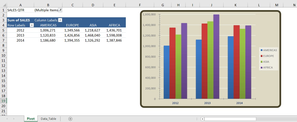
8.3. Pivot Charts
Pivot charts are visual representations of pivot table data. They allow you to easily visualize trends and patterns in your data.
- Creating Pivot Charts: Select your pivot table and go to
Insert > PivotChart. - Customizing Charts: Customize the chart type, axes, and labels to create a visual representation of your data.
- Analyzing Data: Use the pivot chart to analyze trends and patterns in your data.
8.4. Power BI Integration
Power BI is a business intelligence tool that allows you to create interactive dashboards and reports. You can integrate your Excel pivot tables with Power BI to create more advanced visualizations and analyses.
- Importing Data: Import your Excel data into Power BI.
- Creating Visualizations: Create visualizations (e.g., charts, maps, tables) to analyze your data.
- Sharing Dashboards: Share your dashboards with colleagues and stakeholders.
9. Case Studies
Let’s examine a few detailed case studies to illustrate the power of comparing pivot tables in different scenarios.
9.1. Retail Sales Analysis
A retail company wants to analyze sales data to identify top-performing products and regions, and understand trends over time.
- Data Source: Sales data from multiple stores, including product details, sales dates, and customer information.
- Pivot Table Setup:
- Create pivot tables to summarize sales by product, region, and month.
- Use calculated fields to calculate sales growth and profit margins.
- Use slicers to filter data by store, product category, and time period.
- Comparison:
- Compare sales performance across different regions and product categories.
- Identify top-performing products and regions.
- Analyze sales trends over time to identify seasonal patterns.
9.2. Healthcare Patient Analysis
A healthcare provider wants to analyze patient data to identify trends in patient demographics, treatment outcomes, and costs.
- Data Source: Patient data from multiple hospitals, including demographic information, treatment details, and cost data.
- Pivot Table Setup:
- Create pivot tables to summarize patient demographics, treatment outcomes, and costs by hospital and patient segment.
- Use calculated fields to calculate average treatment costs and success rates.
- Use slicers to filter data by hospital, patient segment, and time period.
- Comparison:
- Compare patient demographics and treatment outcomes across different hospitals.
- Identify trends in patient demographics and treatment outcomes.
- Analyze cost data to identify areas for cost reduction.
9.3. Manufacturing Production Analysis
A manufacturing company wants to analyze production data to identify bottlenecks, improve efficiency, and reduce costs.
- Data Source: Production data from multiple factories, including production volumes, defect rates, and costs.
- Pivot Table Setup:
- Create pivot tables to summarize production volumes, defect rates, and costs by factory and product line.
- Use calculated fields to calculate production efficiency and cost per unit.
- Use slicers to filter data by factory, product line, and time period.
- Comparison:
- Compare production volumes and defect rates across different factories.
- Identify bottlenecks in the production process.
- Analyze cost data to identify areas for cost reduction.
10. Frequently Asked Questions (FAQ)
Here are some frequently asked questions about comparing pivot tables.
10.1. How Do I Add a Year Column to My Pivot Table?
To add a Year column to your pivot table, ensure your data source has a date column. If it doesn’t, you may need to insert the dates manually. Then, add a new column adjacent to your data and label it “Year.” In the first cell of this new column, use a formula like =YEAR(date_cell) where date_cell is the cell reference containing the date. Drag this formula down to fill the rest of the cells in the column with the corresponding years.
Afterward, refresh your pivot table data source to include the newly added Year column. When you open the PivotTable Field List, you should now see the Year field available. You can then add this to the Rows or Columns area of your pivot table layout to start analyzing your data by year.
Remember, this Year column is crucial for performing year-over-year analysis, so having it in your pivot table setup is essential.
10.2. Can Pivot Tables Calculate Percentage Differences Automatically?
Absolutely, pivot tables can automatically calculate percentage differences without you needing to do the math. Once you have your pivot table set up, you can use the “Show Values As” feature to compare two periods. For example, to show the percent difference in sales between two years, you would:
- Add your Sales data to the Values area of the pivot table twice.
- Right-click on the second instance of your Sales data in the pivot table.
- Choose “Show Values As” then select “% Difference From.”
- In the dialog box that appears, select the base field, such as the Year, and choose the specific year or “(previous)” to compare against the previous period.
Your pivot table will now display the percentage differences for you. This is particularly useful for analyzing trends over time, giving you a clear view of growth or decline.
10.3. How Can I Compare Pivot Tables from Different Excel Files?
To compare pivot tables from different Excel files, you can use the following methods:
- Copy and Paste: Copy the pivot tables from one Excel file to another and place them side-by-side for comparison.
- Link Pivot Tables: Use formulas to link cells in one pivot table to cells in another pivot table. This allows you to perform calculations and comparisons across different files.
- Power Query: Use Power Query to import data from multiple Excel files into a single table and create a pivot table for comparison.
10.4. What is the Best Way to Compare Pivot Tables for Trend Analysis?
The best way to compare pivot tables for trend analysis is to use timelines, calculated fields, and conditional formatting. Timelines allow you to filter your data by time period, calculated fields allow you to calculate changes over time, and conditional formatting allows you to highlight significant trends.
10.5. Can I Use Pivot Tables to Compare Data from Different Sources?
Yes, you can use pivot tables to compare data from different sources by using Power Query to consolidate the data into a single table. Power Query allows you to import data from multiple sources, clean and transform the data, and load it into a single table for pivot table analysis.
10.6. How Do I Update a Pivot Table When the Data Source Changes?
To update a pivot table when the data source changes, simply select the pivot table and go to PivotTable Tools > Analyze > Refresh. This will update the pivot table with the latest data from the data source.
10.7. What Are the Benefits of Using Slicers in Pivot Table Comparisons?
Slicers provide a visual way to filter your pivot tables, allowing you to dynamically compare different segments of your data. They make it easier to explore your data and identify key trends and patterns.
10.8. How Can I Improve the Readability of My Pivot Tables?
To improve the readability of your pivot tables, use clear and concise labels, appropriate number formats, different font styles, and color coding to highlight significant differences.
10.9. What Should I Do If My Pivot Table is Too Large and Slow?
If your pivot table is too large and slow, try the following:
- Filter Your Data: Use filters to reduce the amount of data being analyzed.
- Use Calculated Fields Sparingly: Calculated fields can slow down pivot tables. Use them only when necessary.
- Use Power Pivot: Power Pivot is designed for analyzing large datasets and can improve the performance of your pivot tables.
10.10. Where Can I Find More Resources on Comparing Pivot Tables?
You can find more resources on comparing pivot tables on websites like COMPARE.EDU.VN, which offers detailed guides and tutorials on pivot table analysis. Additionally, Microsoft’s official documentation and various Excel forums can provide valuable insights and solutions to common issues.
11. Conclusion
Comparing pivot tables is a powerful technique for analyzing data and gaining insights. By following the techniques and best practices outlined in this guide, you can effectively compare pivot tables to identify trends, evaluate performance, and make informed decisions. Whether you are analyzing sales data, budget data, or customer satisfaction data, pivot tables can help you unlock the hidden potential of your data.
Ready to take your data analysis skills to the next level? Visit COMPARE.EDU.VN today to discover more insightful guides and resources on data comparison and analysis. Let us help you make smarter, data-driven decisions. For further assistance, contact us at 333 Comparison Plaza, Choice City, CA 90210, United States, Whatsapp: +1 (626) 555-9090, or visit our website compare.edu.vn.