Bar graphs are a powerful visualization tool for comparing data across different categories. They allow you to quickly identify trends, spot outliers, and understand the relationships between different groups. This article explores how bar graphs achieve this, examining their structure and providing real-world examples.
A bar chart effectively illustrates pageviews over a six-month period, highlighting a peak in June and July.
Deconstructing the Bar Graph: Key Components for Comparison
A bar graph consists of two primary axes: a horizontal (x-axis) representing categorical variables (distinct groups or labels) and a vertical (y-axis) representing numerical values. The length of each bar corresponds to the value of the specific category it represents, facilitating direct visual comparison. Categories can be anything from types of products, geographical locations, or time periods.
Visualizing Differences: How Bar Graphs Make Comparisons Clear
The core strength of a bar graph lies in its ability to visually represent differences in data. By placing bars side-by-side, you can instantly compare the values of different categories. Longer bars indicate higher values, making it easy to identify the largest and smallest values within the dataset. This clear visual representation allows for rapid understanding and insights without needing complex calculations.
Beyond Simple Counts: Using Bar Graphs for Complex Comparisons
While often used for simple frequency counts (like counting the number of items in each category), bar graphs can also handle more complex comparisons. They can display:
- Averages: The height of each bar can represent the average value of a numeric variable within each category. For example, comparing the average salary across different professions.
- Totals: Each bar can represent the sum of values within a category, allowing comparison of total sales across different regions.
- Other Summary Statistics: Bar graphs can display various metrics like medians, percentiles, or standard deviations, providing a deeper understanding of data distribution within each category.
This bar chart compares the average transaction amount across different payment methods, revealing that checks have the highest average transaction value.
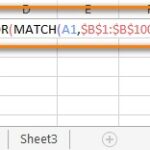
From Data Table to Visual Insight: How Data is Used in Bar Graphs
Data used to create bar graphs is often organized in a table with two columns: one listing the categories and the other containing the corresponding numerical values. Software tools can automatically aggregate and visualize this data, transforming raw numbers into easily understandable visual comparisons.
Raw data, as shown in this table snippet, can be used to generate bar graphs. The visualization tool aggregates the data by payment type and calculates the average transaction value for each.
Conclusion: The Power of Visual Comparison with Bar Graphs
Bar graphs are an essential tool for data analysis and communication, making complex data accessible and understandable. Their ability to visually represent differences between categories enables quick identification of trends, patterns, and key insights, empowering informed decision-making. Whether comparing simple counts or complex summary statistics, bar graphs provide a clear and concise way to understand data relationships.