Greenland, a land of immense glaciers and stark beauty, holds a significant place in our world, especially concerning climate change and rising sea levels. It’s home to the second-largest ice body on Earth, the Greenland Ice Sheet, a crucial contributor to global sea-level rise. Despite its global importance and being the world’s largest island, Greenland often appears much larger than it actually is on common world maps. This size distortion raises a fundamental question: Just how big is Greenland, especially when we compare it to a familiar landmass like the United States?
To grasp the true dimensions of Greenland, simply stating its area of approximately 2 million square kilometers might not be relatable. Fortunately, tools like The True Size web application offer a fantastic way to visualize and compare the real sizes of countries and regions across the globe.
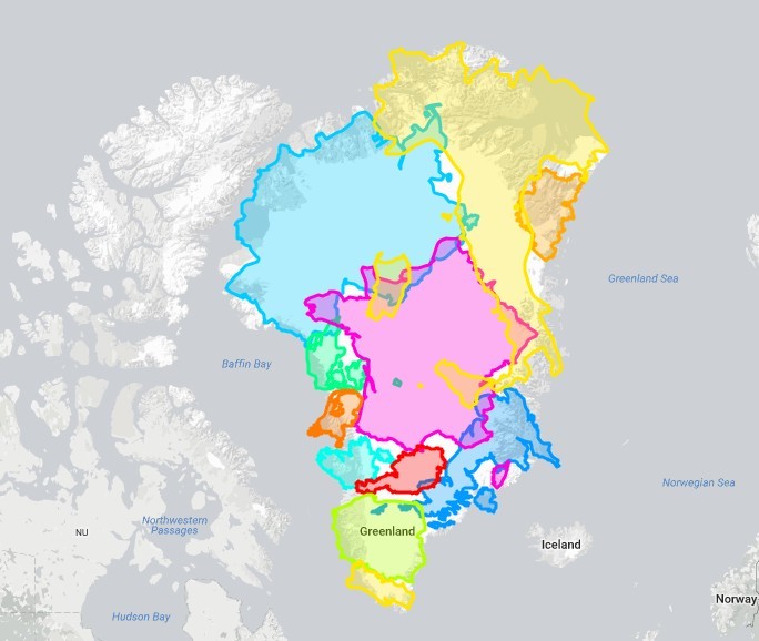
As illustrated in Figure 1, Greenland, while substantial, is only marginally larger than a combination of numerous European countries including Austria, Belgium, Denmark, France, Germany, Ireland, Italy, Poland, Portugal, the Netherlands, and the United Kingdom combined.
Further comparisons, as shown in Figure 3, put Greenland’s size into even clearer perspective:
- It is roughly equivalent in size to the Democratic Republic of Congo.
- Greenland could fit into India about 1.4 times.
- Crucially, Greenland is approximately 4.2 times smaller than the United States.
- Australia is about 3.5 times larger than Greenland.
Therefore, while Greenland is undeniably large, its size is often exaggerated in our minds and on many world maps. This leads to the question: Why do popular world maps distort the actual sizes of countries, particularly making Greenland appear so vast?
The Map Distortion Dilemma: Why Greenland Looks Bigger
The issue stems from the fundamental challenge of cartography: representing a spherical Earth on a flat map. This process, known as map projection, inevitably introduces distortions. Different map projections prioritize different properties; some preserve shapes (conformal projections) while distorting areas, and others preserve areas (equal-area projections) at the cost of shape accuracy. No single map projection can perfectly represent all aspects of the Earth simultaneously.
The widely used Mercator projection, depicted in Figure 2, is a cylindrical projection where the Earth is projected onto a cylinder. This cylinder is then unrolled to create a flat map. Mercator maps excel at preserving angles and shapes, which is why they are invaluable for navigation. However, this projection significantly distorts areas, especially at higher latitudes, causing landmasses like Greenland and Antarctica to appear disproportionately large.
Figure 4 illustrates the Mercator cylindrical projection process, where you can visualize how projecting the spherical Earth onto a cylinder leads to stretching at the poles.
Mercator’s Enduring Popularity: Utility over True Size
If the Mercator projection distorts the size of Greenland and other regions, why is it so prevalent, especially in online mapping services like Google Maps? The answer lies in its utility for local navigation and mapping. Mercator projection’s strength in preserving angles means that directions and shapes are accurately represented locally. For street-level navigation and city maps, maintaining correct angles is crucial – perpendicular streets will indeed appear perpendicular on a Mercator map. This accuracy at local scales outweighs the area distortions for many everyday applications of online maps.
In conclusion, Greenland is a large island, but significantly smaller than commonly perceived due to map projections like Mercator. When compared to the United States, Greenland is about 4.2 times smaller. While Mercator maps distort area for regions like Greenland, their angle and shape preservation makes them highly useful for navigation and local-scale mapping. Understanding map projections helps us appreciate that all maps are representations with inherent distortions, and the “best” map depends on its intended purpose.