Have you ever looked at a world map and wondered about the real size of countries? Maps, as essential as they are, can sometimes be deceiving. Greenland, often appearing vast and imposing, is a prime example of this cartographic illusion. While Greenland is indeed the world’s largest island and a significant landmass, especially concerning its massive ice sheet and contribution to sea-level rise, its size is often misrepresented on common world maps. Let’s delve into the true dimensions of Greenland and compare its size, particularly in relation to the United States, to understand its real geographic scale.
The Map Projection Deception: Why Greenland Looks Larger Than It Is
The reason behind this size distortion lies in map projections, specifically the Mercator projection, which is widely used in online mapping applications and traditional world maps. To represent the spherical Earth on a flat surface, mapmakers employ projections, each with its own set of distortions. The Mercator projection, while excellent for navigation because it preserves angles and shapes locally, significantly distorts areas, especially as you move towards the poles.
In a Mercator projection, Greenland, situated at high latitudes, gets stretched out disproportionately. This stretching effect leads to a visual misrepresentation, making Greenland appear much larger than it actually is compared to countries located closer to the equator. This is why on many maps, Greenland can look as big as or even bigger than Africa or South America, which is far from the truth.
Unveiling Greenland’s True Size: Comparisons That Matter
So, how big is Greenland in reality? While it covers approximately 2 million square kilometers (around 836,000 square miles), this number might be hard to grasp without context. Visual comparisons are much more effective in understanding scale.
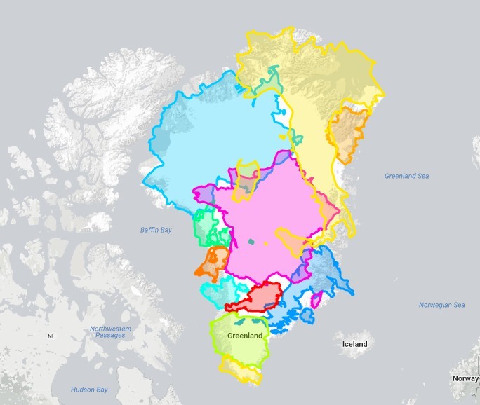
As illustrated in Figure 1 from TheTrueSize.com, Greenland, when accurately scaled and moved to lower latitudes, is only slightly larger than a combination of several European countries. Imagine Austria, Belgium, Denmark, France, Germany, Ireland, Italy, Poland, Portugal, the Netherlands, and the United Kingdom combined – Greenland is just a bit bigger than all of them put together.
To bring this comparison closer to home for a US audience, Figure 3 provides a more relatable perspective. Greenland, despite its apparent enormity on standard maps, is significantly smaller than the United States. In fact, you could fit Greenland into the United States more than four times (approximately 4.2 times).
Furthermore, consider these comparisons:
- Greenland is roughly the same size as the Democratic Republic of Congo in Africa.
- India, a vast and populous country, is about 1.4 times larger than Greenland.
- Australia, another geographically expansive nation, is approximately 3.5 times larger than Greenland.
These comparisons highlight that while Greenland is indeed a large island, its size is often exaggerated due to the distortions inherent in common map projections like Mercator.
Why Mercator Persists: Utility Over Absolute Accuracy
If the Mercator projection distorts sizes so significantly, why is it still so prevalent, especially in online tools like Google Maps? The answer lies in its utility for specific purposes. The Mercator projection excels at preserving local shapes and angles. This is crucial for navigation and for applications where maintaining the correct orientation and shape of smaller areas is paramount.
For city-level mapping and directions, the Mercator projection ensures that streets that are perpendicular in reality appear perpendicular on the map. This local accuracy is more important for everyday use in online maps than the accurate representation of global areas. While area-preserving projections exist, they often distort shapes, which can be less intuitive for local navigation.
Conclusion: Seeing Greenland in True Perspective
Greenland, a land of immense ice sheets and critical importance in our climate system, is often misrepresented in terms of size due to the widespread use of the Mercator projection. By comparing Greenland’s area to familiar entities like the United States and European countries, we gain a more accurate understanding of its true geographic dimensions. While maps are essential tools, it’s crucial to remember that all map projections involve some form of distortion. Understanding these distortions allows us to interpret geographic information more accurately and appreciate the world in its true proportions. Tools like TheTrueSize.com are invaluable resources for visualizing and comparing the real sizes of countries, helping to dispel cartographic myths and promote a more accurate global perspective.