Pivot tables are powerful tools for data analysis, and this guide from COMPARE.EDU.VN provides comprehensive steps on How To Use Pivot Tables To Compare Data effectively, enabling informed decision-making. By leveraging the summarization and display options within pivot tables, you can efficiently analyze datasets, calculate relevant metrics, and present information in a clear, comparative format. Learn how to use them for insightful data comparison, aiding strategic decisions and performance evaluation.
1. Understanding Pivot Tables for Data Comparison
1.1. What is a Pivot Table?
A pivot table is a data summarization tool found in data visualization programs such as spreadsheets or business intelligence software. Pivot tables can automatically sort, count, total, or average the data stored in one table or spreadsheet. They display the results in a second table (the “pivot table”) showing the summarized data. Pivot tables are especially useful for quickly analyzing and comparing large amounts of data.
1.2. Key Components of a Pivot Table
Understanding the key components is crucial to effectively use pivot tables to compare data. These components include:
- Rows: These are the categories that you want to compare against each other.
- Columns: These are the attributes or metrics that you want to measure for each row.
- Values: This is the data that will be summarized in the table. It can be a sum, average, count, or any other aggregate function.
- Filters: These allow you to narrow down the data that is displayed in the table, focusing on specific subsets for comparison.
1.3. Why Use Pivot Tables for Data Comparison?
Pivot tables offer several advantages for data comparison:
- Efficiency: Quickly summarize and analyze large datasets.
- Flexibility: Easily rearrange and modify the table to explore different perspectives.
- Insightful Analysis: Facilitate identifying trends, patterns, and outliers.
- Customization: Tailor the table to focus on specific comparisons of interest.
- Real-Time Updates: Reflect changes in the source data instantly.
2. Preparing Your Data for Pivot Table Analysis
2.1. Data Structure Requirements
To effectively use pivot tables to compare data, ensure your data is structured properly:
- Column Headers: Each column should have a clear and descriptive header.
- Consistent Data Types: Ensure that each column contains consistent data types (e.g., numbers, text, dates).
- No Empty Rows or Columns: Remove any empty rows or columns to avoid errors.
- Avoid Merged Cells: Merged cells can cause issues with pivot table functionality.
- Table Format: Convert your data range into an Excel table for easier management.
2.2. Cleaning and Formatting Your Data
Cleaning and formatting your data is crucial before creating a pivot table:
- Remove Duplicates: Identify and remove any duplicate records.
- Correct Errors: Fix any typos or inconsistencies in the data.
- Standardize Formats: Ensure dates, numbers, and text are formatted consistently.
- Handle Missing Values: Decide how to handle missing values (e.g., replace with 0, average, or leave blank).
- Trim Whitespace: Remove leading or trailing whitespace from text fields.
2.3. Data Validation Techniques
Implementing data validation can help maintain data quality:
- Data Validation Rules: Set up rules to restrict the type of data that can be entered into a cell.
- Drop-Down Lists: Use drop-down lists to ensure consistent data entry for specific columns.
- Error Alerts: Configure error alerts to notify users of invalid data entries.
- Input Messages: Provide clear instructions for data entry to minimize errors.
- Conditional Formatting: Highlight cells that violate data validation rules.
3. Creating Your First Pivot Table
3.1. Selecting Your Data Source
To start creating a pivot table, select your data source:
- Select Data: Choose the range of cells or the Excel table that contains your data.
- Insert PivotTable: Go to the “Insert” tab on the Excel ribbon and click “PivotTable.”
- Choose Location: In the “Create PivotTable” dialog box, specify where you want to place the pivot table (e.g., a new worksheet or an existing worksheet).
- Confirm Selection: Click “OK” to create the pivot table.
3.2. Designing the Pivot Table Layout
Design the layout by dragging fields to different areas:
- Rows Area: Drag the field that you want to use as row labels.
- Columns Area: Drag the field that you want to use as column labels.
- Values Area: Drag the field that contains the data you want to summarize (e.g., sales, quantity, expenses).
- Filters Area: Drag the field that you want to use as a filter.
3.3. Understanding the PivotTable Fields Pane
The PivotTable Fields pane is where you manage your data fields:
- Choose Fields: Select the fields that you want to include in the pivot table.
- Rearrange Fields: Drag and drop fields between the Rows, Columns, Values, and Filters areas.
- Field Settings: Click on a field to access its settings, where you can change the summary function, number format, and more.
- Search Fields: Use the search bar to quickly find fields in large datasets.
- Refresh: Click the refresh button to update the pivot table with the latest data from the source.
4. Basic Data Comparison Techniques with Pivot Tables
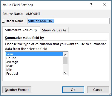
4.1. Summarizing Data with Sum, Average, Count, and More
Pivot tables offer various summary functions:
- Sum: Calculates the total value of the selected field.
- Average: Calculates the average value of the selected field.
- Count: Counts the number of items in the selected field.
- Max: Finds the maximum value in the selected field.
- Min: Finds the minimum value in the selected field.
To change the summary function:
- Value Field Settings: Click on the field in the Values area.
- Summarize Values By: Select the desired summary function (e.g., Sum, Average, Count).
- Number Format: Adjust the number format as needed.
4.2. Grouping Data for Meaningful Comparisons
Grouping data allows for more meaningful comparisons:
- Group by Date: Group dates by day, week, month, quarter, or year.
- Group by Numbers: Group numerical data into ranges (e.g., 0-100, 101-200).
- Group by Text: Group text data into categories (e.g., product types, customer segments).
To group data:
- Right-Click: Right-click on a cell in the row or column that you want to group.
- Group: Select “Group” from the context menu.
- Define Grouping: Specify the grouping parameters (e.g., starting value, ending value, interval).
4.3. Filtering Data to Focus on Specific Segments
Filtering data helps focus on specific segments for comparison:
- Filter by Value: Filter data based on specific values in a field.
- Filter by Date: Filter data based on a date range.
- Filter by Top/Bottom Values: Filter data to show only the top or bottom N values.
To filter data:
- Click Filter Arrow: Click the filter arrow next to the field in the PivotTable Fields pane.
- Select Filter Criteria: Choose the filter criteria (e.g., specific values, date range, top 10).
- Apply Filter: Click “OK” to apply the filter.
5. Advanced Pivot Table Techniques for Enhanced Comparison
5.1. Calculated Fields and Items
Calculated fields and items allow you to create new metrics based on existing data:
- Calculated Fields: Create new columns in the pivot table based on formulas.
- Calculated Items: Create new row or column labels based on formulas.
To create a calculated field:
- Analyze Tab: Go to the “Analyze” tab on the Excel ribbon.
- Fields, Items, & Sets: Click “Fields, Items, & Sets” and select “Calculated Field.”
- Enter Formula: Enter the formula for the calculated field (e.g.,
=[Sales]-[Cost]). - Add Field: Click “Add” to add the calculated field to the pivot table.
5.2. Using Slicers and Timelines for Interactive Filtering
Slicers and timelines provide interactive filtering:
- Slicers: Visual filters that allow you to quickly filter data by clicking buttons.
- Timelines: Visual filters that allow you to filter data by date ranges.
To insert a slicer:
- Analyze Tab: Go to the “Analyze” tab on the Excel ribbon.
- Insert Slicer: Click “Insert Slicer.”
- Choose Field: Select the field that you want to use as a slicer.
- Position Slicer: Position the slicer on the worksheet and click buttons to filter the data.
To insert a timeline:
- Analyze Tab: Go to the “Analyze” tab on the Excel ribbon.
- Insert Timeline: Click “Insert Timeline.”
- Choose Date Field: Select the date field that you want to use as a timeline.
- Position Timeline: Position the timeline on the worksheet and drag the handles to filter the data.
5.3. Displaying Values as Percentages, Differences, and Ratios
Displaying values in different formats can enhance comparison:
- % of Grand Total: Display values as a percentage of the grand total.
- % of Row Total: Display values as a percentage of the row total.
- % of Column Total: Display values as a percentage of the column total.
- Difference From: Display the difference between values and a base value.
- % Difference From: Display the percentage difference between values and a base value.
- Running Total In: Display a running total of values.
- Rank Smallest to Largest: Display the rank of values from smallest to largest.
- Index: Display an index value based on the selected fields.
To change the display format:
- Value Field Settings: Click on the field in the Values area.
- Show Values As: Select the desired display format (e.g., % of Grand Total, Difference From).
- Base Field: Specify the base field for comparison (if applicable).
6. Visualizing Pivot Table Data with Charts
6.1. Creating Pivot Charts for Visual Comparison
Pivot charts provide visual representations of pivot table data:
- Select Pivot Table: Select the pivot table.
- Analyze Tab: Go to the “Analyze” tab on the Excel ribbon.
- PivotChart: Click “PivotChart.”
- Choose Chart Type: Select the desired chart type (e.g., column, bar, line, pie).
- Customize Chart: Customize the chart elements (e.g., title, labels, axes) to enhance clarity.
6.2. Chart Types Best Suited for Different Comparisons
Choosing the right chart type is crucial:
- Column Chart: Compares values across different categories.
- Bar Chart: Compares values across different categories (horizontal).
- Line Chart: Shows trends over time or across a series of values.
- Pie Chart: Shows the proportion of each category to the total.
- Scatter Plot: Shows the relationship between two variables.
6.3. Customizing Chart Elements for Clarity
Customize chart elements to enhance clarity:
- Chart Title: Add a clear and descriptive chart title.
- Axis Labels: Label the axes with clear and concise descriptions.
- Data Labels: Add data labels to show the exact values for each data point.
- Legend: Include a legend to identify the different categories.
- Gridlines: Add gridlines to make it easier to read the chart.
7. Real-World Examples of Using Pivot Tables for Data Comparison
7.1. Sales Performance Analysis
Compare sales performance across different regions, products, and time periods. For example, COMPARE.EDU.VN can help you determine which regions are performing best, which products are selling the most, and how sales are trending over time.
7.2. Marketing Campaign Effectiveness
Evaluate the effectiveness of marketing campaigns by comparing metrics such as impressions, clicks, conversions, and cost per acquisition.
7.3. Customer Satisfaction Analysis
Analyze customer satisfaction scores by segmenting data based on demographics, product usage, and customer service interactions.
8. Tips and Tricks for Efficient Pivot Table Use
8.1. Keyboard Shortcuts for Faster Navigation
Use keyboard shortcuts for faster navigation:
- Alt + D + P: Create a pivot table.
- Ctrl + Shift + *: Select the entire data range.
- Alt + N + V: Insert a pivot table.
- Alt + J + T + R: Refresh the pivot table.
8.2. Using the GetPivotData Function
The GetPivotData function retrieves data from a pivot table:
=GETPIVOTDATA("Sales",A3,"Region","North","Product","Widget")This formula retrieves the sales value for the North region and the Widget product.
8.3. Refreshing Pivot Tables to Reflect Updated Data
To refresh a pivot table:
- Right-Click: Right-click on the pivot table.
- Refresh: Select “Refresh” from the context menu.
Alternatively, you can go to the “Data” tab on the Excel ribbon and click “Refresh All.”
9. Common Mistakes to Avoid When Using Pivot Tables
9.1. Incorrect Data Types
Ensure that data types are consistent:
- Numbers: Use number format for numerical data.
- Dates: Use date format for date data.
- Text: Use text format for text data.
9.2. Missing or Inconsistent Data
Handle missing or inconsistent data appropriately:
- Replace Missing Values: Replace missing values with 0, average, or leave blank.
- Standardize Data: Standardize data formats to ensure consistency.
9.3. Overcomplicating the Pivot Table
Keep the pivot table simple and focused:
- Focus on Key Metrics: Include only the key metrics that are relevant to your analysis.
- Avoid Overfiltering: Avoid overfiltering the data, which can lead to misleading results.
- Use Clear Labels: Use clear and concise labels for rows, columns, and values.
10. Advanced Analysis Techniques
10.1. Performing Cohort Analysis
Cohort analysis helps you understand how customer behavior changes over time:
- Create Cohorts: Group customers based on when they joined (e.g., month of acquisition).
- Track Behavior: Track their behavior over time (e.g., retention rate, purchase frequency).
- Compare Cohorts: Compare the behavior of different cohorts to identify trends and patterns.
10.2. Conducting Variance Analysis
Variance analysis helps you compare actual results to budgeted or expected results:
- Create Baseline: Establish a baseline (e.g., budget, forecast).
- Track Actuals: Track the actual results.
- Calculate Variance: Calculate the difference between the actuals and the baseline.
- Analyze Variance: Analyze the variance to identify areas of concern and opportunities for improvement.
10.3. Implementing What-If Analysis
What-if analysis helps you evaluate different scenarios:
- Identify Key Drivers: Identify the key drivers of your business (e.g., sales price, cost of goods sold).
- Create Scenarios: Create different scenarios by changing the values of the key drivers.
- Analyze Results: Analyze the results of each scenario to understand the potential impact on your business.
11. Integrating Pivot Tables with Other Tools
11.1. Connecting Pivot Tables to External Data Sources
Connect pivot tables to external data sources:
- Data Tab: Go to the “Data” tab on the Excel ribbon.
- Get External Data: Click “Get External Data” and select the data source (e.g., SQL Server, Access, text file).
- Connect to Data: Follow the prompts to connect to the data source.
- Create Pivot Table: Create a pivot table based on the external data.
11.2. Using Power Query for Data Transformation
Use Power Query for data transformation:
- Data Tab: Go to the “Data” tab on the Excel ribbon.
- Get & Transform Data: Click “Get & Transform Data” and select the data source.
- Edit Query: Click “Edit” to open the Power Query Editor.
- Transform Data: Transform the data as needed (e.g., remove columns, filter rows, change data types).
- Load Data: Load the transformed data into a pivot table.
11.3. Combining Pivot Tables with Power BI for Advanced Visualization
Combine pivot tables with Power BI for advanced visualization:
- Import Data: Import the data into Power BI.
- Create Pivot Tables: Create pivot tables in Power BI.
- Create Visualizations: Create advanced visualizations using Power BI’s charting tools.
- Share Reports: Share your reports with others through Power BI’s sharing features.
12. Best Practices for Presenting Pivot Table Data
12.1. Creating Clear and Concise Reports
Create clear and concise reports:
- Focus on Key Findings: Highlight the key findings in your report.
- Use Visualizations: Use visualizations to illustrate your findings.
- Provide Context: Provide context for your findings by explaining the data and the analysis.
- Keep it Simple: Keep your report simple and easy to understand.
12.2. Using Color and Formatting to Highlight Key Insights
Use color and formatting to highlight key insights:
- Use Color Sparingly: Use color sparingly to highlight the most important data points.
- Use Consistent Formatting: Use consistent formatting throughout your report.
- Use Conditional Formatting: Use conditional formatting to highlight data that meets certain criteria.
12.3. Telling a Story with Your Data
Tell a story with your data:
- Start with a Question: Start with a question that you want to answer.
- Gather Data: Gather the data that you need to answer the question.
- Analyze Data: Analyze the data to identify trends and patterns.
- Draw Conclusions: Draw conclusions based on your analysis.
- Present Findings: Present your findings in a clear and concise manner.
13. Pivot Table Limitations and Alternatives
13.1. Understanding the Limitations of Pivot Tables
Limitations of pivot tables include:
- Data Size: Pivot tables can be slow to process large datasets.
- Complexity: Complex pivot tables can be difficult to create and understand.
- Flexibility: Pivot tables are not as flexible as some other data analysis tools.
13.2. Exploring Alternatives Like SQL, R, and Python
Alternatives to pivot tables include:
- SQL: Use SQL to query and analyze data in databases.
- R: Use R for statistical analysis and data visualization.
- Python: Use Python with libraries like Pandas and Matplotlib for data analysis and visualization.
13.3. When to Use Pivot Tables vs. Other Tools
Use pivot tables when:
- You need to quickly summarize and analyze data.
- You need to create interactive reports.
- You are working with relatively small datasets.
Use other tools when:
- You need to analyze very large datasets.
- You need to perform complex statistical analysis.
- You need more flexibility in your data analysis.
14. Pivot Table FAQs
14.1. How do I handle errors in my pivot table?
Check for data inconsistencies, ensure correct data types, and use the IFERROR function to handle errors.
14.2. Can I use pivot tables with multiple data sources?
Yes, you can use Power Query to combine data from multiple sources before creating a pivot table.
14.3. How do I update my pivot table with new data?
Right-click on the pivot table and select “Refresh” or go to the “Data” tab and click “Refresh All.”
14.4. What is the best way to group dates in a pivot table?
Right-click on a date field and select “Group” to group dates by day, week, month, quarter, or year.
14.5. How can I calculate the difference between two values in a pivot table?
Use calculated fields to create a new field that calculates the difference between two existing fields.
14.6. Can I use pivot tables to create dashboards?
Yes, you can use pivot tables and pivot charts to create interactive dashboards.
14.7. What are slicers and how do I use them?
Slicers are visual filters that allow you to quickly filter data by clicking buttons. Go to the “Analyze” tab and click “Insert Slicer” to add them.
14.8. How do I display values as percentages in a pivot table?
Click on the field in the Values area, select “Value Field Settings,” and then choose the desired display format (e.g., % of Grand Total).
14.9. What are calculated items and when should I use them?
Calculated items are new row or column labels based on formulas, useful for creating new categories or groupings.
14.10. How do I remove blank rows or columns in my pivot table?
Filter out blank values in the row or column labels or adjust the source data to remove blank rows and columns.
15. Conclusion
Mastering pivot tables is essential for effective data comparison and analysis. By understanding the fundamentals, employing advanced techniques, and avoiding common pitfalls, you can unlock the full potential of pivot tables for informed decision-making. Visit COMPARE.EDU.VN for more insights and resources to enhance your data analysis skills. Leverage pivot tables to gain deeper insights, identify trends, and make data-driven decisions.
Are you struggling to compare different products, services, or ideas? Do you find it challenging to make informed decisions based on available data? At COMPARE.EDU.VN, we provide detailed and objective comparisons to help you make the right choices. Whether you’re evaluating different universities, comparing product features, or analyzing marketing strategies, our comprehensive comparisons offer the insights you need. Visit compare.edu.vn today and make smarter, data-driven decisions. For further assistance, contact us at 333 Comparison Plaza, Choice City, CA 90210, United States, or via WhatsApp at +1 (626) 555-9090. We are here to help you compare and choose with confidence.