Comparative bar graphs in Excel offer a powerful visual tool for analyzing and presenting data. COMPARE.EDU.VN provides comprehensive guidance on creating impactful charts that highlight key differences between datasets, leading to better informed decisions. Learn how to effortlessly construct comparative bar graphs to showcase your data effectively and gain valuable insights. Discover the best data visualization techniques for your needs.
1. Understanding Comparative Bar Graphs
1.1 What is a Comparative Bar Graph?
A comparative bar graph, also known as a multiple bar graph, is a visual representation that uses parallel bars to compare different categories or groups of data. Each set of bars represents a specific category, and the length of the bars corresponds to the magnitude of the data for that category. This type of graph is particularly useful for highlighting differences and similarities between various data points, making it easier to identify trends, patterns, and outliers.
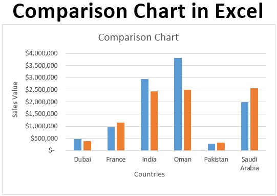 Comparative Bar Graph Example
Comparative bar graphs are widely used across various fields, including business, finance, education, and science, to analyze and present complex data in a clear and concise manner.
1.2 Key Components of a Comparative Bar Graph
To effectively interpret and create comparative bar graphs, it is crucial to understand their key components:
- Categories (X-axis): Represent the different groups or items being compared.
- Values (Y-axis): Indicate the numerical data associated with each category.
- Bars: Visual representations of the data values, with the length of each bar proportional to the corresponding value.
- Legend: Explains what each color or pattern represents if multiple data series are displayed.
- Title: Provides a clear and concise description of the graph’s purpose.
- Axis Labels: Label the X and Y axes to indicate the categories and values being measured.
1.3 Benefits of Using Comparative Bar Graphs
Comparative bar graphs offer numerous advantages in data analysis and presentation:
- Easy Comparison: Facilitate quick and straightforward comparison of data across different categories.
- Visual Clarity: Present data in a visually appealing and easily understandable format.
- Trend Identification: Help identify trends, patterns, and outliers in data sets.
- Data Storytelling: Enable effective communication of data-driven insights and narratives.
- Decision Making: Support informed decision-making by providing a clear overview of key data points.
By leveraging the benefits of comparative bar graphs, you can effectively analyze and communicate your data, leading to better understanding and more informed decisions.
2. Preparing Your Data in Excel
2.1 Structuring Your Data for a Comparative Bar Graph
Before creating a comparative bar graph in Excel, it’s essential to structure your data properly. This involves organizing your data into columns and rows that Excel can easily interpret.
- Column 1: Categories (e.g., Product Names, Regions, Years)
- Column 2, 3, etc.: Data Series (e.g., Sales for 2022, Sales for 2023)
Here’s an example of how your data should be structured:
| Category | 2022 Sales | 2023 Sales |
|---|---|---|
| Product A | 150 | 180 |
| Product B | 200 | 220 |
| Product C | 120 | 140 |
| Product D | 180 | 200 |
2.2 Cleaning and Validating Your Data
Data cleaning is a crucial step in preparing your data for a comparative bar graph. Ensure that your data is accurate, consistent, and free of errors.
- Remove Duplicates: Identify and remove any duplicate entries in your dataset.
- Correct Errors: Fix any spelling mistakes, typos, or inconsistencies in your data.
- Handle Missing Values: Decide how to handle missing values (e.g., replace with 0, calculate average, or exclude from the graph).
- Standardize Formats: Ensure that your data is in a consistent format (e.g., dates, numbers, text).
2.3 Sorting Your Data for Enhanced Clarity
Sorting your data can significantly improve the readability and impact of your comparative bar graph. Consider sorting your data by category or value to highlight specific trends or patterns.
- Sort by Category: Arrange your data alphabetically or chronologically by category.
- Sort by Value: Sort your data in ascending or descending order based on the values in one of the data series.
3. Creating a Basic Comparative Bar Graph in Excel
3.1 Selecting Your Data Range
The first step in creating a comparative bar graph is to select the data range you want to include in your graph. This includes the categories and data series you want to compare.
- Open your Excel spreadsheet and locate the data you want to use for your comparative bar graph.
- Click and drag your mouse to select the entire data range, including the column headers (categories and data series).
3.2 Inserting a Clustered Column Chart
Once you have selected your data range, you can insert a clustered column chart, which is the most common type of comparative bar graph in Excel.
- Go to the Insert tab in the Excel ribbon.
- In the Charts group, click on the Insert Column or Bar Chart dropdown menu.
- Under the 2-D Column section, select the Clustered Column chart type.
Excel will insert a basic comparative bar graph based on your selected data range.
3.3 Understanding the Default Chart Elements
The default comparative bar graph in Excel includes several elements that you need to understand to customize your chart effectively.
- Chart Title: The title of your chart, which can be edited to reflect the purpose of your graph.
- Axis Titles: The labels for the X and Y axes, which can be edited to indicate the categories and values being measured.
- Legend: Explains what each color represents if you have multiple data series.
- Plot Area: The area where the bars are displayed.
- Gridlines: The horizontal and vertical lines that help you read the values on the chart.
4. Customizing Your Comparative Bar Graph
4.1 Adding and Editing Chart Titles
A clear and descriptive chart title is essential for conveying the purpose of your comparative bar graph.
- Click on the Chart Title text box in your chart.
- Type in a new title that accurately reflects the data you are presenting.
- To format the chart title, click on the Format Chart Title option in the Format tab of the Excel ribbon.
4.2 Adding and Editing Axis Titles
Axis titles are crucial for indicating the categories and values being measured on your graph.
- Click on the + button that appears when you select the chart.
- Check the Axis Titles box.
- Click on the Axis Title text boxes and type in the appropriate labels for the X and Y axes.
- To format the axis titles, click on the Format Axis Title option in the Format tab of the Excel ribbon.
4.3 Adjusting Colors and Styles for Visual Appeal
The colors and styles of your comparative bar graph can significantly impact its visual appeal and readability.
- Click on the bars you want to change the color of.
- Go to the Format Data Series option in the Format tab of the Excel ribbon.
- In the Fill & Line section, choose a new color for the bars.
- Experiment with different colors and styles to find the most visually appealing combination.
You can also change the chart’s background color, gridline color, and font styles to enhance its overall appearance.
5. Advanced Comparative Bar Graph Techniques
5.1 Adding Data Labels for Precise Values
Data labels display the exact values of each bar on the graph, making it easier to read and interpret the data.
- Click on the + button that appears when you select the chart.
- Check the Data Labels box.
- To format the data labels, click on the Format Data Labels option in the Format tab of the Excel ribbon.
5.2 Incorporating Error Bars to Show Data Variability
Error bars indicate the variability or uncertainty in your data, providing a more complete picture of the data being presented.
- Select the data series you want to add error bars to.
- Go to the Chart Design tab in the Excel ribbon.
- Click on the Add Chart Element dropdown menu.
- Select Error Bars and choose the type of error bars you want to add (e.g., Standard Error, Percentage, Standard Deviation).
5.3 Creating Stacked Bar Graphs for Part-to-Whole Comparisons
Stacked bar graphs are useful for comparing the composition of different categories or groups, showing how each part contributes to the whole.
- Select your data range.
- Go to the Insert tab in the Excel ribbon.
- In the Charts group, click on the Insert Column or Bar Chart dropdown menu.
- Under the 2-D Bar section, select the Stacked Bar chart type.
6. Enhancing Your Comparative Bar Graph for Clarity
6.1 Adjusting Axis Scales for Better Representation
Adjusting the axis scales can significantly improve the clarity and readability of your comparative bar graph.
- Right-click on the axis you want to adjust and select Format Axis.
- In the Format Axis pane, you can adjust the minimum and maximum values, as well as the major and minor units.
6.2 Using Gridlines and Backgrounds Effectively
Gridlines and backgrounds can help to visually separate the data and make the chart easier to read.
- To add or remove gridlines, click on the + button that appears when you select the chart and check or uncheck the Gridlines box.
- To change the background color, click on the chart area and go to the Format Chart Area option in the Format tab of the Excel ribbon.
6.3 Choosing the Right Font and Text Sizes
The font and text sizes you use in your comparative bar graph can impact its readability and visual appeal.
- Select the text you want to format.
- Go to the Home tab in the Excel ribbon.
- Choose a font and text size that is easy to read and visually appealing.
7. Tips for Effective Comparative Bar Graph Design
7.1 Keeping It Simple and Uncluttered
Avoid adding too many elements to your comparative bar graph, as this can make it difficult to read and understand.
- Use clear and concise labels.
- Avoid using too many colors.
- Remove any unnecessary elements.
7.2 Highlighting Key Insights with Color and Emphasis
Use color and emphasis to highlight key insights and draw attention to important data points.
- Use different colors to represent different data series.
- Use bold or italics to emphasize important text.
- Use data labels to highlight specific values.
7.3 Ensuring Accessibility for All Viewers
Make sure your comparative bar graph is accessible to all viewers, including those with visual impairments.
- Use high-contrast colors.
- Provide alternative text for all images.
- Use clear and concise language.
8. Common Mistakes to Avoid
8.1 Using the Wrong Chart Type
Make sure you choose the right chart type for your data. A comparative bar graph is best suited for comparing different categories or groups of data.
8.2 Overloading the Chart with Too Much Information
Avoid adding too much information to your chart, as this can make it difficult to read and understand.
8.3 Misleading the Audience with Distorted Scales
Be careful when adjusting the axis scales, as this can distort the data and mislead the audience.
9. Real-World Examples of Comparative Bar Graphs
9.1 Comparing Sales Performance Across Regions
A comparative bar graph can be used to compare sales performance across different regions, identifying which regions are performing well and which need improvement.
9.2 Analyzing Website Traffic from Different Sources
A comparative bar graph can be used to analyze website traffic from different sources, such as search engines, social media, and email marketing, helping you to optimize your marketing efforts.
9.3 Evaluating Student Performance in Various Subjects
A comparative bar graph can be used to evaluate student performance in various subjects, identifying areas where students are excelling and areas where they need additional support.
10. Advanced Excel Features for Comparative Analysis
10.1 Using Pivot Tables to Summarize Data
Pivot tables are a powerful tool for summarizing and analyzing data in Excel. You can use pivot tables to quickly create comparative bar graphs based on summarized data.
10.2 Incorporating Conditional Formatting for Visual Cues
Conditional formatting allows you to automatically format cells based on their values, providing visual cues that can help you to identify trends and patterns in your data.
10.3 Utilizing Excel’s Built-In Chart Templates
Excel offers a variety of built-in chart templates that you can use to quickly create professional-looking comparative bar graphs.
11. Best Practices for Presenting Comparative Bar Graphs
11.1 Choosing the Right Venue for Your Presentation
Consider the audience and the purpose of your presentation when choosing the venue.
11.2 Tailoring Your Presentation to Your Audience
Tailor your presentation to your audience by using language and visuals that they will understand and appreciate.
11.3 Practicing Your Delivery for a Smooth Presentation
Practice your delivery to ensure that your presentation is smooth and engaging.
12. Tools and Resources for Creating Better Graphs
12.1 Online Chart Generators
Numerous online chart generators can help you create professional-looking comparative bar graphs.
12.2 Excel Add-Ins for Advanced Charting
Excel add-ins can provide additional charting features and capabilities.
12.3 Data Visualization Books and Courses
Numerous books and courses can teach you more about data visualization and comparative bar graph design.
13. The Future of Comparative Bar Graphs
13.1 Emerging Trends in Data Visualization
Stay up-to-date on the latest trends in data visualization to ensure that your comparative bar graphs are effective and engaging.
13.2 The Role of AI in Chart Creation
AI is increasingly being used to automate the chart creation process, making it easier to create professional-looking graphs.
13.3 Interactive and Dynamic Bar Graphs
Interactive and dynamic bar graphs are becoming increasingly popular, allowing viewers to explore the data in more detail.
14. Conclusion: Mastering Comparative Bar Graphs
Mastering comparative bar graphs in Excel can significantly enhance your ability to analyze and present data effectively. By following the steps and tips outlined in this guide, you can create compelling visuals that communicate your insights clearly and concisely. Remember to visit COMPARE.EDU.VN for more resources and examples to further refine your skills in data visualization.
15. FAQs About Comparative Bar Graphs in Excel
1. What is the primary purpose of a comparative bar graph?
The primary purpose of a comparative bar graph is to visually compare different categories or groups of data, highlighting differences and similarities between them.
2. What types of data are best suited for comparative bar graphs?
Comparative bar graphs are best suited for comparing categorical data, such as sales performance across regions, website traffic from different sources, or student performance in various subjects.
3. How do I add data labels to my comparative bar graph?
To add data labels, click on the “+” button that appears when you select the chart, check the “Data Labels” box, and format the labels as needed.
4. How do I adjust the axis scales on my comparative bar graph?
Right-click on the axis you want to adjust, select “Format Axis,” and adjust the minimum and maximum values, as well as the major and minor units.
5. What are some common mistakes to avoid when creating comparative bar graphs?
Common mistakes include using the wrong chart type, overloading the chart with too much information, and misleading the audience with distorted scales.
6. Can I create a stacked bar graph in Excel?
Yes, to create a stacked bar graph, select your data range, go to the “Insert” tab, click on the “Insert Column or Bar Chart” dropdown menu, and select the “Stacked Bar” chart type.
7. How do I change the colors of the bars in my comparative bar graph?
Click on the bars you want to change the color of, go to the “Format Data Series” option in the “Format” tab, and choose a new color for the bars.
8. What is the difference between a clustered bar graph and a stacked bar graph?
A clustered bar graph displays each data series side-by-side for easy comparison, while a stacked bar graph displays each data series on top of each other, showing how each part contributes to the whole.
9. How do I ensure that my comparative bar graph is accessible to all viewers?
Use high-contrast colors, provide alternative text for all images, and use clear and concise language to ensure accessibility.
10. Where can I find more resources and examples of comparative bar graphs?
You can find more resources and examples on websites like COMPARE.EDU.VN, which offer comprehensive guides and tutorials on data visualization techniques.
Ready to make data-driven decisions with ease? Visit COMPARE.EDU.VN today to explore our comprehensive guides and resources. Whether you’re comparing products, services, or ideas, we provide the tools and insights you need to make informed choices. Discover the power of clear, objective comparisons at COMPARE.EDU.VN and start making smarter decisions now.
For assistance with your data visualization needs, contact us at:
Address: 333 Comparison Plaza, Choice City, CA 90210, United States
Whatsapp: +1 (626) 555-9090
Website: compare.edu.vn