Comparing frequency distributions can be complex, but COMPARE.EDU.VN simplifies the process. This guide provides a comprehensive overview of techniques for effective comparison, offering solutions to ensure you make informed decisions. Explore methods and tools for frequency analysis, statistical significance tests, and data visualization.
1. What Is A Frequency Distribution And Why Compare Them?
A frequency distribution is a table or graph that displays the frequency of various outcomes in a sample. Comparing frequency distributions allows you to:
- Identify patterns: Spot similarities and differences in data sets.
- Assess relationships: Determine how variables are related.
- Make informed decisions: Base choices on data-driven insights.
1.1 Understanding Frequency Distributions
A frequency distribution organizes data by showing how often each value occurs. It provides a clear snapshot of the data’s central tendency, variability, and shape. Types include:
- Simple Frequency Distribution: Lists each value and its frequency.
- Grouped Frequency Distribution: Groups values into intervals.
- Cumulative Frequency Distribution: Shows the cumulative frequency for each value or interval.
1.2 Why Comparing Frequency Distributions Matters
Comparing distributions helps in various fields:
- Business: Comparing sales data across different regions.
- Healthcare: Analyzing patient demographics and treatment outcomes.
- Education: Evaluating student performance across different teaching methods.
- Science: Studying the distribution of species in different habitats.
2. What Are The Different Methods To Compare Frequency Distributions?
Several methods can compare frequency distributions, each with its strengths and weaknesses.
- Visual Comparison: Using graphs and charts.
- Descriptive Statistics: Comparing measures like mean, median, and standard deviation.
- Statistical Tests: Applying tests like the Chi-Square test or Kolmogorov-Smirnov test.
2.1 Visual Comparison Techniques
Visual methods provide an intuitive way to compare distributions.
- Histograms: Display the frequency of data within specific intervals.
- Frequency Polygons: Connect the midpoints of each interval in a histogram with lines.
- Box Plots: Show the median, quartiles, and outliers of a dataset.
- Cumulative Frequency Curves (Ogive): Display the cumulative frequency of data.
Alt text: A histogram displays two frequency distributions, allowing for easy visual comparison of their shapes and central tendencies.
2.2 Comparing Descriptive Statistics
Descriptive statistics summarize the key features of a dataset, facilitating quantitative comparisons.
- Mean: The average value.
- Median: The middle value.
- Mode: The most frequent value.
- Standard Deviation: Measures the spread of the data.
- Variance: The square of the standard deviation.
- Skewness: Measures the asymmetry of the distribution.
- Kurtosis: Measures the peakedness of the distribution.
Comparing these statistics can quickly highlight differences in central tendency, variability, and shape.
2.3 Statistical Tests For Comparison
Statistical tests provide a rigorous way to determine if differences between distributions are statistically significant.
- Chi-Square Test: Compares observed frequencies to expected frequencies.
- Kolmogorov-Smirnov Test: Determines if two samples come from the same distribution.
- T-Test: Compares the means of two groups.
- ANOVA (Analysis of Variance): Compares the means of three or more groups.
- Mann-Whitney U Test: A non-parametric test for comparing two independent samples.
- Wilcoxon Signed-Rank Test: A non-parametric test for comparing two related samples.
3. How To Perform A Chi-Square Goodness-Of-Fit Test?
The Chi-Square Goodness-of-Fit test determines if an observed frequency distribution differs significantly from an expected distribution.
3.1 Understanding The Chi-Square Test
The Chi-Square test is based on the Chi-Square statistic, calculated as:
$$X^2 = sum_{i}^{}{ frac{(observed_i – expected_i)^2}{expected_i} }$$
Where:
- $observed_i$ is the observed frequency for category i.
- $expected_i$ is the expected frequency for category i.
3.2 Steps To Perform A Chi-Square Test
- State the Null and Alternative Hypotheses:
- Null Hypothesis (H0): The observed distribution fits the expected distribution.
- Alternative Hypothesis (H1): The observed distribution does not fit the expected distribution.
- Calculate Expected Frequencies: Scale the expected distribution to match the total observations of the observed distribution.
- Calculate the Chi-Square Statistic: Use the formula above to compute the Chi-Square value.
- Determine the Degrees of Freedom: Degrees of freedom (df) = number of categories – 1.
- Find the P-Value: Use a Chi-Square distribution table or statistical software to find the p-value associated with your Chi-Square statistic and degrees of freedom.
- Make a Decision: If the p-value is less than your significance level (e.g., 0.05), reject the null hypothesis.
3.3 Example Using Python
import numpy as np
import scipy.stats as stats

def compute_chi_square_gof(expected, observed):
    """
    Runs a chi-square goodness-of-fit test and returns the p-value.
    Inputs:
    - expected: numpy array of expected values.
    - observed: numpy array of observed values.
    Returns: p-value
    """
    expected_scaled = expected / float(sum(expected)) * sum(observed)
    result = stats.chisquare(f_obs=observed, f_exp=expected_scaled)
    return result[1]

def make_decision(p_value):
    """
    Makes a goodness-of-fit decision on an input p-value.
    Input: p_value: the p-value from a goodness-of-fit test.
    Returns: "different" if the p-value is below 0.05, "same" otherwise
    """
    return "different" if p_value < 0.05 else "same"

if __name__ == "__main__":
    expected = np.array([122319, 295701, 101195])
    observed1 = np.array([1734, 3925, 1823])
    observed2 = np.array([122, 295, 101])

    p_value = compute_chi_square_gof(expected, observed1)
    print("Comparing distributions %s vs %s = %s" %
          (expected, observed1, make_decision(p_value)))

    p_value = compute_chi_square_gof(expected, observed2)
    print("Comparing distributions %s vs %s = %s" %
          (expected, observed2, make_decision(p_value)))
Output:
Comparing distributions [122319 295701 101195] vs [1734 3925 1823] = different
Comparing distributions [122319 295701 101195] vs [122 295 101] = same
This code calculates the Chi-Square Goodness-of-Fit test and makes a decision based on a p-value threshold of 0.05.
4. What Are The Key Considerations When Comparing Frequency Distributions?
When comparing frequency distributions, several factors should be considered to ensure accurate and meaningful results.
4.1 Sample Size
Larger sample sizes provide more reliable frequency distributions and more accurate statistical test results. Small sample sizes can lead to misleading conclusions.
4.2 Data Type
The type of data (categorical, ordinal, or continuous) influences the appropriate comparison methods. Different statistical tests are designed for different data types.
4.3 Independence
Ensure that the observations are independent of each other. If data points are related, it can violate the assumptions of many statistical tests.
4.4 Expected Frequencies
For Chi-Square tests, ensure that expected frequencies are sufficiently large (usually at least 5). Low expected frequencies can lead to inaccurate p-values.
4.5 Context
Always consider the context of the data. Understand what the data represents and what factors might influence the distributions.
 Comparing Distributions with Different Sample Sizes
Alt text: Comparing distributions with different sample sizes, showing the impact of sample size on the shape and reliability of the distribution.
5. How To Use Data Visualization For Effective Comparison?
Data visualization is crucial for effectively comparing frequency distributions. Choosing the right type of visualization can reveal patterns and differences that might be missed in raw data.
5.1 Choosing The Right Visualization
- Histograms: Ideal for showing the distribution of a single dataset.
- Frequency Polygons: Useful for comparing multiple distributions on the same graph.
- Box Plots: Excellent for comparing the central tendency and variability of multiple datasets.
- Bar Charts: Suitable for comparing categorical data.
- Stacked Bar Charts: Show the composition of different categories within each group.
5.2 Enhancing Visual Comparisons
- Clear Labeling: Label axes, titles, and legends clearly.
- Consistent Scales: Use consistent scales for all distributions being compared.
- Color Coding: Use distinct colors to differentiate between datasets.
- Annotations: Add annotations to highlight important features or differences.
5.3 Tools For Data Visualization
Several tools can create effective visualizations:
- Python (with libraries like Matplotlib and Seaborn): Highly customizable and powerful.
- R (with libraries like ggplot2): Another powerful statistical computing and graphics language.
- Tableau: User-friendly and interactive.
- Excel: Simple and widely available.
- Power BI: Microsoft’s business analytics tool.
6. What Are Common Pitfalls To Avoid When Comparing Frequency Distributions?
Several pitfalls can compromise the accuracy and validity of comparisons. Being aware of these can help ensure your analysis is sound.
6.1 Overlooking Sample Size Issues
Small sample sizes can lead to unstable frequency distributions, making it difficult to draw reliable conclusions. Always consider the sample size when interpreting results.
6.2 Ignoring Data Type
Using inappropriate statistical tests for the data type can lead to incorrect conclusions. Ensure that the test aligns with the nature of the data.
6.3 Failing To Account For Independence
If data points are not independent, standard statistical tests may not be valid. Use methods designed for dependent data, such as paired t-tests or repeated measures ANOVA.
6.4 Misinterpreting Statistical Significance
Statistical significance does not always imply practical significance. A statistically significant difference may be too small to be meaningful in a real-world context.
6.5 Neglecting Contextual Information
Without understanding the context of the data, it’s easy to misinterpret results. Always consider the factors that might influence the distributions.
Alt text: A visual representation of common pitfalls in statistical analysis, including issues with sample size, data type, and independence.
7. What Advanced Techniques Can Be Used To Compare Frequency Distributions?
Beyond basic methods, advanced techniques offer more sophisticated ways to compare frequency distributions.
7.1 Kernel Density Estimation (KDE)
KDE is a non-parametric method for estimating the probability density function of a random variable. It can be used to smooth and compare distributions without making strong assumptions about their shape.
7.2 Quantile-Quantile (Q-Q) Plots
Q-Q plots compare the quantiles of two distributions. If the distributions are similar, the points will fall along a straight line.
7.3 Information Theory Measures
Measures like Kullback-Leibler divergence and Jensen-Shannon divergence quantify the difference between two probability distributions.
7.4 Bayesian Methods
Bayesian methods provide a framework for comparing distributions while incorporating prior knowledge and uncertainty.
8. How Do I Compare Frequency Distributions With Missing Data?
Missing data can complicate the comparison of frequency distributions. Several strategies can address this issue.
8.1 Handling Missing Data
- Deletion: Remove observations with missing values (use with caution, as it can introduce bias).
- Imputation: Replace missing values with estimated values (e.g., mean, median, or regression imputation).
- Multiple Imputation: Create multiple datasets with different imputed values and combine the results.
8.2 Adjusting Statistical Tests
Some statistical tests can be adjusted to handle missing data. For example, the EM algorithm can be used to estimate parameters in the presence of missing data.
8.3 Sensitivity Analysis
Perform a sensitivity analysis to assess how different methods of handling missing data affect the results.
9. What Role Does Technology Play In Comparing Frequency Distributions?
Technology significantly enhances the ability to compare frequency distributions efficiently and accurately.
9.1 Statistical Software Packages
- SPSS: A comprehensive statistical software package.
- SAS: Another powerful statistical analysis tool.
- Stata: Popular in economics and social sciences.
9.2 Programming Languages
- Python: With libraries like NumPy, SciPy, Matplotlib, and Seaborn.
- R: Specifically designed for statistical computing and graphics.
9.3 Online Tools
- Online Statistical Calculators: Offer simple tools for basic comparisons.
- Data Visualization Platforms: Like Tableau and Power BI, provide interactive dashboards and visualizations.
Alt text: An overview of technology used in statistical analysis, including software packages, programming languages, and online tools.
10. What Are Real-World Applications Of Comparing Frequency Distributions?
Comparing frequency distributions has numerous real-world applications across various domains.
10.1 Business And Marketing
- Market Segmentation: Comparing customer demographics to identify target markets.
- A/B Testing: Analyzing the distribution of outcomes from different versions of a marketing campaign.
- Sales Analysis: Comparing sales distributions across different regions or time periods.
10.2 Healthcare
- Epidemiology: Studying the distribution of diseases in different populations.
- Clinical Trials: Comparing the distribution of treatment outcomes between different groups.
- Healthcare Management: Analyzing patient satisfaction scores across different hospitals.
10.3 Education
- Student Performance: Comparing the distribution of test scores across different schools.
- Educational Research: Analyzing the effectiveness of different teaching methods.
- Curriculum Evaluation: Comparing student outcomes across different curricula.
10.4 Environmental Science
- Species Distribution: Comparing the distribution of species in different habitats.
- Pollution Analysis: Analyzing the distribution of pollutants in different areas.
- Climate Studies: Comparing temperature distributions across different time periods.
11. How To Interpret The Results Of Comparing Frequency Distributions?
Interpreting results requires careful consideration of the methods used and the context of the data.
11.1 Visual Interpretation
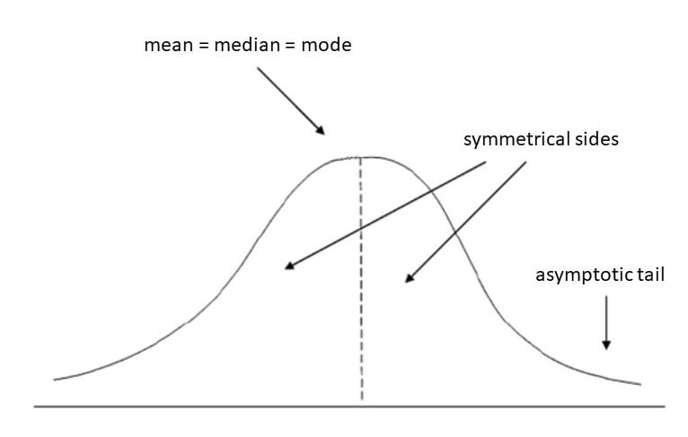
- Shape: Note differences in the shape of the distributions (e.g., symmetry, skewness, peakedness).
- Central Tendency: Compare the means, medians, and modes.
- Variability: Assess the spread of the data using standard deviation or variance.
- Outliers: Identify any unusual values that deviate significantly from the rest of the data.
11.2 Statistical Interpretation
- P-Values: Interpret p-values in the context of the null hypothesis. A small p-value suggests strong evidence against the null hypothesis.
- Effect Sizes: Quantify the magnitude of the difference between the distributions.
- Confidence Intervals: Provide a range of plausible values for the true difference between the distributions.
11.3 Contextual Interpretation
- Practical Significance: Consider whether the observed differences are meaningful in a real-world context.
- Limitations: Acknowledge any limitations of the data or methods used.
- Further Research: Identify areas for further investigation or analysis.
12. What Are Some Advanced Tools And Software For Comparing Frequency Distributions?
For complex analyses, advanced tools and software provide greater flexibility and power.
12.1 R Programming Language
R is a free, open-source programming language specifically designed for statistical computing and graphics. It offers a wide range of packages for comparing frequency distributions, including:
- ggplot2: For creating publication-quality graphics.
- stats: For performing statistical tests.
- MASS: For robust statistical modeling.
- moments: For calculating descriptive statistics.
12.2 Python Programming Language
Python is a versatile programming language with powerful libraries for data analysis and visualization. Key libraries for comparing frequency distributions include:
- NumPy: For numerical computing.
- SciPy: For scientific computing and statistical analysis.
- Matplotlib: For creating static, interactive, and animated visualizations.
- Seaborn: For creating informative and aesthetically pleasing statistical graphics.
- Statsmodels: For estimating and testing statistical models.
12.3 SAS (Statistical Analysis System)
SAS is a comprehensive statistical software suite widely used in business, government, and academia. It offers a broad range of procedures for data analysis, including:
- PROC FREQ: For creating frequency distributions and performing Chi-Square tests.
- PROC UNIVARIATE: For calculating descriptive statistics and testing for normality.
- PROC TTEST: For comparing the means of two groups.
- PROC ANOVA: For comparing the means of three or more groups.
12.4 SPSS (Statistical Package For The Social Sciences)
SPSS is a user-friendly statistical software package popular in the social sciences and other fields. It provides a graphical interface for performing a wide range of statistical analyses, including:
- Frequencies: For creating frequency distributions.
- Descriptives: For calculating descriptive statistics.
- Chi-Square: For performing Chi-Square tests.
- T-Test: For comparing the means of two groups.
- ANOVA: For comparing the means of three or more groups.
12.5 Tableau
Tableau is a powerful data visualization tool that allows you to create interactive dashboards and visualizations. It supports a wide range of data sources and provides features for:
- Creating histograms and frequency polygons.
- Generating box plots and other statistical graphics.
- Performing basic statistical analyses.
- Sharing visualizations with others.
13. How Can I Improve My Skills In Comparing Frequency Distributions?
Improving your skills requires a combination of theoretical knowledge, practical experience, and continuous learning.
13.1 Take Courses And Workshops
Enroll in statistics courses, data analysis workshops, or online tutorials. Look for courses that cover topics like descriptive statistics, hypothesis testing, and data visualization.
13.2 Practice With Real-World Data
Apply your skills to real-world datasets. Look for datasets that are relevant to your interests or career goals. Practice creating frequency distributions, performing statistical tests, and interpreting the results.
13.3 Read Books And Articles
Read books and articles on statistics, data analysis, and data visualization. Stay up-to-date on the latest techniques and best practices.
13.4 Join Online Communities
Join online communities and forums dedicated to statistics and data analysis. Ask questions, share your work, and learn from others.
13.5 Attend Conferences And Workshops
Attend conferences and workshops to network with other professionals, learn about new developments, and present your own work.
14. What Are The Ethical Considerations When Comparing Frequency Distributions?
Ethical considerations are crucial when comparing frequency distributions, particularly when the results may impact individuals or groups.
14.1 Data Privacy And Confidentiality
Protect the privacy and confidentiality of individuals by anonymizing data and obtaining informed consent when necessary.
14.2 Bias And Fairness
Be aware of potential sources of bias in the data and methods used. Strive to ensure fairness and avoid perpetuating stereotypes or discrimination.
14.3 Transparency And Reproducibility
Be transparent about the data sources, methods, and assumptions used. Provide enough information for others to reproduce your results.
14.4 Responsible Interpretation And Communication
Interpret the results responsibly and avoid overstating the conclusions. Communicate the findings clearly and accurately, and be mindful of the potential impact on others.
14.5 Data Integrity
Ensure the integrity of the data by implementing quality control measures and documenting any data cleaning or transformation steps.
15. How Can Compare.Edu.Vn Help Me Compare Frequency Distributions Effectively?
COMPARE.EDU.VN is dedicated to providing comprehensive, objective comparisons to help you make informed decisions.
15.1 Comprehensive Comparison Tools
COMPARE.EDU.VN offers tools to create detailed comparisons using various methods, including visual, statistical, and advanced techniques.
15.2 User-Friendly Interface
The website provides an intuitive platform to easily input data, generate visualizations, and perform statistical analyses.
15.3 Expert Analysis And Insights
Benefit from expert insights and analyses to better understand the implications of your comparisons.
15.4 Real-World Applications
Discover real-world applications and case studies that illustrate the power of comparing frequency distributions in various domains.
15.5 Educational Resources
Access a wealth of educational resources, including tutorials, articles, and guides, to enhance your skills and knowledge.
Navigating the complexities of comparing frequency distributions doesn’t have to be daunting. With the right tools and techniques, you can unlock valuable insights and make informed decisions. Visit COMPARE.EDU.VN today to explore our comprehensive comparison tools and resources. Whether you’re a student, professional, or researcher, our platform provides the support you need to master the art of comparing frequency distributions. Start your journey toward data-driven success with COMPARE.EDU.VN. Contact us at 333 Comparison Plaza, Choice City, CA 90210, United States or via Whatsapp at +1 (626) 555-9090. Visit our website at COMPARE.EDU.VN.
FAQ: Comparing Frequency Distributions
1. What is a frequency distribution?
A frequency distribution is a table or graph that shows the frequency of different outcomes in a sample.
2. Why is it important to compare frequency distributions?
Comparing frequency distributions helps identify patterns, assess relationships, and make informed decisions based on data.
3. What are the different methods to compare frequency distributions?
Methods include visual comparison, descriptive statistics, and statistical tests like the Chi-Square test and Kolmogorov-Smirnov test.
4. How does visual comparison help in comparing frequency distributions?
Visual methods like histograms, frequency polygons, and box plots provide an intuitive way to compare the shapes and central tendencies of distributions.
5. What is the Chi-Square Goodness-of-Fit test?
The Chi-Square test determines if an observed frequency distribution differs significantly from an expected distribution.
6. What factors should be considered when comparing frequency distributions?
Key considerations include sample size, data type, independence of observations, expected frequencies, and the context of the data.
7. How can data visualization enhance the comparison of frequency distributions?
Choosing the right visualization (e.g., histograms, box plots) and using clear labeling and consistent scales can reveal patterns and differences.
8. What are some common pitfalls to avoid when comparing frequency distributions?
Pitfalls include overlooking sample size issues, ignoring data type, failing to account for independence, misinterpreting statistical significance, and neglecting contextual information.
9. What advanced techniques can be used to compare frequency distributions?
Advanced techniques include Kernel Density Estimation (KDE), Quantile-Quantile (Q-Q) plots, and Information Theory measures.
10. How can COMPARE.EDU.VN help me compare frequency distributions effectively?
compare.edu.vn offers comprehensive comparison tools, a user-friendly interface, expert analysis, and educational resources to help you make informed decisions.