Yes, bar graphs are an effective way to compare data, offering a visual representation that makes it easy to understand differences between categories; at COMPARE.EDU.VN, we understand the importance of clear data presentation. Bar graphs are especially useful for comparing distinct categories or showing changes over time. By utilizing this method, you can make informed decisions based on easily digestible information.
To further enhance your analytical capabilities, explore related concepts such as comparative analysis, data interpretation, and statistical graphics for a comprehensive understanding.
1. What Is A Bar Graph And Its Uses?
A bar graph, also known as a bar chart, is a visual representation of data that uses bars to compare different categories. It is a versatile tool that can be used to display and compare data in various fields, from business and finance to science and education. A bar graph is particularly useful for illustrating differences between groups, tracking changes over time, and identifying trends and patterns in data.
1.1. Key Components of a Bar Graph
Understanding the key components of a bar graph is essential for effective data interpretation. These components include:
- Bars: Rectangular shapes representing data values. The length or height of each bar corresponds to the value it represents.
- Axes: Two perpendicular lines that form the framework of the graph. The horizontal axis (x-axis) typically represents categories, while the vertical axis (y-axis) represents numerical values.
- Labels: Textual descriptions that identify the categories and values represented by the bars.
- Title: A concise summary of the graph’s content, providing context and clarity.
1.2. Applications of Bar Graphs
Bar graphs find applications in diverse fields, including:
- Business: Comparing sales figures, market share, and customer demographics.
- Finance: Tracking stock prices, analyzing investment performance, and visualizing financial data.
- Science: Presenting experimental results, comparing data sets, and illustrating scientific findings.
- Education: Displaying student performance, comparing test scores, and visualizing survey data.
2. Why Use Bar Graphs for Comparison?
Bar graphs are a popular choice for data comparison due to their simplicity, clarity, and versatility. They offer several advantages over other types of charts and graphs, making them an effective tool for data analysis and communication.
2.1. Visual Clarity and Simplicity
Bar graphs present data in a visually clear and simple manner, making it easy for viewers to understand and interpret the information. The bars provide a direct comparison between categories, allowing viewers to quickly identify the largest and smallest values, as well as any significant differences between groups.
2.2. Versatility and Adaptability
Bar graphs can be adapted to display various types of data, including categorical, numerical, and ordinal data. They can also be used to represent data from different time periods, geographic locations, or other relevant dimensions. This versatility makes bar graphs a valuable tool for data analysis and presentation in various fields.
2.3. Effective Communication Tool
Bar graphs are an effective communication tool for presenting data to a wide audience. They are easy to understand, even for individuals with limited statistical knowledge. The visual nature of bar graphs makes them engaging and memorable, helping to convey key insights and findings effectively.
3. Types of Bar Graphs for Comparison
Different types of bar graphs cater to specific comparison needs. Understanding these variations allows you to choose the most appropriate graph for your data and objectives.
3.1. Vertical Bar Graph (Column Chart)
Vertical bar graphs, also known as column charts, display data vertically, with bars extending upwards from the horizontal axis. This type of graph is best suited for comparing data across different categories, especially when the categories are distinct and unrelated.
3.2. Horizontal Bar Graph
Horizontal bar graphs display data horizontally, with bars extending from the vertical axis. This type of graph is particularly useful when comparing data with long category names or when there are many categories to display.
3.3. Grouped Bar Graph (Clustered Bar Chart)
Grouped bar graphs, also known as clustered bar charts, display multiple sets of data for each category. This type of graph is useful for comparing different aspects of each category or for showing how the composition of each category changes over time.
3.4. Stacked Bar Graph
Stacked bar graphs display data in a stacked format, with each bar representing the total value for a category and the different segments within the bar representing the contribution of each component. This type of graph is useful for comparing the composition of different categories or for showing how the total value of each category is distributed among its components.
3.5. Segmented Bar Graph (100% Stacked Bar Chart)
Segmented bar graphs, also known as 100% stacked bar charts, display data in a stacked format, with each bar representing 100% of the total value for a category. The different segments within the bar represent the proportion of each component. This type of graph is useful for comparing the relative contribution of each component across different categories.
4. Elements of a Comparison Bar Chart
To effectively utilize bar charts for comparison, it’s crucial to understand their key elements. Each component plays a vital role in conveying information clearly and accurately.
4.1. Bars
Bars are the fundamental building blocks of a bar chart. Their length or height represents the magnitude of the data they depict. The longer the bar, the greater the value it represents.
4.2. Axes
Bar charts have two axes:
- Horizontal Axis (x-axis): Typically represents the categories being compared.
- Vertical Axis (y-axis): Represents the numerical scale used to measure the data values.
4.3. Labels
Labels are essential for providing context and clarity to the bar chart:
- Axis Labels: Describe the categories and numerical scale represented by the axes.
- Bar Labels: Indicate the specific value represented by each bar.
- Title: Provides a concise overview of the chart’s purpose and content.
5. How to Make a Bar Graph for Comparison
Creating a bar graph for comparison involves a series of steps to ensure clarity, accuracy, and effectiveness.
5.1. Step 1: Define the Data
The first step is to clearly define the data you want to compare. This includes identifying the categories, values, and units of measurement.
5.2. Step 2: Choose the Right Type of Bar Graph
Select the appropriate type of bar graph based on the nature of your data and the comparisons you want to make. Consider whether you need a vertical, horizontal, grouped, stacked, or segmented bar graph.
5.3. Step 3: Establish Numerical Scale and Intervals
Determine the scale and intervals for your numerical values. The scale refers to the counting sequence of the axis. If you have smaller values, you can go with a counting sequence like 1, 2, 3… However, for larger values, you have to utilize some interval of numbers between each value. For instance, you can use this sequence: 5, 10, 15… If you need to use a scale of 1 where your values start at a value higher than 1, such as 25, 28, 38, etc., you can skip the initial values and create the scale from a higher value like 20. To accomplish this, you need to add a “break” on the y-axis.
5.4. Step 4: Axis Labeling for Clarity
Label both the horizontal and vertical axes. It will provide the viewer with a clear description of information.
- The Y-axis is generally used to represent the different categories of the values that have to be represented on the graph.
- On the other hand, the X-axis represents the intensity or quantity of the values.
5.5. Step 5: Draw Category-Associated Bars
Draw bars corresponding to each category. For example, you are creating a bar chart for the top-selling item of the day. The no. 1 item is a shirt. 10 customers have made the purchase. Therefore, you need to draw a rectangle over the “shirt category.” Its length will be 10 units. Similarly, you have to draw other bars corresponding to each category.
5.6. Step 6: Graph Finalization with Contextual Title
Label the graph with a title. It will provide a context of what the bar chart is about.
6. Ways to Use Comparison Bar Charts
Comparison bar charts can be used in a multitude of ways to analyze and present data. Here are some common applications:
6.1. Side-by-Side Bar
In a side-by-side bar chart, the bars are split into bar segments. The segments are placed next to each other. You can split the bars into colored segments.
6.2. Clustered Bar
A clustered bar chart utilizes clustered horizontal columns to display multiple data series. Each data series shares the same axis labels. Hence, horizontal bars are grouped by category. Clustered bars enable you to make the direct comparison bar chart of multiple series in a given category.
6.3. Stacked Bar
A stacked bar chart is a graph that represents the proportional contribution of individual data points in comparison to a total. You use it to break down and compare parts of a whole. Each bar in the chart represents a whole. On the other hand, segments in the bar represent different parts or categories.
The stacked Bar graph can have one category axis. Also, it can have up to two numerical axes. The category axis describes the types of categories being compared. On the other hand, the numerical axes represent the values of the data.
7. Tips for Effective Bar Graph Comparison
To maximize the effectiveness of bar graphs for comparison, consider these tips:
7.1. Choose the Right Scale
Select a scale that accurately reflects the range of your data. Avoid distorting the bars or making them difficult to compare.
7.2. Use Clear Labels and Titles
Provide clear labels for the axes and bars, and use a descriptive title that accurately reflects the content of the graph.
7.3. Use Color Strategically
Use color to highlight key differences or to group related categories. However, avoid using too many colors, as this can make the graph confusing.
7.4. Arrange Bars Logically
Arrange the bars in a logical order, such as ascending or descending order, or by category. This makes it easier for viewers to compare the data.
7.5. Keep It Simple
Avoid adding unnecessary elements or clutter to the graph. The goal is to present the data in a clear and concise manner.
8. Tools for Creating Bar Graphs
Several tools are available for creating bar graphs, ranging from simple spreadsheet programs to sophisticated data visualization software.
8.1. Microsoft Excel
Microsoft Excel is a widely used spreadsheet program that offers basic bar graph creation capabilities. It is a suitable option for creating simple bar graphs for personal or professional use.
8.2. Google Sheets
Google Sheets is a free, web-based spreadsheet program that offers similar bar graph creation capabilities as Microsoft Excel. It is a convenient option for creating and sharing bar graphs online.
8.3. Tableau
Tableau is a powerful data visualization software that offers a wide range of chart types, including bar graphs. It is a popular choice for businesses and organizations that need to create complex and interactive data visualizations.
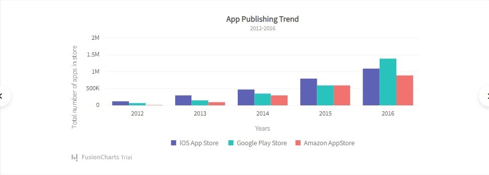
8.4. FusionCharts
You can easily create a comparison bar chart by using FusionCharts. It’s the most comprehensive JavaScript charting library on the planet. It allows you to effortlessly build different types of visualizations, including bar charts, line graphs, scatter plots, etc.
9. Common Mistakes to Avoid When Using Bar Graphs for Comparison
While bar graphs are a powerful tool for data comparison, it’s crucial to avoid common mistakes that can distort or misrepresent the data.
9.1. Distorting the Scale
Using a scale that exaggerates or minimizes differences between bars can mislead viewers. Always ensure the scale accurately reflects the range of your data.
9.2. Omitting Labels or Titles
Failing to provide clear labels for the axes and bars, or using a vague or misleading title, can make it difficult for viewers to understand the graph.
9.3. Using Too Many Colors
Using too many colors can create visual clutter and make it difficult to compare the bars. Stick to a limited color palette and use color strategically to highlight key differences.
9.4. Arranging Bars Illogically
Arranging the bars in a random or illogical order can make it difficult for viewers to compare the data. Arrange the bars in a logical order, such as ascending or descending order, or by category.
9.5. Overcomplicating the Graph
Adding unnecessary elements or clutter to the graph can distract viewers and make it difficult to focus on the key data points. Keep the graph simple and focused on the essential information.
10. Real-World Examples of Bar Graph Comparison
Bar graphs are used extensively in various fields to compare data and communicate insights. Here are a few real-world examples:
10.1. Sales Performance Comparison
A company might use a bar graph to compare the sales performance of different products, regions, or sales representatives. This helps identify top performers, areas for improvement, and overall sales trends.
10.2. Market Share Analysis
A market research firm might use a bar graph to compare the market share of different companies in a particular industry. This provides insights into market competition, brand performance, and overall market dynamics.
10.3. Website Traffic Comparison
A website owner might use a bar graph to compare the website traffic from different sources, such as organic search, social media, or paid advertising. This helps optimize marketing efforts and improve website visibility.
10.4. Student Performance Comparison
A teacher might use a bar graph to compare the performance of students on different assignments, tests, or projects. This helps identify students who need extra support and track overall class performance.
10.5. Public Health Statistics
Public health organizations might use bar graphs to compare disease rates, vaccination coverage, or other health indicators across different populations or regions. This helps monitor public health trends and allocate resources effectively.
Bar graphs are a versatile and effective tool for data comparison. By understanding the different types of bar graphs, their key elements, and how to create them effectively, you can use bar graphs to analyze data, communicate insights, and make informed decisions.
If you’re facing difficulties in comparing various options, whether it’s products, services, or ideas, COMPARE.EDU.VN is here to simplify the process. We offer detailed and objective comparisons, clearly outlining the pros and cons of each choice. Our platform provides side-by-side feature comparisons, specifications, pricing, and user reviews, ensuring you have all the information needed to make a confident decision. Visit COMPARE.EDU.VN today and experience the ease of informed decision-making. Contact us at: 333 Comparison Plaza, Choice City, CA 90210, United States. Whatsapp: +1 (626) 555-9090. Visit our website: compare.edu.vn.
FAQ
How can I create a bar chart in Excel and Google Sheets?
If you are using Excel, head to Insert > Insert Column or Bar Chart icon. Then select a column chart option of your choice. If you are using Google Sheets, go to Insert > Chart. Then, in the pop-up chart menu, click the dropdown under Chart Type. Now, choose Bar Graph.
Why is it important to visualize data?
Data visualization utilizes graphs or maps to visually represent complex data. It offers clear meaning to the information displayed. Hence, the data becomes more natural to the viewers. The audience can easily understand complex information, like patterns and trends.
Why charts and graphs are useful?
Graphs and charts transform a large amount of data into an easily digestible format. It enables you to effectively convey your message to the audience. For instance, pie charts, bar graphs, and line graphs allow you to showcase categorical data.