Comparing data visually in Excel is crucial for insightful analysis. While Excel doesn’t directly compare two separate charts, it offers powerful features to achieve this goal. This article explores various methods to compare data across charts in Excel, enabling you to gain meaningful insights from your data.
Comparing Data Across Multiple Charts in Excel
Excel allows for data comparison across multiple charts through several techniques:
1. Combining Data into a Single Chart
The most straightforward method is to consolidate the data you want to compare into a single chart. This allows for direct visual comparison of trends, values, and other key metrics.
-
Using a Combined Chart: Excel supports creating charts that combine different chart types, like a clustered column chart with a line chart. This enables visualizing different data series with varying scales and interpretations within the same chart. For example, you could compare sales figures (column chart) against target goals (line chart).
-
Adding a Secondary Axis: When comparing data with vastly different scales, a secondary axis helps maintain visual clarity. You can plot one dataset on the primary axis and the other on the secondary, allowing both to be clearly represented without one overshadowing the other.
2. Creating Small Multiples
Small multiples involve creating a series of similar charts, each displaying a subset of the data. This technique facilitates comparing patterns and trends across different categories or time periods. For example, you could generate separate but identically structured charts for sales performance in different regions. The consistent visual structure allows for easy identification of variations between the charts.
3. Utilizing Sparklines
Sparklines are miniature charts embedded within individual cells. While not full-fledged charts, sparklines provide a quick visual summary of trends within a specific row or column. This allows for a compact comparison of data points across multiple rows or columns within a table. You could use sparklines to show the sales trend for each product over time, allowing for quick identification of top performers or declining trends.
4. Leveraging Conditional Formatting
While not a charting technique, conditional formatting can visually highlight differences in data across ranges. By applying color scales or icon sets based on data values, you can quickly pinpoint significant variations between datasets, even without directly charting them. This can be used as a preliminary step to identify areas needing further chart-based analysis.
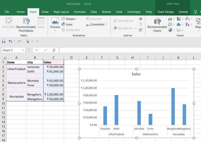 Excel Chart Comparing Sales Data
Conclusion
While Excel doesn’t have a built-in feature to directly compare two separate charts, the methods outlined above offer effective ways to achieve meaningful comparisons. By consolidating data, employing small multiples, utilizing sparklines, or leveraging conditional formatting, you can gain valuable insights from your data and make informed decisions. Choosing the right technique depends on the specific data and the desired level of detail in your comparison.