Visualizing data effectively is crucial for conveying meaningful insights. While numerous chart types exist, selecting the right one ensures your message is clear and accurate. This guide explores various chart types, focusing on those best suited for comparing parts to a whole, and offers best practices for their creation.
Understanding the Need for Comparison Charts
Before creating a chart, define your message and the insights you want to highlight. Charts help audiences understand complex data, identify patterns, and grasp key takeaways. Accuracy and proper scaling are paramount for maintaining precision and conveying the intended message.
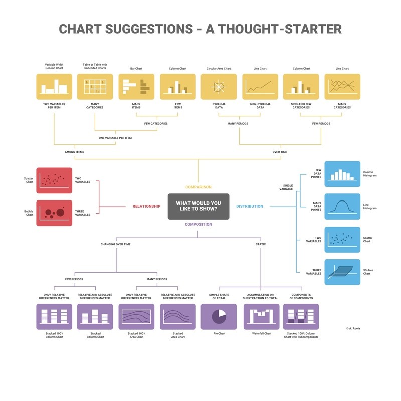
Charts broadly categorize into four types: comparison, relationship, composition, and distribution. For comparing parts to a whole, composition charts are the most relevant. These charts visually represent how individual components contribute to the totality and how their proportions change over time. Examples include pie charts, treemaps, and stacked area charts.
Charts for Comparing Parts to a Whole
Several chart types effectively illustrate the relationship between parts and the whole:
Pie Charts: Classic Part-to-Whole Visualization
Pie charts are widely recognized for representing percentages, with each slice corresponding to a proportion of the total (100%). They excel at showcasing simple comparisons of a few categories.
Best Practices:
- Accuracy: Ensure segments sum up to 100%.
- Simplicity: Limit the number of segments for clarity. If slices are similar in size, consider alternative chart types like bar or column charts.
- Clarity: Avoid 3D effects or tilting, which distort proportions.
Treemaps: Visualizing Hierarchical Part-to-Whole Relationships
Treemaps use nested rectangles to represent hierarchical data. The size of each rectangle corresponds to its value, allowing for quick comparisons and trend identification, even with large datasets. Color can indicate numerical values or categories.
Best Practices:
- Clear Objective: Define the message and highlight specific insights before creating the treemap.
- Color Contrast: Use distinct colors for easy differentiation.
- Clear Labeling: Label each region with text or numbers for clarity.
- Avoid Clutter: Limit the number of boxes to maintain readability.
Stacked Area Charts: Showing Part-to-Whole Change Over Time
Stacked area charts combine the features of line charts and area charts to display the cumulative contribution of each part to the whole over time. The filled areas represent the volume of each part, and their stacked arrangement shows the total.
Best Practices:
- Readability: Avoid occlusion, where one layer obscures another.
- Emphasis: Use stacked area charts to highlight part-to-whole relationships and changes over time.
- Data Set Limit: Avoid comparing too many datasets; line charts may be more suitable for numerous comparisons.
- Context: Provide clear labels and legends.
Utilizing Dual-Axis Charts for Comparison
While not directly representing parts to a whole, dual-axis charts can compare two different datasets against a shared dimension (e.g., time). This allows for visualizing relationships and trends between distinct variables. However, use dual-axis charts cautiously, as they can be misleading if not designed carefully.
Conclusion: Choosing the Right Visualization
Selecting the appropriate chart type is crucial for effective data communication. For comparing parts to a whole, pie charts, treemaps, and stacked area charts provide clear and insightful visualizations. By adhering to best practices for each chart type, you can ensure your data story is accurately and effectively conveyed. Consider using tools like Infogram to easily create interactive and visually appealing charts for your data.