Creating comparative bar graphs in Excel is straightforward, allowing for insightful data analysis and visualization, and COMPARE.EDU.VN offers comprehensive guides to master this skill. By following our detailed instructions, you can effectively present and compare data sets, enhancing your ability to draw meaningful conclusions and make informed decisions. Explore COMPARE.EDU.VN for more on data visualization, chart creation, and effective data representation.
1. What Are Comparative Bar Graphs in Excel?
Comparative bar graphs in Excel are visual tools that display and compare different categories of data using rectangular bars. The length of each bar is proportional to the value it represents, allowing for easy comparison between different data points. These graphs are particularly useful for highlighting differences and trends across various categories or groups. Comparative bar graphs are often used to present data in reports, presentations, and dashboards, enabling stakeholders to quickly grasp key insights. They are versatile and can be adapted to display various types of data, such as sales figures, survey results, and performance metrics.
1.1. Types of Comparative Bar Graphs
Excel offers several types of bar graphs, each suited for different types of comparisons:
-
Clustered Bar Graphs: These display multiple data series side-by-side for each category, making it easy to compare values within the same category.
-
Stacked Bar Graphs: These show the contribution of each category to the total value. They are useful for illustrating parts of a whole and comparing totals across different categories.
-
100% Stacked Bar Graphs: Similar to stacked bar graphs, but each bar represents 100% of the total, allowing for comparison of the percentage contribution of each category.
-
3D Bar Graphs: These add a three-dimensional effect to the bars, making the graph visually appealing. However, they can sometimes be harder to read than 2D graphs.
Each type serves a unique purpose, making it essential to choose the one that best represents your data. For example, if you want to compare sales figures for multiple products over several quarters, a clustered bar graph would be ideal. If you want to show how different departments contribute to the total revenue, a stacked bar graph would be more appropriate.
1.2. Key Elements of a Comparative Bar Graph
A well-designed comparative bar graph includes several key elements:
- Chart Title: A clear and concise title that describes the purpose of the graph.
- Axis Labels: Labels for the horizontal and vertical axes that indicate what the bars represent and the units of measurement.
- Data Series: The different sets of data being compared, each represented by a different color or pattern.
- Legend: A key that explains which color or pattern corresponds to each data series.
- Gridlines: Optional lines that help to align the bars and make it easier to read the values.
- Data Labels: Optional labels that display the exact value of each bar.
These elements work together to provide a clear and informative visual representation of the data. For instance, the chart title should immediately convey the graph’s purpose, such as “Sales Comparison by Region.” Axis labels should clearly indicate what each axis represents, like “Region” and “Sales (in USD).”
1.3. Why Use Comparative Bar Graphs?
Comparative bar graphs are a powerful tool for data visualization because they:
- Simplify Complex Data: They transform raw data into an easily understandable format.
- Highlight Trends: They make it easy to spot trends and patterns in the data.
- Facilitate Comparisons: They allow for quick and accurate comparisons between different categories.
- Enhance Communication: They help to communicate insights and findings to a broader audience.
According to a study by the University of California, Berkeley, visual representations of data can increase comprehension by up to 43%. This underscores the importance of using comparative bar graphs to enhance understanding and facilitate data-driven decision-making. By presenting data visually, you can quickly identify areas that need attention, track progress towards goals, and communicate your findings to stakeholders.
2. Identifying User Search Intent
Understanding user search intent is crucial for creating content that meets the needs of your audience. Here are five key search intents related to “How To Make Comparative Bar Graphs In Excel”:
- Informational: Users seeking general information about creating comparative bar graphs in Excel.
- Tutorial: Users looking for step-by-step instructions on how to create these graphs.
- Comparative: Users wanting to compare different types of bar graphs and their uses.
- Problem-Solving: Users facing issues while creating bar graphs and seeking solutions.
- Best Practices: Users looking for tips and best practices to create effective comparative bar graphs.
2.1. Informational Intent
Users with informational intent are typically looking for an overview of comparative bar graphs in Excel. They might want to understand what these graphs are, why they are useful, and the different types available. Content that addresses this intent should provide a clear definition of comparative bar graphs, explain their benefits, and introduce the various types of bar graphs that can be created in Excel.
For example, an informational query might be: “What is a comparative bar graph in Excel?”
2.2. Tutorial Intent
Users with tutorial intent are seeking detailed, step-by-step instructions on how to create comparative bar graphs in Excel. They want to know exactly what to do, from selecting the data to customizing the graph’s appearance. Content that addresses this intent should provide clear, concise instructions with screenshots or videos to guide users through the process.
For example, a tutorial query might be: “How do I create a clustered bar graph in Excel?”
2.3. Comparative Intent
Users with comparative intent want to understand the differences between various types of bar graphs and when to use each one. They might be trying to decide which type of graph is best suited for their data and their specific needs. Content that addresses this intent should provide a detailed comparison of different bar graph types, highlighting their strengths and weaknesses.
For example, a comparative query might be: “What is the difference between a clustered and stacked bar graph in Excel?”
2.4. Problem-Solving Intent
Users with problem-solving intent are encountering difficulties while creating comparative bar graphs in Excel and are seeking solutions to their problems. They might be facing issues with data formatting, graph customization, or error messages. Content that addresses this intent should provide troubleshooting tips, solutions to common problems, and guidance on how to overcome specific challenges.
For example, a problem-solving query might be: “Why is my bar graph not displaying the data correctly in Excel?”
2.5. Best Practices Intent
Users with best practices intent are looking for tips and recommendations on how to create effective and visually appealing comparative bar graphs in Excel. They want to know how to choose the right colors, fonts, and labels to make their graphs as clear and informative as possible. Content that addresses this intent should provide best practice guidelines, design tips, and examples of well-designed graphs.
For example, a best practices query might be: “What are the best practices for labeling a bar graph in Excel?”
3. Step-by-Step Guide to Creating Comparative Bar Graphs
Creating comparative bar graphs in Excel involves several steps, from preparing your data to customizing the graph’s appearance. Here’s a detailed guide to help you through the process:
3.1. Preparing Your Data
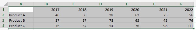
The first step in creating a comparative bar graph is to prepare your data in a format that Excel can easily understand. This typically involves organizing your data into columns and rows, with each column representing a different category or data series, and each row representing a different data point.
Example:
| Category | Series 1 | Series 2 | Series 3 |
|---|---|---|---|
| A | 10 | 15 | 20 |
| B | 25 | 30 | 35 |
| C | 40 | 45 | 50 |
Tips for Data Preparation:
- Use Clear and Consistent Labels: Make sure your column and row labels are clear and consistent.
- Format Your Data Correctly: Ensure your data is formatted as numbers, not text.
- Remove Empty Rows and Columns: Delete any empty rows or columns that could interfere with the graph creation process.
3.2. Selecting Your Data
Once your data is prepared, the next step is to select the data you want to include in your graph. This can be done by clicking and dragging your mouse over the range of cells containing your data, including the column and row labels.
Steps:
- Click on the first cell containing your data.
- Drag your mouse to the last cell containing your data.
- Release the mouse button.
Excel will highlight the selected range of cells, indicating that they are ready to be used for graph creation.
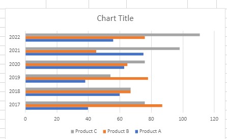
3.3. Inserting a Bar Graph
After selecting your data, the next step is to insert a bar graph into your Excel worksheet. This can be done by going to the “Insert” tab on the Excel ribbon and selecting the “Bar Chart” option.
Steps:
- Go to the “Insert” tab on the Excel ribbon.
- Click on the “Bar Chart” dropdown menu.
- Choose the type of bar graph you want to create (e.g., Clustered Bar, Stacked Bar).
Excel will insert a bar graph into your worksheet, displaying the data you selected.
3.4. Customizing Your Graph
Once your bar graph is inserted, you can customize its appearance to make it more visually appealing and informative. This includes changing the chart title, axis labels, data series colors, and other formatting options.
Customization Options:
- Chart Title: Double-click on the chart title to edit it.
- Axis Labels: Click on the axis labels to edit them.
- Data Series Colors: Click on a data series to select it, then go to the “Format Data Series” pane to change its color.
- Legend: Click on the legend to move it or change its appearance.
- Gridlines: Click on the chart area, then go to the “Format Chart Area” pane to add or remove gridlines.
- Data Labels: Click on a data series to select it, then go to the “Add Chart Element” menu to add data labels.
3.5. Adding Data Labels
Adding data labels to your bar graph can make it easier to read and understand. Data labels display the exact value of each bar, eliminating the need to estimate the values based on the graph’s scale.
Steps:
- Click on a data series to select it.
- Go to the “Chart Design” tab on the Excel ribbon.
- Click on the “Add Chart Element” dropdown menu.
- Select “Data Labels” and choose the position you want the labels to appear (e.g., Outside End, Inside End).
3.6. Adjusting Axis Scales
Adjusting the axis scales of your bar graph can help to improve its readability and highlight important trends in the data. This involves changing the minimum and maximum values of the axes, as well as the interval between the gridlines.
Steps:
- Click on the axis you want to adjust.
- Go to the “Format Axis” pane.
- Change the minimum and maximum values of the axis.
- Change the interval between the gridlines.
3.7. Changing Chart Type
If you decide that a different type of bar graph would be more appropriate for your data, you can easily change the chart type in Excel. This can be done by going to the “Chart Design” tab on the Excel ribbon and selecting the “Change Chart Type” option.
Steps:
- Go to the “Chart Design” tab on the Excel ribbon.
- Click on the “Change Chart Type” button.
- Choose the new chart type you want to use.
3.8. Saving Your Graph
Once you are satisfied with the appearance of your bar graph, you can save it as part of your Excel workbook. This will allow you to easily access and modify the graph in the future.
Steps:
- Go to the “File” tab on the Excel ribbon.
- Click on the “Save” button.
- Choose a location to save your workbook.
- Enter a name for your workbook.
- Click on the “Save” button.
4. Advanced Techniques for Comparative Bar Graphs
Once you’ve mastered the basics of creating comparative bar graphs in Excel, you can explore some advanced techniques to enhance your graphs and make them even more informative.
4.1. Using Pivot Tables for Bar Graphs
Pivot tables are a powerful tool for summarizing and analyzing data in Excel. They can be used to quickly create comparative bar graphs from complex datasets.
Steps to Create a Bar Graph from a Pivot Table:
-
Create a Pivot Table: Select your data and go to the “Insert” tab, then click “PivotTable.”
-
Arrange Your Data: Drag the fields you want to compare to the “Rows” and “Values” areas.
-
Insert a Bar Graph: Select the pivot table, go to the “Insert” tab, and choose a bar graph type.
4.2. Adding Error Bars
Error bars are a visual representation of the uncertainty or variability in your data. They can be added to comparative bar graphs to show the range of possible values for each data point.
Steps to Add Error Bars:
- Select the Data Series: Click on the data series you want to add error bars to.
- Add Chart Element: Go to the “Chart Design” tab, click “Add Chart Element,” then “Error Bars.”
- Choose Error Bar Type: Select the type of error bar you want to use (e.g., Standard Error, Percentage).
4.3. Creating Dynamic Bar Graphs
Dynamic bar graphs automatically update when the underlying data changes. This can be useful for creating dashboards and reports that need to be updated frequently.
Steps to Create a Dynamic Bar Graph:
- Use Excel Tables: Convert your data range into an Excel table by selecting the data and pressing “Ctrl+T.”
- Create a Bar Graph: Insert a bar graph as described earlier.
- Update Data: When you add or modify data in the Excel table, the bar graph will automatically update.
4.4. Using Conditional Formatting
Conditional formatting allows you to automatically apply formatting to cells based on their values. This can be used to highlight important data points in your comparative bar graphs.
Steps to Use Conditional Formatting:
- Select the Data: Select the range of cells containing the data you want to format.
- Conditional Formatting: Go to the “Home” tab and click “Conditional Formatting.”
- Choose a Rule: Select a rule that applies formatting based on cell values (e.g., “Highlight Cells Rules,” “Top/Bottom Rules”).
4.5. Combining Chart Types
In some cases, it may be useful to combine different chart types in a single graph. For example, you could combine a bar graph with a line graph to show both the absolute values and the trends in your data.
Steps to Combine Chart Types:
- Create a Bar Graph: Insert a bar graph as described earlier.
- Change Chart Type: Right-click on one of the data series and select “Change Series Chart Type.”
- Choose a Different Chart Type: Select a different chart type for that data series (e.g., Line).
5. Best Practices for Effective Comparative Bar Graphs
Creating effective comparative bar graphs requires more than just knowing the technical steps. It also involves following best practices to ensure that your graphs are clear, informative, and visually appealing.
5.1. Choosing the Right Chart Type
Selecting the appropriate chart type is crucial for effectively communicating your data. Consider the type of comparison you want to make and choose the chart type that best highlights the relevant information.
- Clustered Bar Graph: Best for comparing values within the same category across different series.
- Stacked Bar Graph: Best for showing the contribution of each category to the total value.
- 100% Stacked Bar Graph: Best for comparing the percentage contribution of each category.
5.2. Using Clear and Concise Labels
Clear and concise labels are essential for making your bar graphs easy to understand. Use descriptive labels for the chart title, axis labels, and data series.
Tips for Labeling:
- Chart Title: Use a clear and descriptive title that accurately reflects the purpose of the graph.
- Axis Labels: Label the horizontal and vertical axes with the units of measurement.
- Data Series: Use a legend to identify each data series.
5.3. Selecting Appropriate Colors
The colors you use in your bar graphs can have a significant impact on their readability and visual appeal. Choose colors that are easy on the eyes and that provide sufficient contrast between the different data series.
Color Guidelines:
- Use a Limited Palette: Avoid using too many colors, as this can make the graph look cluttered and confusing.
- Choose Contrasting Colors: Use colors that provide sufficient contrast between the different data series.
- Consider Color Blindness: Be mindful of color blindness when choosing colors, and use patterns or textures as needed.
5.4. Avoiding Clutter
Clutter can make your bar graphs difficult to read and understand. Avoid adding unnecessary elements that distract from the data.
Tips for Avoiding Clutter:
- Remove Unnecessary Gridlines: Only use gridlines if they are necessary to help align the bars.
- Minimize Data Labels: Only add data labels if they are essential for understanding the graph.
- Avoid 3D Effects: 3D effects can make the graph harder to read and should be used sparingly.
5.5. Ensuring Data Accuracy
Data accuracy is paramount when creating comparative bar graphs. Double-check your data to ensure that it is accurate and consistent.
Tips for Ensuring Data Accuracy:
- Verify Your Data: Double-check your data to ensure that it is accurate.
- Use Consistent Units: Use consistent units of measurement throughout the graph.
- Avoid Misleading Scales: Avoid using scales that distort the data or create a misleading impression.
6. Troubleshooting Common Issues
Even with careful planning and execution, you may encounter issues when creating comparative bar graphs in Excel. Here are some common problems and how to troubleshoot them:
6.1. Graph Not Displaying Data Correctly
If your graph is not displaying the data correctly, there may be a problem with the way your data is formatted or selected.
Troubleshooting Steps:
- Check Data Format: Make sure your data is formatted as numbers, not text.
- Verify Data Selection: Ensure you have selected the correct range of cells.
- Check Chart Type: Make sure you have chosen the appropriate chart type for your data.
6.2. Labels Overlapping
If your labels are overlapping, there may not be enough space to display them properly.
Troubleshooting Steps:
- Increase Chart Size: Increase the size of the chart to provide more space for the labels.
- Rotate Labels: Rotate the labels to make them easier to read.
- Use Shorter Labels: Use shorter labels or abbreviations to reduce the amount of space required.
6.3. Colors Not Displaying Correctly
If your colors are not displaying correctly, there may be a problem with your color settings.
Troubleshooting Steps:
- Check Color Settings: Make sure your color settings are configured correctly.
- Use Different Colors: Try using different colors to see if the problem persists.
- Consider Color Blindness: Be mindful of color blindness when choosing colors.
6.4. Graph Not Updating Automatically
If your graph is not updating automatically when you change the underlying data, there may be a problem with your data source.
Troubleshooting Steps:
- Check Data Source: Make sure your graph is linked to the correct data source.
- Use Excel Tables: Convert your data range into an Excel table to ensure that the graph updates automatically.
- Refresh the Graph: Try refreshing the graph by right-clicking on it and selecting “Refresh Data.”
6.5. Error Messages
If you are receiving error messages when creating your graph, there may be a problem with your data or your Excel installation.
Troubleshooting Steps:
- Read the Error Message: Read the error message carefully to understand the nature of the problem.
- Search for Solutions: Search online for solutions to the specific error message you are receiving.
- Reinstall Excel: If all else fails, try reinstalling Excel to resolve any underlying issues.
7. Real-World Examples of Comparative Bar Graphs
Comparative bar graphs are used in a wide variety of industries and applications. Here are some real-world examples of how they can be used:
7.1. Sales Performance Comparison
A company can use a clustered bar graph to compare the sales performance of different products across different regions. This can help to identify which products are performing well in which regions and to allocate resources accordingly.
Example:
| Region | Product A | Product B | Product C |
|---|---|---|---|
| North | 1000 | 1500 | 2000 |
| South | 2500 | 3000 | 3500 |
| East | 4000 | 4500 | 5000 |
| West | 5500 | 6000 | 6500 |
7.2. Market Share Analysis
A market research firm can use a stacked bar graph to show the market share of different companies in a particular industry. This can help to understand the competitive landscape and to identify opportunities for growth.
Example:
| Company | Market Share |
|---|---|
| A | 30% |
| B | 25% |
| C | 20% |
| D | 15% |
| E | 10% |
7.3. Website Traffic Comparison
A website owner can use a bar graph to compare the traffic to different pages on their website. This can help to identify which pages are the most popular and to optimize the website for better performance.
Example:
| Page | Traffic |
|---|---|
| Home | 10000 |
| About | 5000 |
| Products | 2500 |
| Contact | 1000 |
7.4. Budget Allocation
A government agency can use a stacked bar graph to show how the budget is allocated to different departments. This can help to ensure that resources are allocated fairly and efficiently.
Example:
| Department | Budget |
|---|---|
| Education | 30% |
| Healthcare | 25% |
| Defense | 20% |
| Infrastructure | 15% |
| Other | 10% |
7.5. Survey Results
A survey researcher can use a bar graph to present the results of a survey. This can help to summarize the findings and to communicate them to a wider audience.
Example:
| Response | Percentage |
|---|---|
| Yes | 60% |
| No | 30% |
| Maybe | 10% |
8. Frequently Asked Questions (FAQ)
Here are some frequently asked questions about creating comparative bar graphs in Excel:
8.1. What is the difference between a bar graph and a column chart?
A bar graph displays data horizontally, while a column chart displays data vertically. The choice between the two depends on the data and the message you want to convey.
8.2. How do I change the color of the bars in my graph?
To change the color of the bars, click on the data series you want to modify, then go to the “Format Data Series” pane and select a new color.
8.3. How do I add data labels to my graph?
To add data labels, click on the data series you want to label, then go to the “Chart Design” tab and click “Add Chart Element,” then “Data Labels.”
8.4. How do I change the axis scales on my graph?
To change the axis scales, click on the axis you want to adjust, then go to the “Format Axis” pane and modify the minimum and maximum values.
8.5. How do I create a dynamic bar graph?
To create a dynamic bar graph, convert your data range into an Excel table and then create a bar graph based on that table. The graph will automatically update when you modify the data in the table.
8.6. How do I add error bars to my graph?
To add error bars, click on the data series you want to add error bars to, then go to the “Chart Design” tab and click “Add Chart Element,” then “Error Bars.”
8.7. How do I combine different chart types in a single graph?
To combine chart types, create a bar graph, then right-click on one of the data series and select “Change Series Chart Type.” Choose a different chart type for that data series.
8.8. What are some best practices for creating effective comparative bar graphs?
Some best practices include choosing the right chart type, using clear and concise labels, selecting appropriate colors, avoiding clutter, and ensuring data accuracy.
8.9. How do I troubleshoot common issues with comparative bar graphs?
Common issues include the graph not displaying data correctly, labels overlapping, colors not displaying correctly, and the graph not updating automatically. Refer to the troubleshooting steps in this guide for solutions.
8.10. Where can I find more information about creating comparative bar graphs in Excel?
You can find more information about creating comparative bar graphs in Excel on the Microsoft Office website, as well as on various online forums and tutorials. You can also visit COMPARE.EDU.VN for more detailed guides and resources.
9. Conclusion: Empowering Data-Driven Decisions with Excel
Mastering the art of creating comparative bar graphs in Excel empowers you to transform raw data into actionable insights. By following the step-by-step guides, advanced techniques, and best practices outlined in this article, you can create compelling visuals that facilitate data-driven decision-making.
Whether you’re comparing sales performance, analyzing market share, or presenting survey results, comparative bar graphs provide a powerful tool for simplifying complex data and communicating your findings effectively. Excel’s flexibility and versatility make it an ideal platform for creating these graphs, and with the knowledge you’ve gained here, you’re well-equipped to leverage its capabilities to their fullest extent.
Remember, the key to creating effective comparative bar graphs lies in understanding your data, choosing the right chart type, and following best practices for labeling, coloring, and avoiding clutter. By paying attention to these details, you can create graphs that are not only visually appealing but also highly informative and insightful.
If you’re looking for more ways to enhance your data analysis and decision-making skills, visit COMPARE.EDU.VN. We offer a wide range of resources and tools to help you succeed in today’s data-driven world.
Ready to take your data visualization skills to the next level? Explore the comprehensive guides and resources available at COMPARE.EDU.VN today. Make informed decisions and drive success with the power of comparative bar graphs in Excel.
Contact us:
Address: 333 Comparison Plaza, Choice City, CA 90210, United States
Whatsapp: +1 (626) 555-9090
Website: compare.edu.vn