Creating a comparison chart in Excel is a straightforward process that allows you to visually represent and analyze data from different categories, and COMPARE.EDU.VN is here to guide you. This guide will walk you through the steps to make effective comparison charts, helping you present your information clearly. By following this detailed tutorial, you’ll enhance your data presentation skills.
1. Understanding Comparison Charts
What is a Comparison Chart?
A comparison chart, also known as a comparison diagram, is a visual tool used to display and analyze the similarities and differences between two or more items, categories, or datasets. These charts are essential for making informed decisions, identifying trends, and presenting data in an easily understandable format. According to research from the University of California, Berkeley, visual aids improve comprehension by up to 43%.
Why Use Comparison Charts?
- Easy Analysis: Comparison charts simplify the process of analyzing large datasets by presenting key information in a visual format.
- Informed Decisions: By clearly showing the differences and similarities, these charts help in making better-informed decisions.
- Trend Identification: They make it easier to spot trends and patterns that might not be immediately obvious in raw data.
- Effective Communication: Visual representations are more engaging and easier to understand, making communication more effective.
Types of Comparison Charts
Various types of charts can be used for comparisons, depending on the nature of the data and the insights you want to highlight. Here are some common types:
- Bar Charts: Ideal for comparing discrete categories or groups.
- Column Charts: Similar to bar charts but with vertical columns, often used for time-series data.
- Line Charts: Best for showing trends and changes over a continuous period.
- Scatter Plots: Useful for showing the relationship between two variables.
- Radar Charts: Effective for comparing multiple characteristics across different items.
2. Setting Up Your Data in Excel
Data Preparation: The Foundation of Your Chart
Before you can create a comparison chart, you need to organize your data in a structured format. This involves entering your data into an Excel sheet in a way that Excel can easily interpret.
-
Open Microsoft Excel: Launch Microsoft Excel on your computer.
-
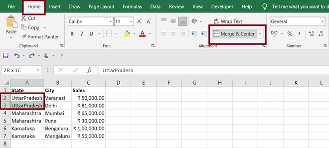
Enter Your Data: Input your data into the Excel spreadsheet. Each column should represent a different category or item you want to compare, and each row should represent a specific attribute or metric.
- Example Data: Suppose you want to compare the sales performance of three different products (Product A, Product B, and Product C) across four quarters. Your data might look like this:
| Quarter | Product A | Product B | Product C |
|---|---|---|---|
| Q1 | 120 | 150 | 100 |
| Q2 | 140 | 130 | 110 |
| Q3 | 160 | 170 | 120 |
| Q4 | 150 | 140 | 130 |
3. Label Your Data: Make sure to label your columns and rows clearly. This will help Excel understand your data and create an accurate chart.
4. Formatting Your Data: Format your data to ensure it is consistent and easy to read. This includes setting the correct number format (e.g., currency, percentage) and aligning your text.
Best Practices for Data Entry
- Consistency: Ensure that your data is consistent across all columns and rows.
- Accuracy: Double-check your data for errors to avoid misleading charts.
- Clarity: Use clear and concise labels for your columns and rows.
- Organization: Keep your data organized and structured for easy analysis.
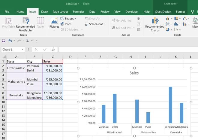
3. Creating a Comparison Chart in Excel: Step-by-Step
Step 1: Select Your Data
- Highlight the Data: Click and drag your mouse to select the data you want to include in your comparison chart. Make sure to include the column and row labels.
Step 2: Insert the Chart
-
Go to the Insert Tab: In the Excel ribbon, click on the “Insert” tab.
-
Choose a Chart Type: In the “Charts” group, you will see various chart types. For a comparison chart, column charts or bar charts are often the most effective.
- Column Chart: Click on the “Insert Column or Bar Chart” dropdown menu and select a column chart type. A “Clustered Column” chart is a good option for comparing multiple categories side by side.
- Bar Chart: Click on the “Insert Column or Bar Chart” dropdown menu and select a bar chart type. A “Clustered Bar” chart works similarly to a clustered column chart but displays the data horizontally.
Step 3: Customize Your Chart
Once you insert the chart, you’ll want to customize it to make it more informative and visually appealing.
-
Chart Title:
- Edit the Title: Double-click on the chart title to edit it. Enter a clear and descriptive title that summarizes the data being presented. For example, “Sales Performance by Product and Quarter.”
-
Axis Titles:
- Add Axis Titles: Click on the chart, and then click the “+” button (Chart Elements) that appears next to the chart. Check the “Axis Titles” box.
- Edit Axis Titles: Double-click on each axis title to edit it. Label the horizontal axis (x-axis) as “Quarter” and the vertical axis (y-axis) as “Sales (Units).”
-
Data Labels:
- Add Data Labels: Click on the chart, click the “+” button, and check the “Data Labels” box. This will display the values for each data point on the chart, making it easier to read.
- Format Data Labels: You can format the data labels by right-clicking on a data label and selecting “Format Data Labels.” Here, you can change the position, number format, and more.
-
Legend:
- Adjust Legend: The legend identifies each data series in the chart. You can change its position by clicking on the chart, clicking the “+” button, and selecting “Legend.” Choose the position that works best for your chart.
-
Gridlines:
- Customize Gridlines: You can show or hide gridlines by clicking on the chart, clicking the “+” button, and checking or unchecking the “Gridlines” box. Adjusting gridlines can help improve readability.
-
Chart Styles and Colors:
- Change Chart Style: Click on the chart, and then click on the “Format” tab. Here, you can change the chart style, colors, and fonts to match your preferences or company branding.
- Change Chart Style: Click on the chart, and then click on the “Format” tab. Here, you can change the chart style, colors, and fonts to match your preferences or company branding.
Step 4: Refine Your Chart
-
Adjust Axis Scales:
- Right-click on the vertical axis (y-axis) and select “Format Axis.”
- In the “Format Axis” pane, adjust the minimum and maximum values to better represent your data. For example, if your data ranges from 100 to 200, set the minimum to 100 and the maximum to 200.
-
Add Data Table:
- Click on the chart, click the “+” button, and check the “Data Table” box. This will display the data in a table below the chart, providing additional context.
-
Error Bars:
- If you have error values or standard deviations, you can add error bars to your chart. Click on the chart, click the “+” button, and select “Error Bars.” Choose the appropriate error bar option (e.g., standard deviation).
- If you have error values or standard deviations, you can add error bars to your chart. Click on the chart, click the “+” button, and select “Error Bars.” Choose the appropriate error bar option (e.g., standard deviation).
4. Advanced Techniques for Comparison Charts
Using Combination Charts
A combination chart combines two or more chart types in a single chart. This can be useful for comparing different types of data or highlighting specific trends.
- Create a Basic Chart: Start by creating a basic column or bar chart as described above.
- Change Chart Type for a Series: Right-click on a data series in the chart and select “Change Series Chart Type.”
- Choose a Different Chart Type: In the “Change Chart Type” dialog box, select a different chart type for the selected data series (e.g., line chart).
- Add a Secondary Axis: If the scales of the two chart types are very different, you may need to add a secondary axis. Right-click on the data series and select “Format Data Series.” In the “Format Data Series” pane, select “Secondary Axis.”
Creating a Dynamic Comparison Chart
A dynamic comparison chart updates automatically when the underlying data changes. This can be achieved by using Excel tables and formulas.
- Convert Data to Table: Select your data and press
Ctrl+T(orCmd+Ton Mac) to convert it into an Excel table. - Use Formulas: Use Excel formulas to calculate values that you want to display in your chart. For example, you can use the
SUMfunction to calculate totals or theAVERAGEfunction to calculate averages. - Create the Chart: Create a chart based on the data in the Excel table. As you update the data in the table, the chart will automatically update.
Conditional Formatting for Comparison Charts
Conditional formatting can be used to highlight specific data points in your chart based on certain criteria.
- Select Data: Select the data you want to format.
- Go to Conditional Formatting: In the “Home” tab, click on “Conditional Formatting.”
- Choose a Rule: Choose a rule that you want to apply to your data. For example, you can use “Highlight Cells Rules” to highlight cells that are greater than a certain value.
- Apply Formatting: Apply the formatting that you want to use to highlight the data points.
5. Best Practices for Effective Comparison Charts
Keep It Simple
- Avoid Clutter: Remove unnecessary elements from your chart, such as excessive gridlines or decorations.
- Limit Data Series: Avoid including too many data series in your chart, as this can make it difficult to read.
Choose the Right Chart Type
- Consider Your Data: Choose a chart type that is appropriate for the type of data you are presenting.
- Highlight Key Insights: Select a chart type that effectively highlights the key insights you want to communicate.
Use Clear Labels and Titles
- Descriptive Titles: Use clear and descriptive titles for your chart and axes.
- Readable Labels: Ensure that your labels are easy to read and understand.
Use Color Effectively
- Consistent Colors: Use consistent colors for each data series to make it easy to track.
- Contrast: Use contrasting colors to highlight important data points.
Tell a Story
- Focus on Insights: Use your chart to tell a story about your data.
- Highlight Trends: Draw attention to important trends and patterns.
6. Common Mistakes to Avoid
Using the Wrong Chart Type
- Inappropriate Chart: Using a pie chart to compare multiple categories or a line chart to compare discrete values.
Overloading the Chart
- Too Much Data: Including too many data series or categories can make the chart cluttered and difficult to read.
Poor Labeling
- Missing Labels: Failing to label axes, data series, or data points can make the chart confusing.
Misleading Scales
- Truncated Axes: Starting the y-axis at a value other than zero can distort the data and create a misleading impression.
Ignoring the Audience
- Technical Jargon: Using technical jargon or complex terminology that the audience may not understand.
7. Real-World Applications of Comparison Charts
Business and Finance
- Sales Performance: Comparing sales across different products, regions, or time periods.
- Financial Analysis: Comparing revenue, expenses, and profits over time.
- Market Research: Comparing market share, customer satisfaction, and brand awareness.
Education and Research
- Student Performance: Comparing test scores, grades, and attendance rates.
- Research Data: Comparing experimental results, survey responses, and statistical data.
Healthcare
- Patient Outcomes: Comparing treatment outcomes, recovery rates, and patient satisfaction.
- Medical Research: Comparing the effectiveness of different drugs or therapies.
Marketing and Advertising
- Campaign Performance: Comparing the performance of different marketing campaigns.
- Website Analytics: Comparing website traffic, conversion rates, and bounce rates.
8. Resources and Tools
Excel Templates
- Microsoft Office Templates: Microsoft Office offers a variety of pre-designed Excel templates for creating comparison charts.
- Third-Party Templates: Numerous websites offer free and premium Excel templates for various chart types.
Online Chart Builders
- Google Charts: A free online tool for creating interactive charts and graphs.
- Chart.js: An open-source JavaScript library for creating responsive charts.
- Tableau: A powerful data visualization tool for creating interactive dashboards and reports.
Books and Courses
- “Data Visualisation: A Handbook for Data Driven Design” by Andy Kirk: A comprehensive guide to data visualization principles and techniques.
- “Storytelling with Data: A Data Visualization Guide for Business Professionals” by Cole Nussbaumer Knaflic: A practical guide to creating compelling data stories.
- Online Courses: Platforms like Coursera, Udemy, and LinkedIn Learning offer courses on data visualization and Excel charting.
9. Conclusion: Making Data-Driven Decisions with Excel
Comparison charts are powerful tools for analyzing data, identifying trends, and making informed decisions. By following the steps outlined in this guide, you can create effective comparison charts in Excel that communicate your insights clearly and concisely. Remember to keep your charts simple, choose the right chart type, use clear labels and titles, and tell a story with your data.
For more comprehensive guides and tools on data comparison, visit COMPARE.EDU.VN. We offer a wide range of resources to help you make informed decisions based on reliable comparisons. Contact us at 333 Comparison Plaza, Choice City, CA 90210, United States, or reach out via WhatsApp at +1 (626) 555-9090.
10. Frequently Asked Questions (FAQs)
What is the best chart type for comparing data?
The best chart type depends on the nature of your data and the insights you want to highlight. Column charts and bar charts are generally effective for comparing discrete categories, while line charts are best for showing trends over time.
How do I add data labels to my chart?
To add data labels, click on the chart, click the “+” button (Chart Elements), and check the “Data Labels” box.
How do I change the chart title?
Double-click on the chart title to edit it. Enter a clear and descriptive title that summarizes the data being presented.
How do I format the axes on my chart?
Right-click on an axis and select “Format Axis.” In the “Format Axis” pane, you can adjust the minimum and maximum values, number format, and other settings.
Can I create a dynamic comparison chart in Excel?
Yes, you can create a dynamic comparison chart by using Excel tables and formulas. As you update the data in the table, the chart will automatically update.
How do I use conditional formatting in my chart?
Select the data you want to format, go to the “Home” tab, click on “Conditional Formatting,” and choose a rule that you want to apply to your data.
What are some common mistakes to avoid when creating comparison charts?
Common mistakes include using the wrong chart type, overloading the chart with too much data, poor labeling, and misleading scales.
Where can I find Excel templates for creating comparison charts?
You can find Excel templates on Microsoft Office Templates and various third-party websites.
What are some online tools for creating comparison charts?
Some online tools include Google Charts, Chart.js, and Tableau.
How can COMPARE.EDU.VN help me with data comparison?
COMPARE.EDU.VN provides comprehensive guides, tools, and resources to help you make informed decisions based on reliable comparisons. Visit our website at compare.edu.vn or contact us at 333 Comparison Plaza, Choice City, CA 90210, United States, or via WhatsApp at +1 (626) 555-9090.