Comparing bar graphs is essential for data analysis; COMPARE.EDU.VN provides you with expert techniques to make informed interpretations. This article clarifies bar graph types, construction, and usage, leading to better data-driven decisions. Discover How To Compare Bar Graphs using visual comparisons, data interpretation, and statistical analysis.
1. What Is a Bar Graph?
A bar graph, also known as a bar chart, is a visual representation of data that uses bars to compare different categories. These bars can be either horizontal or vertical, with their lengths proportional to the values they represent. Bar graphs are widely used because they provide a clear and intuitive way to display and compare data, making it easier to identify patterns, trends, and outliers. According to a study by the University of California, data presented visually is processed 60,000 times faster than text-based data, underscoring the effectiveness of bar graphs in conveying information quickly.
1.1. Key Elements of a Bar Graph
Understanding the basic components of a bar graph is crucial for effective comparison. These elements include:
- Bars: Rectangular shapes that represent data values for each category.
- Axes: Two perpendicular lines that define the graph’s framework:
- X-axis (Horizontal): Typically represents categories or independent variables.
- Y-axis (Vertical): Represents the numerical values or dependent variables.
- Labels: Text that identifies the categories and numerical values on the axes.
- Title: A concise description of the data being presented in the graph.
- Legend (if applicable): Explains the different colors or patterns used for different data series in the graph.
1.2. Different Types of Bar Graphs
There are several types of bar graphs, each suited for different comparison purposes:
- Vertical Bar Graph (Column Chart): Bars are oriented vertically, making it easy to compare values across different categories.
alt: A vertical bar graph displaying sales figures for different product categories.
- Horizontal Bar Graph: Bars are oriented horizontally, which is useful when category names are long or when comparing many categories.
alt: A horizontal bar graph showing customer satisfaction ratings for various services.
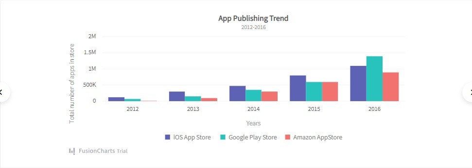
- Grouped Bar Graph (Clustered Bar Chart): Compares multiple data series within the same category, with bars grouped side-by-side.
alt: A clustered bar graph comparing sales performance of multiple regions over different quarters.
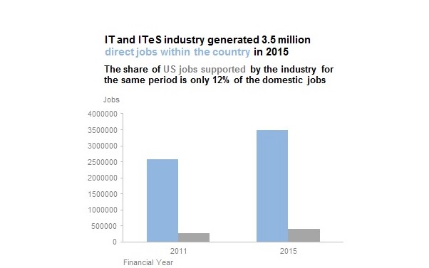
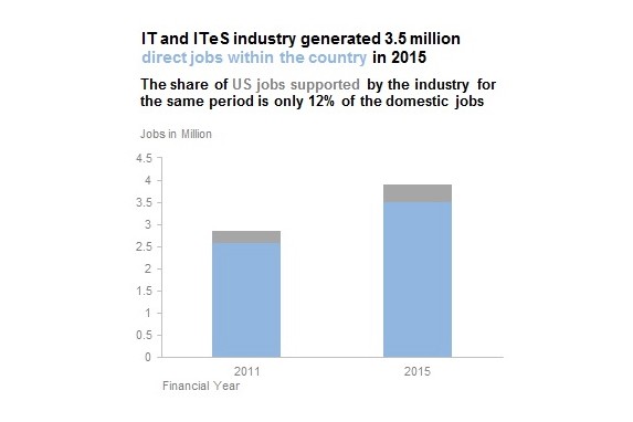
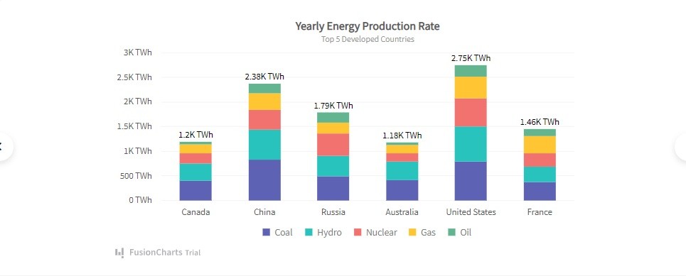
- Stacked Bar Chart: Shows the composition of each category by stacking bars on top of each other, representing different parts of a whole.
alt: A stacked bar graph illustrating the market share of various products within a specific industry.
- Segmented Bar Graph (100% Stacked Bar Chart): A type of stacked bar chart where each bar represents 100% of the value, with segments showing the percentage contribution of each sub-category.
alt: A segmented bar graph showing the distribution of survey responses across different demographic groups.
2. Why Are Bar Graphs Effective for Comparisons?
Bar graphs are particularly effective for comparisons due to their simplicity and visual clarity. They allow viewers to quickly grasp the relative sizes of different categories, making it easy to identify the largest, smallest, and intermediate values. Here are some reasons why bar graphs excel in comparative analysis:
- Ease of Interpretation: The straightforward design of bar graphs makes them easy to understand, even for individuals without a statistical background.
- Visual Clarity: The use of bars provides a clear visual representation of data, highlighting differences and similarities between categories.
- Direct Comparison: Bar graphs facilitate direct comparison of values, enabling quick identification of trends and patterns.
- Versatility: They can be used to compare various types of data, including nominal, ordinal, and numerical data.
- Accessibility: Bar graphs are widely accessible and can be created using common software tools like Excel, Google Sheets, and specialized data visualization platforms.
3. How to Construct a Bar Graph for Comparison
Creating a bar graph involves several steps to ensure accuracy and clarity. Here’s a detailed guide on how to construct a bar graph for effective comparison:
3.1. Step 1: Define the Purpose of the Comparison
Before creating a bar graph, it’s crucial to define the purpose of the comparison. What specific questions are you trying to answer? What insights do you hope to gain from the data? Defining the purpose will guide your choice of data, categories, and graph type.
For example, if you want to compare the sales performance of different products over a year, you would need monthly sales data for each product. The purpose here is to identify which products are performing best and which need improvement.
3.2. Step 2: Collect and Organize Data
Gather the data you need for the comparison. Ensure that the data is accurate, complete, and relevant to your purpose. Organize the data in a table or spreadsheet, with categories in one column and corresponding values in another.
Here’s an example of data organized in a table for comparing the sales of three products (A, B, and C) over four quarters:
| Quarter | Product A Sales | Product B Sales | Product C Sales |
|---|---|---|---|
| Q1 | 150 | 120 | 100 |
| Q2 | 180 | 150 | 130 |
| Q3 | 200 | 180 | 150 |
| Q4 | 220 | 200 | 170 |

3.3. Step 3: Choose the Appropriate Type of Bar Graph
Select the type of bar graph that best suits your comparison needs. Consider the number of categories, the type of data, and the specific insights you want to highlight.
- Vertical Bar Graph: Ideal for comparing values across different categories when you have a limited number of categories.
- Horizontal Bar Graph: Best for comparing values when you have long category names or a large number of categories.
- Grouped Bar Graph: Suitable for comparing multiple data series within the same category.
- Stacked Bar Chart: Useful for showing the composition of each category and comparing the contribution of different parts to the whole.
- Segmented Bar Graph: Best for showing the percentage contribution of each sub-category to the total value of each category.
3.4. Step 4: Set Up the Axes
Determine which categories and values will be represented on the x-axis and y-axis. Typically, categories are placed on the x-axis, and numerical values are placed on the y-axis. Label both axes clearly, including units of measurement where applicable.
For the sales comparison example, the x-axis would represent the quarters (Q1, Q2, Q3, Q4), and the y-axis would represent the sales values in dollars.
3.5. Step 5: Determine the Scale and Intervals
Choose an appropriate scale for the y-axis to accurately represent the data values. The scale should start at zero and extend to a value slightly higher than the maximum data value. Divide the scale into equal intervals to ensure consistent representation.
For the sales data, if the maximum sales value is 220, the y-axis scale could range from 0 to 250, with intervals of 50.
3.6. Step 6: Draw the Bars
Draw the bars corresponding to each category, with their lengths proportional to the data values. Ensure that the bars are of equal width and are spaced evenly apart. Use different colors or patterns to distinguish between different data series in grouped or stacked bar charts.
3.7. Step 7: Add Labels and Title
Label each bar with its corresponding category name or value. Add a title to the graph that clearly describes the data being presented and the purpose of the comparison. Include a legend if necessary to explain the different colors or patterns used in the graph.
3.8. Step 8: Review and Refine
Review the completed bar graph to ensure that it accurately represents the data and effectively communicates the intended message. Check for any errors or inconsistencies and make necessary refinements to improve clarity and visual appeal.
4. Techniques for Comparing Bar Graphs
Comparing bar graphs involves more than just looking at the visual representation. Here are several techniques to effectively compare bar graphs and extract meaningful insights:
4.1. Visual Inspection
Start by visually inspecting the bar graphs to get a general sense of the data. Look for the tallest and shortest bars, identify any trends or patterns, and note any outliers or anomalies.
- Identify Maxima and Minima: Determine the categories with the highest and lowest values.
- Observe Trends: Look for increasing or decreasing trends across categories.
- Detect Outliers: Identify any bars that are significantly different from the others.
- Assess Overall Distribution: Observe the overall shape of the distribution to understand the general characteristics of the data.
4.2. Quantitative Comparison
Perform quantitative comparisons to measure the differences between categories. Calculate differences, ratios, and percentages to quantify the relative sizes of the bars.
- Calculate Differences: Subtract the values of different categories to find the absolute differences between them.
- Compute Ratios: Divide the values of different categories to find the relative ratios between them.
- Determine Percentages: Calculate the percentage change or percentage contribution of each category to the total.
4.3. Trend Analysis
Analyze trends over time or across categories to identify patterns and predict future outcomes. Look for consistent increases, decreases, or cyclical patterns in the data.
- Time Series Analysis: Examine trends over time to identify seasonal variations, long-term trends, and turning points.
- Cross-Sectional Analysis: Compare data across different categories at a specific point in time to identify similarities and differences.
- Regression Analysis: Use statistical techniques to model the relationship between variables and predict future outcomes.
4.4. Comparative Ratios
Use comparative ratios to compare the relative sizes of different categories. Calculate ratios such as market share, growth rate, or profitability to compare performance across different segments.
- Market Share: Calculate the percentage of total sales or revenue that each category represents.
- Growth Rate: Determine the percentage change in sales or revenue over a specific period.
- Profitability: Compare the profit margins of different categories to assess their relative profitability.
4.5. Benchmarking
Compare the bar graphs to external benchmarks or industry standards to assess performance relative to competitors or best practices. Identify areas where the data excels or falls short of expectations.
- Competitive Benchmarking: Compare the data to the performance of key competitors to identify areas of competitive advantage or disadvantage.
- Industry Benchmarking: Compare the data to industry averages or best practices to assess overall performance.
- Internal Benchmarking: Compare the data to historical performance or internal targets to track progress and identify areas for improvement.
5. Tools and Software for Creating Bar Graphs
Several tools and software options are available for creating bar graphs, ranging from basic spreadsheet programs to advanced data visualization platforms. Here are some popular options:
5.1. Microsoft Excel
Microsoft Excel is a widely used spreadsheet program that offers basic charting capabilities, including bar graphs. It provides a user-friendly interface and a variety of customization options, making it suitable for creating simple bar graphs.
- Pros:
- Widely accessible and familiar to most users.
- Easy to use for creating basic bar graphs.
- Offers a variety of customization options.
- Cons:
- Limited advanced charting capabilities.
- Can be cumbersome for large datasets.
- May not be suitable for complex comparisons.
5.2. Google Sheets
Google Sheets is a free, web-based spreadsheet program that offers similar charting capabilities to Microsoft Excel. It is accessible from any device with an internet connection and allows for real-time collaboration.
- Pros:
- Free and accessible from any device.
- Easy to use for creating basic bar graphs.
- Offers real-time collaboration features.
- Cons:
- Limited advanced charting capabilities.
- Requires an internet connection.
- May not be suitable for complex comparisons.
5.3. Tableau
Tableau is a powerful data visualization platform that offers advanced charting and analytical capabilities. It allows users to create interactive dashboards and perform complex comparisons with ease.
- Pros:
- Offers advanced charting and analytical capabilities.
- Allows for creating interactive dashboards.
- Supports complex comparisons and data analysis.
- Cons:
- Can be expensive for individual users.
- Requires a learning curve to master advanced features.
- May be overkill for simple bar graph creation.
5.4. Power BI
Power BI is a business analytics service by Microsoft that provides interactive visualizations and business intelligence capabilities. It offers a wide range of charting options, including bar graphs, and allows for seamless integration with other Microsoft products.
- Pros:
- Offers interactive visualizations and business intelligence capabilities.
- Provides a wide range of charting options.
- Integrates seamlessly with other Microsoft products.
- Cons:
- Can be expensive for individual users.
- Requires a learning curve to master advanced features.
- May be overkill for simple bar graph creation.
5.5. FusionCharts
FusionCharts is a JavaScript charting library that offers a comprehensive set of interactive charts and graphs, including bar graphs. It allows developers to create visually appealing and customizable charts for web applications.
- Pros:
- Offers a comprehensive set of interactive charts and graphs.
- Allows for creating visually appealing and customizable charts.
- Suitable for web application development.
- Cons:
- Requires coding knowledge to implement.
- Can be expensive for commercial use.
- May not be suitable for non-developers.
6. Common Mistakes to Avoid When Comparing Bar Graphs
When comparing bar graphs, it’s important to avoid common mistakes that can lead to misinterpretations or inaccurate conclusions. Here are some pitfalls to watch out for:
6.1. Inconsistent Scales
Using different scales on the y-axis can distort the visual comparison of bar graphs. Always ensure that the scales are consistent across all graphs being compared.
6.2. Misleading Axis Labels
Incorrect or unclear axis labels can lead to confusion and misinterpretation. Ensure that all axes are labeled clearly, accurately, and with appropriate units of measurement.
6.3. Unequal Bar Widths
Using bars of different widths can create a false impression of relative importance. Ensure that all bars in the graph are of equal width to accurately represent the data values.
6.4. Omitting Baseline
Omitting the baseline (zero value) on the y-axis can exaggerate the differences between bars. Always include the baseline to provide a true representation of the data.
6.5. Overcrowding
Adding too many categories or data series to a single bar graph can make it difficult to read and interpret. Limit the number of categories and data series to maintain clarity.
6.6. Ignoring Context
Interpreting bar graphs without considering the context of the data can lead to incorrect conclusions. Always consider the source of the data, the purpose of the comparison, and any relevant background information.
7. Real-World Applications of Bar Graph Comparisons
Bar graph comparisons are used in various fields to analyze data and make informed decisions. Here are some real-world applications:
7.1. Business Analytics
In business analytics, bar graphs are used to compare sales performance, market share, customer satisfaction, and other key metrics. Companies use these comparisons to identify trends, track progress, and make strategic decisions.
For example, a retail company might use a bar graph to compare the sales of different product categories in different regions. This comparison can help the company identify which products are performing well in each region and adjust their marketing strategies accordingly.
7.2. Financial Analysis
In financial analysis, bar graphs are used to compare revenue, expenses, profits, and other financial indicators. Investors and analysts use these comparisons to assess the financial health of companies and make investment decisions.
For example, an investor might use a bar graph to compare the revenue growth of different companies in the same industry. This comparison can help the investor identify which companies are growing the fastest and are likely to generate the highest returns.
7.3. Market Research
In market research, bar graphs are used to compare consumer preferences, brand awareness, and market trends. Researchers use these comparisons to understand consumer behavior and make marketing recommendations.
For example, a market research firm might use a bar graph to compare the preferences of different demographic groups for a particular product. This comparison can help the company tailor its marketing messages to appeal to specific groups.
7.4. Scientific Research
In scientific research, bar graphs are used to compare experimental results, treatment effects, and control groups. Scientists use these comparisons to draw conclusions and make evidence-based recommendations.
For example, a medical researcher might use a bar graph to compare the effectiveness of different treatments for a particular disease. This comparison can help the researcher identify which treatment is most effective and recommend it to patients.
7.5. Education
In education, bar graphs are used to compare student performance, test scores, and graduation rates. Educators use these comparisons to identify areas for improvement and make data-driven decisions.
For example, a school administrator might use a bar graph to compare the test scores of different schools in the district. This comparison can help the administrator identify which schools are performing well and which need additional support.
8. Case Studies: Successful Bar Graph Comparisons
Examining real-world case studies can provide valuable insights into how bar graph comparisons can be used to drive successful outcomes. Here are a few examples:
8.1. Case Study 1: Improving Sales Performance
A company used bar graph comparisons to analyze its sales performance across different product categories. By comparing the sales of each category over time, they identified that one category was consistently underperforming. After further investigation, they discovered that this category had been neglected in terms of marketing and promotion. As a result, they increased their marketing efforts for this category, leading to a significant increase in sales and overall revenue.
8.2. Case Study 2: Enhancing Customer Satisfaction
A service provider used bar graph comparisons to analyze customer satisfaction scores across different service areas. By comparing the scores for each area, they identified that one area had consistently low satisfaction ratings. After conducting customer surveys and focus groups, they discovered that customers were dissatisfied with the response time in this area. As a result, they implemented measures to improve response times, leading to a significant increase in customer satisfaction and loyalty.
8.3. Case Study 3: Optimizing Marketing Campaigns
A marketing agency used bar graph comparisons to analyze the performance of different marketing campaigns. By comparing the results of each campaign, they identified that one campaign was significantly more effective than the others. After analyzing the characteristics of this campaign, they discovered that it had a highly targeted audience and a compelling message. As a result, they replicated these characteristics in their other campaigns, leading to improved overall marketing performance.
9. Best Practices for Presenting Bar Graph Comparisons
Presenting bar graph comparisons effectively is crucial for conveying insights and driving action. Here are some best practices to follow:
9.1. Keep It Simple
Avoid cluttering the bar graph with too much information. Focus on the key data points and remove any unnecessary elements.
9.2. Use Clear Labels
Label all axes, bars, and legends clearly and concisely. Use a font size that is easy to read.
9.3. Choose Appropriate Colors
Use colors that are visually appealing and easy to distinguish. Avoid using too many colors, as this can make the graph confusing.
9.4. Tell a Story
Use the bar graph to tell a story about the data. Highlight the key trends, patterns, and outliers.
9.5. Provide Context
Provide context for the bar graph by explaining the data, the purpose of the comparison, and the implications of the findings.
9.6. Use Annotations
Use annotations to highlight key data points or trends. Add text boxes, arrows, or other visual cues to draw attention to important information.
9.7. Be Consistent
Use consistent formatting, colors, and labels across all bar graphs in the presentation. This will help maintain a professional and cohesive look.
10. Future Trends in Bar Graph Comparisons
As technology continues to evolve, bar graph comparisons are becoming more sophisticated and interactive. Here are some future trends to watch out for:
10.1. Interactive Bar Graphs
Interactive bar graphs allow users to explore the data in more detail by hovering over bars, drilling down into subcategories, and filtering data. These graphs provide a more engaging and informative experience.
10.2. Dynamic Bar Graphs
Dynamic bar graphs update in real-time as new data becomes available. These graphs are useful for monitoring key metrics and tracking progress over time.
10.3. Augmented Reality (AR) Bar Graphs
Augmented reality bar graphs overlay data visualizations onto the real world, allowing users to view and interact with data in a more immersive way.
10.4. Artificial Intelligence (AI) Powered Bar Graphs
AI-powered bar graphs use machine learning algorithms to analyze data, identify patterns, and generate insights automatically. These graphs can help users uncover hidden trends and make more informed decisions.
Conclusion
Comparing bar graphs is a powerful technique for analyzing data and making informed decisions. By understanding the different types of bar graphs, following best practices for construction, and avoiding common mistakes, you can effectively compare data and extract meaningful insights. Whether you are in business, finance, research, or education, bar graph comparisons can help you identify trends, track progress, and make data-driven decisions.
At COMPARE.EDU.VN, we understand the importance of data-driven decision-making. We provide you with the tools and resources you need to compare bar graphs effectively and gain valuable insights.
Need help comparing different options? Visit COMPARE.EDU.VN today to find comprehensive comparisons and make informed decisions. Contact us at 333 Comparison Plaza, Choice City, CA 90210, United States, or reach out via Whatsapp at +1 (626) 555-9090. Let compare.edu.vn be your guide to smart comparisons.
FAQ
How do I choose the right type of bar graph for my data?
Choosing the right type of bar graph depends on the nature of your data and the insights you want to highlight. Vertical bar graphs are ideal for comparing values across different categories. Horizontal bar graphs are best for comparing values when you have long category names or a large number of categories. Grouped bar graphs are suitable for comparing multiple data series within the same category. Stacked bar charts are useful for showing the composition of each category and comparing the contribution of different parts to the whole. Segmented bar graphs are best for showing the percentage contribution of each sub-category to the total value of each category.
What are some common mistakes to avoid when creating bar graphs?
Common mistakes to avoid when creating bar graphs include using inconsistent scales, misleading axis labels, unequal bar widths, omitting the baseline, overcrowding the graph with too much information, and ignoring the context of the data.
How can I make my bar graphs more visually appealing?
To make your bar graphs more visually appealing, use clear labels, choose appropriate colors, tell a story with the data, provide context, use annotations to highlight key data points, and maintain consistency in formatting, colors, and labels across all graphs.
What tools and software can I use to create bar graphs?
Several tools and software options are available for creating bar graphs, including Microsoft Excel, Google Sheets, Tableau, Power BI, and FusionCharts. The best option depends on your needs, budget, and technical expertise.
How can I use bar graph comparisons to improve my business?
You can use bar graph comparisons to analyze sales performance, market share, customer satisfaction, and other key metrics. By identifying trends, tracking progress, and making data-driven decisions, you can improve your business performance and achieve your goals.