Creating comparative bar graphs in Excel is a straightforward way to visualize and analyze data, and COMPARE.EDU.VN is here to guide you through the process. By following this guide, you’ll easily learn how to display your data in a format that highlights key comparisons, trends, and insights. Use this information to make effective comparisons, understand data relationships, and make informed decisions.
1. What Is a Comparative Bar Graph in Excel?
A comparative bar graph in Excel is a visual representation that uses bars to compare different categories or groups of data. It’s particularly useful when you want to highlight differences and similarities between various data points. These graphs are widely used in business, education, and research to present data in an easily understandable format.
1.1 Types of Comparative Bar Graphs
There are several types of comparative bar graphs you can create in Excel, each suited for different purposes:
- Clustered Bar Graph: Compares multiple values for each category side by side.
- Stacked Bar Graph: Displays the contribution of each value to the total for each category.
- 100% Stacked Bar Graph: Shows the percentage contribution of each value to the total for each category, making it easy to compare proportions.
1.2 Why Use Comparative Bar Graphs?
- Easy to Understand: Bar graphs are intuitive and easy to interpret, even for those with limited data analysis experience.
- Clear Comparisons: They clearly show differences and similarities between categories, making it easier to draw conclusions.
- Effective Communication: Bar graphs are great for presenting data to a wide audience, including stakeholders and decision-makers.
- Versatile: Suitable for various types of data, from sales figures to survey results.
2. Understanding the Basics of Excel Charts
Before diving into creating comparative bar graphs, it’s essential to understand some basic elements of Excel charts.
2.1 Key Elements of an Excel Chart
- Chart Area: The entire area that contains the chart and all its elements.
- Plot Area: The area where the actual chart is plotted.
- Data Series: The set of values that are represented in the chart (e.g., sales figures for different products).
- Category Axis (X-axis): The horizontal axis that displays the categories being compared (e.g., product names, years).
- Value Axis (Y-axis): The vertical axis that displays the values being measured (e.g., sales amount, percentage).
- Chart Title: A descriptive title that explains what the chart represents.
- Axis Titles: Titles for the category and value axes that describe what each axis represents.
- Legend: A key that identifies the data series used in the chart.
- Data Labels: Labels that display the values of the data points on the chart.
2.2 Navigating the Excel Chart Tools
Excel provides a variety of tools to customize your charts. Here’s how to access and use them:
- Chart Tools Tab: When you select a chart, the “Chart Tools” tab appears in the Excel ribbon. This tab has two main sub-tabs: “Design” and “Format.”
- Design Tab: Use this tab to change the chart type, add chart elements, select chart styles, and filter data.
- Format Tab: Use this tab to format the chart area, plot area, data series, and other chart elements.
3. Step-by-Step Guide: Creating a Clustered Bar Graph
A clustered bar graph is ideal for comparing multiple values for different categories. Here’s how to create one in Excel:
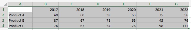
3.1 Preparing Your Data
First, you need to organize your data in a way that Excel can easily interpret. For example, let’s compare the sales of three products (A, B, and C) over three years (2021, 2022, and 2023).
| Product | 2021 | 2022 | 2023 |
|---|---|---|---|
| A | 100 | 120 | 150 |
| B | 80 | 90 | 110 |
| C | 110 | 130 | 140 |
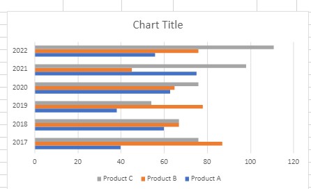
3.2 Inserting the Chart
- Select Your Data: Highlight the entire data range, including the headers (Product, 2021, 2022, 2023).
- Go to Insert Tab: Click on the “Insert” tab in the Excel ribbon.
- Choose Clustered Bar Chart: In the “Charts” group, click on the “Insert Column or Bar Chart” dropdown menu. Select “Clustered Bar.”
3.3 Customizing the Chart
Once the chart is inserted, you can customize it to make it more informative and visually appealing.
- Chart Title:
- Click on the chart title to edit it.
- Enter a descriptive title, such as “Sales Comparison by Product and Year.”
- Axis Titles:
- Go to the “Design” tab under “Chart Tools.”
- Click on “Add Chart Element,” then “Axis Titles.”
- Add titles for both the horizontal and vertical axes (e.g., “Product” for the horizontal axis and “Sales” for the vertical axis).
- Legend:
- The legend is usually added by default. If it’s missing, go to “Add Chart Element,” then “Legend,” and choose a position (e.g., “Right,” “Top”).
- Data Labels:
- To add data labels, go to “Add Chart Element,” then “Data Labels,” and choose a position (e.g., “Outside End,” “Inside End”).
- Chart Styles:
- Excel offers various chart styles that can change the look and feel of your chart. You can find these styles in the “Design” tab under “Chart Styles.”
3.4 Enhancing Readability
To ensure your chart is easy to read and understand, consider these enhancements:
- Color Scheme: Use a consistent and visually appealing color scheme. Avoid using too many colors, which can make the chart look cluttered.
- Gridlines: Adjust gridlines to make it easier to read values. You can format gridlines by right-clicking on them and selecting “Format Gridlines.”
- Font Size: Ensure that the font size for titles, labels, and legends is large enough to be easily readable.
- Axis Scale: Adjust the axis scale to better display the data. For example, you can set the minimum and maximum values on the vertical axis.
4. Creating a Stacked Bar Graph
A stacked bar graph is useful for showing how different parts contribute to a whole. Here’s how to create one:
4.1 Preparing Your Data
Use the same data as before:
| Product | 2021 | 2022 | 2023 |
|---|---|---|---|
| A | 100 | 120 | 150 |
| B | 80 | 90 | 110 |
| C | 110 | 130 | 140 |
4.2 Inserting the Chart
- Select Your Data: Highlight the data range, including headers.
- Go to Insert Tab: Click on the “Insert” tab.
- Choose Stacked Bar Chart: In the “Charts” group, click on the “Insert Column or Bar Chart” dropdown and select “Stacked Bar.”
4.3 Customizing the Chart
Customize the stacked bar chart in a similar way to the clustered bar chart:
- Chart Title: Add a descriptive title like “Sales Contribution by Product and Year.”
- Axis Titles: Add titles to the horizontal and vertical axes.
- Legend: Ensure the legend is visible and correctly identifies the data series.
- Data Labels: Add data labels to show the values for each segment of the stacked bars.
- Chart Styles: Choose a style that enhances the visual appeal of the chart.
4.4 Interpreting a Stacked Bar Graph
Stacked bar graphs show the total value for each category and the contribution of each part. For example, you can see the total sales for each year and how much each product contributed to that total. This type of graph is excellent for understanding the composition of each category.
5. Creating a 100% Stacked Bar Graph
A 100% stacked bar graph is similar to a stacked bar graph, but it shows the percentage contribution of each value to the total for each category.
5.1 Preparing Your Data
Use the same data:
| Product | 2021 | 2022 | 2023 |
|---|---|---|---|
| A | 100 | 120 | 150 |
| B | 80 | 90 | 110 |
| C | 110 | 130 | 140 |
5.2 Inserting the Chart
- Select Your Data: Highlight the data range, including headers.
- Go to Insert Tab: Click on the “Insert” tab.
- Choose 100% Stacked Bar Chart: In the “Charts” group, click on the “Insert Column or Bar Chart” dropdown and select “100% Stacked Bar.”
5.3 Customizing the Chart
- Chart Title: Add a descriptive title such as “Percentage Sales Contribution by Product and Year.”
- Axis Titles: Add titles to the horizontal and vertical axes.
- Legend: Ensure the legend is visible and correctly identifies the data series.
- Data Labels: Add data labels to show the percentage values for each segment of the bars. You may need to format the data labels to display percentages.
- Chart Styles: Choose a style that enhances the visual appeal of the chart.
5.4 Interpreting a 100% Stacked Bar Graph
100% stacked bar graphs are useful for comparing the proportions of different categories. They show how each part contributes to the total as a percentage, making it easy to compare relative contributions across different categories.
6. Advanced Techniques for Comparative Bar Graphs
To make your comparative bar graphs even more effective, consider using these advanced techniques:
6.1 Adding Error Bars
Error bars can be used to indicate the uncertainty or variability in your data. They are commonly used in scientific and statistical charts.
How to Add Error Bars
- Select the chart.
- Go to the “Design” tab under “Chart Tools.”
- Click on “Add Chart Element,” then “Error Bars.”
- Choose a type of error bar (e.g., “Standard Error,” “Percentage,” or “Standard Deviation”).
- Customize the error bars by right-clicking on them and selecting “Format Error Bars.”
6.2 Using Conditional Formatting
Conditional formatting can highlight specific data points based on certain criteria. For example, you can highlight the highest sales value in each category.
How to Use Conditional Formatting
- Select the data range you want to format.
- Go to the “Home” tab.
- Click on “Conditional Formatting.”
- Choose a rule (e.g., “Top/Bottom Rules” to highlight the highest or lowest values).
- Customize the formatting options.
6.3 Creating Dynamic Charts with Formulas
Dynamic charts update automatically when the underlying data changes. You can create dynamic charts using formulas and named ranges.
How to Create a Dynamic Chart
- Define named ranges for your data.
- Use formulas to calculate the data that will be displayed in the chart.
- Create the chart using the named ranges and formulas.
- When the underlying data changes, the chart will automatically update.
7. Best Practices for Designing Effective Bar Graphs
Follow these best practices to create bar graphs that are clear, informative, and visually appealing:
7.1 Keep It Simple
Avoid cluttering the chart with too many elements. Focus on presenting the key data points in a clear and concise manner.
7.2 Use Clear Labels
Make sure all chart elements, including titles, axis titles, legends, and data labels, are clearly labeled and easy to understand.
7.3 Choose the Right Chart Type
Select the chart type that is most appropriate for your data and the message you want to convey. Clustered, stacked, and 100% stacked bar graphs are suitable for different types of comparisons.
7.4 Use Appropriate Colors
Choose a color scheme that is visually appealing and easy on the eyes. Avoid using too many colors or colors that are too bright or distracting.
7.5 Ensure Accessibility
Make sure your chart is accessible to all users, including those with visual impairments. Use high contrast colors, provide alternative text for chart elements, and ensure that the chart can be easily read by screen readers.
8. Common Mistakes to Avoid
Avoid these common mistakes when creating comparative bar graphs:
8.1 Using the Wrong Chart Type
Choosing the wrong chart type can make it difficult to interpret the data. Make sure you select the chart type that is most appropriate for your data and the message you want to convey.
8.2 Cluttering the Chart
Adding too many elements to the chart can make it look cluttered and confusing. Focus on presenting the key data points in a clear and concise manner.
8.3 Using Inconsistent Scales
Using inconsistent scales on the axes can distort the data and make it difficult to compare different categories. Make sure the scales are consistent and appropriate for the data.
8.4 Omitting Labels and Titles
Omitting labels and titles can make it difficult to understand what the chart represents. Make sure all chart elements are clearly labeled and titled.
8.5 Ignoring Accessibility
Ignoring accessibility can make it difficult for some users to access and understand the chart. Make sure your chart is accessible to all users.
9. Real-World Examples of Comparative Bar Graphs
Comparative bar graphs are used in a wide range of industries and applications. Here are some real-world examples:
9.1 Sales and Marketing
Companies use comparative bar graphs to track sales performance, compare marketing campaigns, and analyze customer demographics. For example, a company might use a clustered bar graph to compare the sales of different products in different regions.
9.2 Education
Educators use comparative bar graphs to compare student performance, analyze test scores, and track attendance rates. For example, a teacher might use a stacked bar graph to show the distribution of grades in a class.
9.3 Healthcare
Healthcare professionals use comparative bar graphs to track patient outcomes, compare treatment options, and analyze healthcare costs. For example, a hospital might use a 100% stacked bar graph to show the distribution of patients by age group.
9.4 Finance
Financial analysts use comparative bar graphs to compare investment performance, analyze market trends, and track economic indicators. For example, an investor might use a clustered bar graph to compare the returns of different stocks.
10. Resources for Further Learning
To deepen your understanding of comparative bar graphs and Excel charting, check out these resources:
10.1 Online Courses
- Microsoft Excel Courses on Microsoft Learn: Offers comprehensive courses on Excel, including charting and data analysis.
- Excel Skills for Business Specialization on Coursera: Provides in-depth training on using Excel for business applications.
- Excel Courses on Udemy: Offers a variety of courses on Excel, from beginner to advanced levels.
10.2 Books
- “Microsoft Excel 2019 Bible” by Michael Alexander and Richard Kusleika: A comprehensive guide to Excel 2019, covering all aspects of the program.
- “Excel Data Analysis For Dummies” by Stephen L. Nelson: A beginner-friendly guide to using Excel for data analysis.
- “Power Pivot and Power BI: The Excel User’s Guide to DAX, Power Query, Power BI & Power Pivot in Excel 2010-2016” by Rob Collie and Avichal Singh: An advanced guide to using Power Pivot and Power BI for data analysis in Excel.
10.3 Websites and Blogs
- Microsoft Office Support: Official support website for Microsoft Office products, including Excel.
- Exceljet: A website with tutorials, tips, and tricks for using Excel.
- Chandoo.org: A blog with articles and tutorials on Excel charting and data analysis.
11. Troubleshooting Common Issues
If you encounter problems while creating comparative bar graphs, here are some common issues and how to resolve them:
11.1 Chart Not Displaying Correctly
- Check Data Range: Make sure you have selected the correct data range, including headers.
- Verify Chart Type: Ensure you have chosen the appropriate chart type for your data.
- Adjust Axis Scales: Adjust the axis scales to better display the data.
11.2 Missing Labels or Titles
- Add Chart Elements: Use the “Add Chart Element” option in the “Design” tab to add missing labels and titles.
- Check Data Source: Make sure the data source includes the necessary labels and titles.
11.3 Incorrect Data Representation
- Verify Data Series: Ensure the data series are correctly defined and correspond to the appropriate categories.
- Check Data Values: Verify that the data values are accurate and consistent.
11.4 Chart Looks Cluttered
- Simplify Chart Elements: Remove unnecessary chart elements, such as gridlines or data labels.
- Adjust Color Scheme: Use a simpler and more visually appealing color scheme.
- Increase Chart Size: Enlarge the chart to make it easier to read.
12. Optimizing Comparative Bar Graphs for Different Audiences
When creating comparative bar graphs, consider the audience you are presenting to and tailor the chart accordingly.
12.1 Business Professionals
- Focus on Key Metrics: Highlight the most important metrics, such as sales, revenue, and profit margins.
- Use Clear Language: Use clear and concise language that is easy to understand.
- Provide Actionable Insights: Provide insights that can be used to make better business decisions.
12.2 Academic Researchers
- Include Detailed Data: Include detailed data and statistical analysis.
- Use Technical Language: Use technical language and terminology that is appropriate for the audience.
- Cite Sources: Cite sources for all data and information.
12.3 General Audience
- Use Simple Visuals: Use simple and easy-to-understand visuals.
- Avoid Technical Jargon: Avoid using technical jargon and terminology.
- Tell a Story: Use the chart to tell a story and engage the audience.
13. The Future of Data Visualization in Excel
Data visualization is constantly evolving, and Excel continues to add new features and capabilities to meet the changing needs of users.
13.1 New Chart Types
Excel is likely to introduce new chart types that provide even more ways to visualize and analyze data. These new chart types may include more advanced options for comparing data and highlighting trends.
13.2 Improved Customization Options
Excel will likely offer improved customization options that allow users to create charts that are more visually appealing and informative. These customization options may include more control over colors, fonts, and chart elements.
13.3 Integration with Other Tools
Excel is likely to become more integrated with other data analysis and visualization tools, such as Power BI and Tableau. This integration will allow users to seamlessly move data between different tools and create more comprehensive and interactive dashboards.
14. Conclusion: Making Data-Driven Decisions with Excel
Creating comparative bar graphs in Excel is a powerful way to visualize and analyze data, making it easier to understand trends, compare categories, and make data-driven decisions. By following the steps and best practices outlined in this guide, you can create effective and visually appealing bar graphs that communicate your message clearly and concisely. Remember to consider your audience and tailor the chart accordingly to ensure that it resonates with them and provides valuable insights.
For additional assistance and a wide range of comparison tools, visit COMPARE.EDU.VN. Our platform offers comprehensive resources to help you make informed decisions. Whether you’re comparing products, services, or ideas, COMPARE.EDU.VN is your go-to source for objective and detailed comparisons.
Address: 333 Comparison Plaza, Choice City, CA 90210, United States
WhatsApp: +1 (626) 555-9090
Website: compare.edu.vn
FAQ: Creating Comparative Bar Graphs in Excel
1. What is the best type of bar graph for comparing data in Excel?
The best type of bar graph depends on your data and what you want to highlight. Clustered bar graphs are great for comparing multiple values for each category, stacked bar graphs show how different parts contribute to a whole, and 100% stacked bar graphs compare the percentage contribution of each value.
2. How do I add labels to a bar graph in Excel?
To add labels, select the chart, go to the “Design” tab under “Chart Tools,” click on “Add Chart Element,” then “Data Labels,” and choose a position for the labels.
3. Can I change the colors of the bars in Excel?
Yes, you can change the colors of the bars by selecting the data series, right-clicking, choosing “Format Data Series,” and then selecting a new color in the “Fill” option.
4. How do I add a title to my bar graph in Excel?
Click on the chart, go to the “Design” tab, click on “Add Chart Element,” then “Chart Title,” and choose a position for the title. Then, click on the title to edit it.
5. What is the difference between a column chart and a bar chart in Excel?
A column chart displays bars vertically, while a bar chart displays them horizontally. The choice depends on your preference and the layout of your data.
6. How do I create a dynamic bar graph in Excel?
Use formulas and named ranges to define the data for your chart. When the underlying data changes, the chart will automatically update.
7. How can I add error bars to my bar graph?
Select the chart, go to the “Design” tab, click on “Add Chart Element,” then “Error Bars,” and choose a type of error bar.
8. What should I do if my bar graph looks cluttered?
Simplify the chart by removing unnecessary elements, adjusting the color scheme, and ensuring labels are clear and concise.
9. How do I ensure my bar graph is accessible to everyone?
Use high contrast colors, provide alternative text for chart elements, and ensure the chart can be easily read by screen readers.
10. Where can I find more resources for learning about Excel charting?
Check out online courses on platforms like Microsoft Learn, Coursera, and Udemy, as well as books and websites like Microsoft Office Support, Exceljet, and Chandoo.org.