Comparing data in two pivot tables involves leveraging Excel’s powerful features to analyze and contrast information effectively, which can be easily achieved with the methods detailed on COMPARE.EDU.VN. This guide will delve into the various techniques and functionalities to help you perform in-depth comparisons, identify trends, and gain valuable insights, all while optimizing your data analysis workflow and exploring advanced comparison strategies. Discover the difference and comparison now!
1. Understanding Pivot Tables
Pivot tables are a powerful tool in spreadsheet programs like Microsoft Excel, designed to summarize and analyze large datasets. They enable users to reorganize and aggregate data in various ways, making it easier to identify trends, patterns, and relationships. A pivot table consists of several key components:
- Rows: Categories or fields that form the rows of the table.
- Columns: Categories or fields that form the columns of the table.
- Values: Data fields that are summarized (e.g., sum, average, count) in the table.
- Filters: Fields used to narrow down the data displayed in the table.
Understanding these components is crucial for effectively using pivot tables to compare data and extract meaningful insights.
2. Setting Up Your Data for Comparison
2.1 Data Preparation
Before you can compare data in two pivot tables, you need to ensure that your data is properly structured and prepared. Here are some key steps:
- Clean Your Data: Remove any inconsistencies, errors, or missing values that could skew your analysis.
- Ensure Data Consistency: Verify that the data types are consistent across all columns (e.g., dates are in the same format).
- Organize Your Data: Arrange your data in a tabular format with clear column headers.
- Combine Data (If Necessary): If your data is in separate sheets or files, consider combining them into a single table for easier analysis.
2.2 Creating Basic Pivot Tables
Once your data is prepared, you can create basic pivot tables to summarize and analyze the information. Here’s how:
- Select Your Data: Choose the range of cells containing your data.
- Insert a Pivot Table: Go to the “Insert” tab and click “PivotTable”.
- Choose a Location: Select whether to create the pivot table in a new worksheet or an existing one.
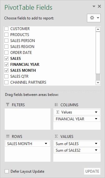
- Drag and Drop Fields: In the PivotTable Fields pane, drag fields to the “Rows”, “Columns”, and “Values” areas to structure your table.
2.3 Image of PivotTable field List
3. Methods to Compare Data in Two Pivot Tables
3.1 Side-by-Side Comparison
One of the simplest ways to compare data in two pivot tables is to place them side by side. This allows for a direct visual comparison of the summarized data.
- Create Two Pivot Tables: Generate two separate pivot tables from your data, each summarizing different aspects or using different filters.
- Arrange Them Side by Side: Place the pivot tables next to each other in your worksheet for easy comparison.
- Analyze Visual Differences: Look for differences in values, trends, and patterns between the two tables.
3.2 Using Calculated Fields
Calculated fields allow you to create custom formulas within a pivot table to perform calculations on the summarized data. This can be useful for comparing data between different categories or time periods.
- Create a Base Pivot Table: Set up a pivot table with the fields you want to analyze.
- Add a Calculated Field:
- Go to the “Analyze” or “Options” tab in the PivotTable Tools ribbon.
- Click “Fields, Items, & Sets” and select “Calculated Field”.
- Enter a name for your calculated field and create a formula that compares the relevant fields.
- Analyze the Results: The calculated field will appear as a new column in your pivot table, showing the results of your comparison.
3.3 The Power of “Show Values As”
The “Show Values As” feature in pivot tables is a hidden gem for comparisons.
- Access “Show Values As”: Right-click on a value field in your pivot table.
- Select a Comparison Option: Choose from options like “% of Grand Total”, “% of Column Total”, “Difference From”, or “% Difference From” to compare values.
- Specify Base Field and Item: If applicable, specify the base field and item for the comparison (e.g., comparing against a specific month or year).
- Interpret the Results: The pivot table will display the comparison results based on your selected option.
3.3.1 Difference From
This option shows the difference between the current value and a base value. You can select a specific field and item to use as the base for the comparison.
- Right-click on the data field you want to compare.
- Select Show Values As > Difference From.
- Choose the Base field (e.g., Year) and the Base item (e.g., previous year).
- The pivot table will now display the difference between each year.
3.3.2 % Difference From
This option displays the percentage difference between the current value and a base value.
- Right-click on the data field.
- Select Show Values As > % Difference From.
- Choose the Base field and Base item for comparison.
- The pivot table will show the percentage difference.
3.4 Using Slicers for Dynamic Filtering
Slicers are visual filters that allow you to dynamically filter the data in your pivot tables. They can be used to compare data across different categories or time periods.
- Insert Slicers:
- Select your pivot table.
- Go to the “Analyze” or “Options” tab in the PivotTable Tools ribbon.
- Click “Insert Slicer”.
- Choose the fields you want to use as filters.
- Filter Data Dynamically: Use the slicers to select different categories or time periods to compare the data in your pivot tables.
- Analyze the Changes: Observe how the values in your pivot tables change as you filter the data using the slicers.
3.5 Combining Data with Power Query
If your data is spread across multiple tables or sources, Power Query can be used to combine and transform the data into a single table for analysis.
- Import Data into Power Query:
- Go to the “Data” tab and click “From Table/Range” or “Get Data” to import your data.
- Transform Your Data:
- Use Power Query to clean, reshape, and transform your data as needed.
- Combine multiple tables using merge or append operations.
- Load Data into a Pivot Table:
- Click “Close & Load” to load the transformed data into a new worksheet.
- Create a pivot table from the loaded data to perform your analysis.
3.6 Creating Pivot Charts for Visual Comparison
Pivot charts provide a visual representation of the data in your pivot tables, making it easier to identify trends and patterns. They can be used to compare data across different categories or time periods.
- Create a Pivot Table: Set up a pivot table with the fields you want to analyze.
- Insert a Pivot Chart:
- Go to the “Analyze” or “Options” tab in the PivotTable Tools ribbon.
- Click “PivotChart”.
- Choose a chart type that best represents your data (e.g., column chart, line chart).
- Customize Your Chart:
- Add chart titles, axis labels, and legends to make your chart more informative.
- Use chart filters to focus on specific data points or categories.
- Analyze Visual Trends: Look for trends, patterns, and outliers in your pivot chart to gain insights into your data.
3.7 Image of Pivot Chart
4. Advanced Comparison Techniques
4.1 Using GETPIVOTDATA Function
The GETPIVOTDATA function allows you to extract specific values from a pivot table based on criteria you specify. This can be useful for creating custom comparison formulas outside of the pivot table.
- Understand the Syntax: The basic syntax of the
GETPIVOTDATAfunction is:
=GETPIVOTDATA(data_field, pivot_table, [field1, item1], [field2, item2], ...) - Extract Specific Values: Use the
GETPIVOTDATAfunction to extract the values you want to compare from different pivot tables. - Create Comparison Formulas: Use the extracted values to create custom formulas that calculate differences, percentages, or other comparison metrics.
4.2 Power Pivot for Complex Data Models
Power Pivot is an Excel add-in that allows you to create complex data models and perform advanced analysis on large datasets. It can be used to combine data from multiple sources and create relationships between tables.
- Enable Power Pivot:
- Go to “File” > “Options” > “Add-ins”.
- Select “COM Add-ins” in the Manage dropdown and click “Go”.
- Check the box next to “Microsoft Power Pivot for Excel” and click “OK”.
- Import Data into Power Pivot:
- Go to the “Power Pivot” tab and click “Manage”.
- Click “Get External Data” to import data from various sources.
- Create Relationships:
- In the Power Pivot window, go to “Diagram View”.
- Drag fields from one table to another to create relationships between them.
- Create Pivot Tables from the Data Model:
- Create pivot tables from the Power Pivot data model to perform advanced analysis and comparisons.
4.3 DAX Formulas for Advanced Calculations
DAX (Data Analysis Expressions) is a formula language used in Power Pivot to perform advanced calculations and analysis. It can be used to create custom measures, calculated columns, and KPIs.
- Understand DAX Syntax: DAX formulas are similar to Excel formulas but have additional functions and capabilities.
- Create Custom Measures: Use DAX formulas to create custom measures that perform complex calculations on your data.
- Analyze Results: Use the custom measures in your pivot tables to gain deeper insights into your data.
5. Best Practices for Effective Data Comparison
5.1 Choosing the Right Comparison Method
Select the comparison method that best suits your data and analysis goals. Consider the following factors:
- Data Structure: Is your data in a single table or multiple tables?
- Analysis Goals: What specific comparisons do you want to make?
- Data Complexity: How complex are the calculations and relationships you need to analyze?
5.2 Ensuring Data Accuracy and Consistency
Verify that your data is accurate and consistent before performing any analysis. This includes:
- Data Validation: Implement data validation rules to prevent errors and inconsistencies.
- Data Auditing: Regularly audit your data to identify and correct any issues.
- Documentation: Document your data sources, transformations, and calculations to ensure transparency and reproducibility.
5.3 Clearly Labeling and Documenting Your Analysis
Clearly label and document your pivot tables, charts, and formulas to make your analysis easy to understand and interpret. This includes:
- Descriptive Titles: Use descriptive titles for your pivot tables and charts.
- Axis Labels: Label the axes of your charts with clear and concise descriptions.
- Formula Documentation: Document your formulas and calculations with comments and explanations.
6. Troubleshooting Common Issues
6.1 Data Not Showing Up Correctly
If your data is not showing up correctly in your pivot tables, check the following:
- Data Source: Verify that your data source is correct and up-to-date.
- Field Placement: Ensure that your fields are placed in the correct areas (Rows, Columns, Values, Filters).
- Data Types: Check that your data types are correct (e.g., numbers are formatted as numbers).
6.2 Calculated Field Errors
If you encounter errors with your calculated fields, check the following:
- Formula Syntax: Verify that your formula syntax is correct.
- Field References: Ensure that your field references are valid.
- Division by Zero: Avoid dividing by zero by using the
IFfunction to handle potential zero values.
6.3 Pivot Table Not Refreshing
If your pivot table is not refreshing with the latest data, try the following:
- Refresh Data: Go to the “Analyze” or “Options” tab in the PivotTable Tools ribbon and click “Refresh”.
- Check Data Source: Verify that your data source is still available and accessible.
- Reconnect Data Source: If necessary, reconnect your pivot table to the data source.
7. Real-World Examples of Data Comparison
7.1 Sales Performance Analysis
A sales manager can use pivot tables to compare sales performance across different regions, products, and time periods. By creating pivot charts, they can visualize trends and identify areas for improvement.
7.2 Financial Budget vs. Actual Analysis
A finance analyst can use pivot tables to compare budgeted expenses against actual expenses. By using calculated fields, they can calculate variances and identify areas where spending is over or under budget.
7.3 Marketing Campaign Performance Analysis
A marketing manager can use pivot tables to compare the performance of different marketing campaigns. By using slicers, they can filter the data by demographics, channels, and time periods to identify the most effective campaigns.
8. How COMPARE.EDU.VN Can Help
At COMPARE.EDU.VN, we understand the challenges of comparing data and making informed decisions. That’s why we provide comprehensive comparisons across various domains. Whether you’re evaluating products, services, or ideas, our platform offers detailed analyses to help you make the right choice.
- Objective Comparisons: We offer unbiased comparisons, highlighting the pros and cons of each option.
- Detailed Analysis: Our comparisons include feature breakdowns, specifications, and pricing to ensure you have all the necessary information.
- User Reviews: Benefit from the experiences of others with user reviews and testimonials.
- Customized Recommendations: Get personalized recommendations based on your specific needs and preferences.
9. Conclusion
Comparing data in two pivot tables can provide valuable insights for making informed decisions. By using the techniques and methods described in this guide, you can effectively analyze and compare your data, identify trends, and gain a deeper understanding of your business or personal finances. Remember to practice data accuracy, consistency, and clear documentation to ensure the reliability of your analysis. For more comprehensive comparisons and expert analysis, visit COMPARE.EDU.VN and make smarter choices today.
10. Frequently Asked Questions (FAQ)
10.1 How Do I Add a Year Column to My Pivot Table?
To add a Year column to your pivot table, start by ensuring your data source has a date column. If it doesn’t, you may need to first insert the dates manually. Then, add a new column adjacent to your data, and label it “Year.” In the first cell of this new column, use a formula like =YEAR(date_cell) where date_cell is the cell reference containing the date. Drag this formula down to fill the rest of the cells in the column with the corresponding years.
Afterward, refresh your pivot table data source to include the newly added Year column. When you open the PivotTable Field List, you should now see the Year field available. You can then add this to the Rows or Columns area of your pivot table layout to start analyzing your data by year.
Remember, this Year column is crucial for performing year-over-year analysis, so having it in your pivot table setup is essential.
10.2 Can Pivot Tables Calculate Percentage Differences Automatically?
Absolutely, pivot tables can automatically calculate percentage differences without you needing to do the math. Once you have your pivot table set up, you can use the “Show Values As” feature to compare two periods. For example, to show the percent difference in sales between two years, you would:
- Add your Sales data to the Values area of the pivot table twice.
- Right-click on the second instance of your Sales data in the pivot table.
- Choose “Show Values As” then select “% Difference From.”
- In the dialog box that appears, select the base field, such as the Year, and choose the specific year or “(previous)” to compare against the previous period.
Your pivot table will now display the percentage differences for you. This is particularly useful for analyzing trends over time, giving you a clear view of growth or decline.
10.3 What Is the Difference Between “Difference From” and “% Difference From”?
“Difference From” shows the absolute difference between two values, while “% Difference From” shows the percentage difference.
10.4 Can I Compare Data from Different Excel Files in a Pivot Table?
Yes, by using Power Query to combine data from multiple sources into a single data model.
10.5 How Can I Filter Data in a Pivot Table for Comparison?
Use slicers to dynamically filter data and compare different categories or time periods.
10.6 What Is the GETPIVOTDATA Function Used For?
The GETPIVOTDATA function extracts specific values from a pivot table based on specified criteria, useful for creating custom comparison formulas.
10.7 How Do I Handle Missing Values in My Data?
Clean your data by replacing missing values with appropriate values or using filters to exclude them from the analysis.
10.8 What Are Some Common Errors When Creating Calculated Fields?
Common errors include incorrect formula syntax, invalid field references, and division by zero.
10.9 Can I Use Pivot Tables for Financial Analysis?
Yes, pivot tables are excellent for financial analysis, such as comparing budget vs. actual expenses and analyzing sales performance.
10.10 How Do I Refresh a Pivot Table with New Data?
Go to the “Analyze” or “Options” tab in the PivotTable Tools ribbon and click “Refresh”.
Ready to make smarter decisions? Visit COMPARE.EDU.VN today for comprehensive comparisons and expert analysis. Our platform is designed to help you evaluate products, services, and ideas with ease and confidence. Don’t stay confused—find clarity with COMPARE.EDU.VN.
Address: 333 Comparison Plaza, Choice City, CA 90210, United States
WhatsApp: +1 (626) 555-9090
Website: compare.edu.vn