Filtering a Google Sheets pivot table by comparing two columns allows for insightful data analysis, revealing trends and patterns efficiently, and COMPARE.EDU.VN provides comprehensive guides to master this technique. This enables precise filtering and enhanced data interpretation, helping users gain actionable insights. Dive deeper into data comparison techniques.
1. What is a Pivot Table and Why Use It?
A pivot table is a powerful data summarization tool found in spreadsheet programs like Google Sheets. It allows you to reorganize and summarize large datasets to extract meaningful information. Instead of manually sorting and calculating data, a pivot table automates the process, enabling quick and efficient analysis.
1.1 Understanding Pivot Tables
Pivot tables are interactive, meaning you can dynamically change the layout to explore different perspectives of your data. They provide a flexible way to group, filter, sort, and calculate data, making it easier to identify trends and patterns. Pivot tables are particularly useful when dealing with datasets containing numerous rows and columns.
For instance, imagine a sales dataset containing columns for date, product, region, and sales amount. Using a pivot table, you can quickly summarize the total sales amount by region, product, or any combination of these fields. This type of analysis would be time-consuming and error-prone if done manually.
1.2 Benefits of Using Pivot Tables
Using pivot tables offers several advantages:
- Efficiency: Quickly summarize and analyze large datasets.
- Flexibility: Easily rearrange data to view it from different perspectives.
- Accuracy: Reduce the risk of manual calculation errors.
- Insights: Identify trends and patterns that might be hidden in raw data.
- Customization: Tailor the pivot table to your specific analytical needs.
1.3 Common Use Cases for Pivot Tables
Pivot tables are used across various industries for different purposes. Here are some common use cases:
- Sales Analysis: Analyzing sales data to identify top-selling products, regions, and sales representatives.
- Financial Reporting: Summarizing financial data to create income statements, balance sheets, and cash flow statements.
- Marketing Analysis: Analyzing marketing campaign data to measure effectiveness and ROI.
- Inventory Management: Tracking inventory levels and identifying slow-moving items.
- Human Resources: Analyzing employee data to identify trends in hiring, retention, and performance.
2. Preparing Your Data for Pivot Table Filtering
Before you can effectively filter a pivot table by comparing two columns, you need to ensure that your data is properly structured and formatted. This preparation step is crucial for accurate and meaningful analysis.
2.1 Data Structure Requirements
Your data should be organized in a tabular format, with each column representing a specific attribute and each row representing a unique record. Ensure that your data meets the following requirements:
- Column Headers: Each column should have a clear and descriptive header.
- Consistent Data Types: Each column should contain consistent data types (e.g., numbers, dates, text).
- No Empty Rows or Columns: Avoid empty rows or columns within your data range.
- Clean Data: Remove any irrelevant or duplicate data.
2.2 Formatting Data in Google Sheets
Proper formatting is essential for accurate pivot table analysis. Here are some formatting tips:
- Dates: Format dates using a standard date format (e.g., MM/DD/YYYY).
- Numbers: Format numbers with appropriate decimal places and currency symbols, if necessary.
- Text: Ensure text entries are consistent and free of typos.
- Boolean Values: Use consistent boolean values (e.g., TRUE/FALSE or 1/0).
2.3 Example Data Set
Let’s consider an example dataset for a fictional online store:
| Order ID | Customer ID | Order Date | Product Category | Sales Amount | Discount Amount |
|---|---|---|---|---|---|
| 1 | 101 | 01/01/2024 | Electronics | 500 | 50 |
| 2 | 102 | 01/01/2024 | Clothing | 200 | 20 |
| 3 | 101 | 01/02/2024 | Electronics | 600 | 60 |
| 4 | 103 | 01/02/2024 | Books | 100 | 10 |
| 5 | 102 | 01/03/2024 | Clothing | 250 | 25 |
| 6 | 104 | 01/03/2024 | Home Goods | 300 | 30 |
In this dataset, we have columns for Order ID, Customer ID, Order Date, Product Category, Sales Amount, and Discount Amount. We can use a pivot table to analyze this data and filter it based on comparisons between different columns.
2.4 Cleaning Data Before Creating a Pivot Table
Before creating a pivot table, it’s essential to clean your data to ensure accuracy. Common data cleaning tasks include:
- Removing Duplicates: Identify and remove duplicate rows.
- Handling Missing Values: Fill in missing values or remove rows with missing data.
- Correcting Errors: Fix any typos or inconsistencies in your data.
- Standardizing Formats: Ensure all data is in a consistent format.
Tools like Google Sheets’ “Remove Duplicates” feature and “Find and Replace” function can be helpful for data cleaning.
3. Creating a Basic Pivot Table in Google Sheets
Once your data is prepared, you can create a basic pivot table in Google Sheets. This involves selecting your data range and choosing the appropriate settings for your pivot table.
3.1 Selecting Your Data Range
- Open your Google Sheet containing the data you want to analyze.
- Select the entire data range, including column headers.
- Go to “Data” in the menu bar and select “Pivot table.”
3.2 Pivot Table Editor Interface
The Pivot table editor will appear on the right side of your screen. This editor allows you to configure your pivot table by adding rows, columns, values, and filters. The interface typically includes the following sections:
- Rows: Fields that will appear as rows in your pivot table.
- Columns: Fields that will appear as columns in your pivot table.
- Values: Fields that will be summarized (e.g., sum, average, count).
- Filters: Fields that will be used to filter the data.
3.3 Adding Rows, Columns, and Values
To add fields to your pivot table, simply drag them from the “Suggested” section or manually add them to the appropriate sections (Rows, Columns, Values). For example, if you want to summarize sales data by product category, you can add “Product Category” to the Rows section and “Sales Amount” to the Values section.
3.4 Summarizing Data with Values
The Values section allows you to summarize your data using various functions such as SUM, AVERAGE, COUNT, MIN, MAX, and more. To change the summarization function, click on the field in the Values section and select the desired function from the dropdown menu. For example, to calculate the total sales amount, you would use the SUM function.
4. Understanding Basic Filtering Techniques
Basic filtering techniques in pivot tables allow you to narrow down your data based on specific criteria. This is essential for focusing on relevant information and extracting meaningful insights.
4.1 Filtering by a Single Column
To filter by a single column, add the desired field to the Filters section of the Pivot table editor. Then, click on the filter icon next to the field name and select the values you want to include in your analysis. For example, if you want to analyze sales data only for the “Electronics” category, you would add “Product Category” to the Filters section and select “Electronics” from the list of values.
4.2 Using Multiple Filters
You can use multiple filters to further refine your data. Simply add additional fields to the Filters section and select the desired values for each filter. For example, you can filter sales data by both “Product Category” and “Order Date” to analyze sales of “Electronics” in a specific month.
4.3 Filtering by Conditions (e.g., Greater Than, Less Than)
Pivot tables also allow you to filter data based on conditions such as “greater than,” “less than,” “between,” and “not equal to.” To use conditional filtering, click on the filter icon next to the field name and select “Filter by condition.” Then, choose the desired condition and enter the appropriate values. For example, you can filter sales data to show only orders with a “Sales Amount” greater than 500.
5. Advanced Filtering Techniques: Calculated Fields
Calculated fields are a powerful feature in pivot tables that allow you to create new fields based on existing data. This is particularly useful for performing calculations and comparisons between columns.
5.1 Creating a Calculated Field
- In the Pivot table editor, click on “Add” next to “Values” and select “Calculated field.”
- Enter a name for your calculated field.
- Enter the formula for your calculated field using the existing fields in your data.
5.2 Using Formulas to Compare Two Columns
You can use formulas to compare two columns and create a new field that represents the result of the comparison. For example, if you want to calculate the percentage discount for each order, you can use the following formula:
=Discount Amount / Sales AmountThis formula divides the “Discount Amount” by the “Sales Amount” to calculate the discount percentage.
5.3 Examples of Useful Calculated Fields
Here are some examples of useful calculated fields that you can create in your pivot tables:
- Profit Margin:
=Sales Amount - Cost of Goods Sold - Sales Growth:
=(Current Year Sales - Previous Year Sales) / Previous Year Sales - Customer Lifetime Value:
=Average Sales per Customer * Customer Retention Rate
6. Can Google Sheets Pivot Table Filter By Comparing Two Columns Directly?
Directly filtering a Google Sheets pivot table by comparing two columns isn’t a built-in feature. Pivot tables primarily filter based on the values within a single column. However, there are workarounds to achieve a similar result using calculated fields and helper columns.
6.1 Limitations of Direct Filtering
Google Sheets pivot tables are designed to filter data based on specific values or conditions within a single column. They do not natively support filtering based on a direct comparison between two columns. This limitation can be overcome by using calculated fields or adding helper columns to your data.
6.2 Workaround 1: Using Calculated Fields for Comparison
One workaround is to create a calculated field that compares the two columns and returns a boolean value (TRUE or FALSE) based on the comparison. You can then filter the pivot table based on this calculated field.
6.2.1 Steps to Create a Comparison-Based Calculated Field
-
Create a Calculated Field: In the Pivot table editor, click on “Add” next to “Values” and select “Calculated field.”
-
Enter a Name: Give your calculated field a descriptive name (e.g., “Sales Exceeds Target”).
-
Enter the Formula: Enter the formula to compare the two columns. For example, if you want to check if “Sales Amount” is greater than “Target Sales,” the formula would be:
=Sales Amount > Target Sales -
Add to Values: Add the calculated field to the “Values” section of the pivot table.
6.2.2 Filtering Based on the Calculated Field
- Add the Calculated Field to Filters: Drag the calculated field from the “Values” section to the “Filters” section.
- Filter by Condition: Click on the filter icon next to the calculated field name.
- Select TRUE or FALSE: Choose “TRUE” to show rows where “Sales Amount” is greater than “Target Sales,” or “FALSE” to show rows where it is not.
6.3 Workaround 2: Using Helper Columns in Your Data
Another workaround is to add a helper column to your original data that performs the comparison between the two columns. You can then use this helper column as a filter in your pivot table.
6.3.1 Steps to Add a Helper Column
-
Insert a New Column: In your Google Sheet, insert a new column next to the columns you want to compare.
-
Enter the Formula: In the first cell of the new column, enter the formula to compare the two columns. For example, if you want to check if “Sales Amount” is greater than “Target Sales,” the formula would be:
=IF(Sales Amount > Target Sales, "Yes", "No") -
Apply the Formula: Drag the fill handle (the small square at the bottom right of the cell) down to apply the formula to all rows in your data.
6.3.2 Filtering the Pivot Table Using the Helper Column
- Refresh the Pivot Table: After adding the helper column, refresh your pivot table to include the new column.
- Add the Helper Column to Filters: Drag the helper column from the “Suggested” section or manually add it to the “Filters” section.
- Filter by Condition: Click on the filter icon next to the helper column name.
- Select “Yes” or “No”: Choose “Yes” to show rows where “Sales Amount” is greater than “Target Sales,” or “No” to show rows where it is not.
6.4 Example Scenario: Comparing Actual Sales to Target Sales
Let’s say you have a dataset with columns for “Actual Sales” and “Target Sales,” and you want to filter the pivot table to show only the rows where “Actual Sales” exceeds “Target Sales.”
6.4.1 Using Calculated Fields
- Create a calculated field named “Sales Exceeds Target” with the formula
=Actual Sales > Target Sales. - Add “Sales Exceeds Target” to the Filters section.
- Filter by “TRUE” to show rows where “Actual Sales” exceeds “Target Sales.”
6.4.2 Using Helper Columns
- Add a helper column named “Exceeds Target” with the formula
=IF(Actual Sales > Target Sales, "Yes", "No"). - Refresh the pivot table.
- Add “Exceeds Target” to the Filters section.
- Filter by “Yes” to show rows where “Actual Sales” exceeds “Target Sales.”
7. Step-by-Step Guide: Filtering by Comparing Sales Amount and Discount Amount
In this section, we will provide a step-by-step guide on how to filter a pivot table by comparing “Sales Amount” and “Discount Amount” using both calculated fields and helper columns.
7.1 Using a Calculated Field
7.1.1 Creating the Calculated Field
-
Open your Google Sheet: Open the Google Sheet containing your sales data.
-
Create a Pivot Table: Select your data range and create a pivot table.
-
Open Pivot Table Editor: Open the Pivot table editor on the right side of your screen.
-
Add a Calculated Field: Click on “Add” next to “Values” and select “Calculated field.”
-
Name the Field: Enter “Significant Discount” as the name for your calculated field.
-
Enter the Formula: Enter the formula to determine if the discount is significant. For example, if you want to check if “Discount Amount” is greater than 10% of “Sales Amount,” the formula would be:
=Discount Amount > (Sales Amount * 0.1) -
Add to Values: Add the calculated field to the “Values” section of the pivot table.
7.1.2 Filtering the Pivot Table
- Add to Filters: Drag the “Significant Discount” field from the “Values” section to the “Filters” section.
- Filter by Condition: Click on the filter icon next to the “Significant Discount” field name.
- Select TRUE or FALSE: Choose “TRUE” to show rows where the discount is greater than 10% of the sales amount, or “FALSE” to show rows where it is not.
7.2 Using a Helper Column
7.2.1 Adding the Helper Column
-
Open your Google Sheet: Open the Google Sheet containing your sales data.
-
Insert a New Column: Insert a new column next to the “Discount Amount” column.
-
Name the Column: Name the new column “Significant Discount.”
-
Enter the Formula: In the first cell of the “Significant Discount” column, enter the formula to determine if the discount is significant:
=IF(Discount Amount > (Sales Amount * 0.1), "Yes", "No") -
Apply the Formula: Drag the fill handle down to apply the formula to all rows in your data.
7.2.2 Filtering the Pivot Table
- Refresh the Pivot Table: After adding the helper column, refresh your pivot table to include the new column.
- Add to Filters: Drag the “Significant Discount” column from the “Suggested” section to the “Filters” section.
- Filter by Condition: Click on the filter icon next to the “Significant Discount” column name.
- Select “Yes” or “No”: Choose “Yes” to show rows where the discount is greater than 10% of the sales amount, or “No” to show rows where it is not.
8. Tips for Optimizing Pivot Table Performance
To ensure your pivot tables perform efficiently, especially when dealing with large datasets, consider the following tips:
8.1 Reducing Data Size
- Filter Data: Before creating a pivot table, filter your data to include only the relevant rows and columns.
- Remove Unnecessary Columns: Delete any columns that are not needed for your analysis.
- Aggregate Data: If possible, aggregate your data before creating the pivot table to reduce the number of rows.
8.2 Using Efficient Formulas
- Simplify Formulas: Use simple and efficient formulas in your calculated fields.
- Avoid Volatile Functions: Avoid using volatile functions (e.g., NOW(), TODAY()) in your formulas, as they can slow down performance.
- Use Array Formulas: Consider using array formulas to perform calculations on entire ranges of data at once.
8.3 Optimizing Pivot Table Settings
- Disable Grand Totals: If you don’t need grand totals, disable them to improve performance.
- Use Manual Calculation: Set the calculation mode to manual to prevent automatic recalculations every time you make a change.
- Limit the Number of Fields: Limit the number of fields in your pivot table to reduce complexity.
9. Common Issues and Troubleshooting
When working with pivot tables, you may encounter some common issues. Here are some tips for troubleshooting:
9.1 Data Not Showing Up
- Check Data Range: Ensure that your data range is correct and includes all relevant data.
- Refresh the Pivot Table: Refresh the pivot table to update the data.
- Check Filters: Verify that your filters are not excluding the data you expect to see.
9.2 Incorrect Calculations
- Check Formulas: Double-check your formulas in calculated fields to ensure they are correct.
- Verify Data Types: Ensure that your data types are consistent and appropriate for the calculations.
- Check Summarization Functions: Verify that you are using the correct summarization functions (e.g., SUM, AVERAGE, COUNT).
9.3 Performance Issues
- Reduce Data Size: Follow the tips in Section 8.1 to reduce the size of your data.
- Optimize Formulas: Follow the tips in Section 8.2 to optimize your formulas.
- Optimize Pivot Table Settings: Follow the tips in Section 8.3 to optimize your pivot table settings.
10. Conclusion: Enhancing Data Analysis with Pivot Table Filtering
Filtering pivot tables by comparing two columns enhances data analysis by enabling users to focus on specific subsets of data that meet certain criteria. While direct filtering by comparing two columns isn’t a built-in feature, workarounds such as calculated fields and helper columns can be used to achieve this functionality. By mastering these techniques, you can unlock valuable insights and make more informed decisions.
Using calculated fields, you can create new fields that represent the result of a comparison between two columns. These calculated fields can then be used as filters in your pivot table, allowing you to focus on rows where the comparison is true or false. Alternatively, you can add helper columns to your original data that perform the comparison and use these columns as filters in your pivot table.
By following the step-by-step guides and tips provided in this article, you can effectively filter pivot tables by comparing two columns and optimize the performance of your pivot tables. This will enable you to extract meaningful insights from your data and make more informed decisions.
Ready to take your data analysis skills to the next level? Visit COMPARE.EDU.VN today to discover more powerful techniques and tools for data comparison. Whether you’re comparing products, services, or ideas, COMPARE.EDU.VN provides the resources you need to make informed decisions. Contact us at 333 Comparison Plaza, Choice City, CA 90210, United States. Whatsapp: +1 (626) 555-9090. Visit our website COMPARE.EDU.VN for more information.
11. FAQ: Common Questions About Pivot Table Filtering
11.1 Can I filter a pivot table by comparing two columns directly?
No, Google Sheets pivot tables do not natively support direct filtering by comparing two columns. However, you can use calculated fields or helper columns as workarounds.
11.2 What is a calculated field in a pivot table?
A calculated field is a new field that you create in a pivot table based on a formula using existing fields in your data.
11.3 How do I create a calculated field to compare two columns?
In the Pivot table editor, click on “Add” next to “Values” and select “Calculated field.” Enter a name for your calculated field and enter the formula to compare the two columns.
11.4 What is a helper column and how do I add one?
A helper column is a new column that you add to your original data that performs a calculation or comparison between existing columns. To add a helper column, insert a new column in your Google Sheet and enter the formula in the first cell. Then, apply the formula to all rows in your data.
11.5 How do I filter a pivot table using a calculated field or helper column?
Add the calculated field or helper column to the Filters section of the Pivot table editor. Then, click on the filter icon next to the field name and select the values you want to include in your analysis.
11.6 Can I use multiple filters in a pivot table?
Yes, you can use multiple filters to further refine your data. Simply add additional fields to the Filters section and select the desired values for each filter.
11.7 How can I optimize the performance of my pivot tables?
To optimize the performance of your pivot tables, reduce the size of your data, use efficient formulas, and optimize your pivot table settings.
11.8 What should I do if my data is not showing up in the pivot table?
Check your data range, refresh the pivot table, and verify that your filters are not excluding the data you expect to see.
11.9 How do I correct incorrect calculations in a pivot table?
Double-check your formulas in calculated fields, verify your data types, and check that you are using the correct summarization functions.
11.10 Where can I find more resources for learning about pivot tables?
Visit compare.edu.vn to discover more powerful techniques and tools for data comparison. We provide the resources you need to make informed decisions.
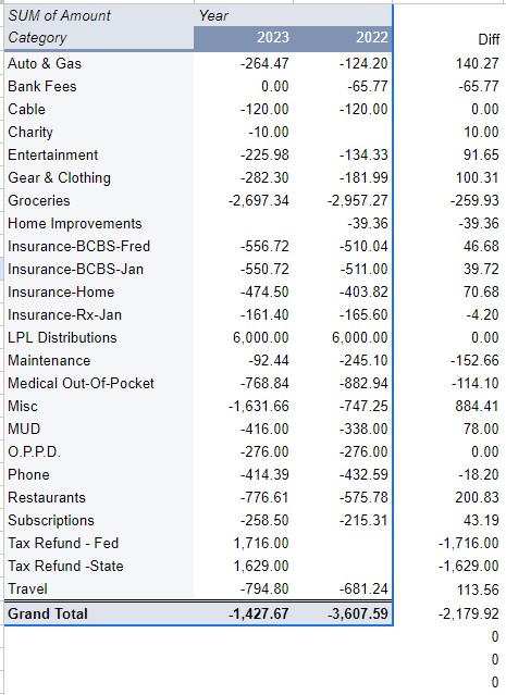 Pivot Table Example