Bar graphs are powerful tools for data visualization, but can I use a bar graph to compare percentages effectively? Absolutely! Bar graphs provide a clear and intuitive way to represent and compare percentages, making them ideal for a wide range of applications. At COMPARE.EDU.VN, we understand the importance of presenting data in an understandable format. Leveraging bar graphs for percentage comparisons helps in quickly identifying trends, differences, and key insights. For comprehensive guides and tools, explore data visualization techniques to ensure accurate and impactful data representation.
1. Understanding Bar Graphs for Percentage Comparison
1.1 What is a Bar Graph?
A bar graph, also known as a bar chart, is a visual representation of data that uses rectangular bars to compare different categories or groups. The length or height of each bar corresponds to the value it represents, making it easy to compare magnitudes at a glance.
1.2 How Bar Graphs Represent Percentages
When using bar graphs to compare percentages, each bar represents a category, and the length of the bar corresponds to the percentage value. This visual format allows viewers to quickly understand the relative proportions of different categories, making it ideal for presenting survey results, market share data, or any other information where percentages are significant.
1.3 Key Advantages of Using Bar Graphs for Percentages
- Clarity: Bar graphs provide a clear and straightforward way to visualize percentage data.
- Comparability: They make it easy to compare the relative sizes of different percentages.
- Accessibility: Bar graphs are generally easy for a broad audience to understand, even without a strong background in statistics.
- Versatility: They can be adapted to display various types of percentage data, including stacked percentages and grouped percentages.
2. Types of Bar Graphs for Comparing Percentages
2.1 Simple Bar Graphs
Simple bar graphs are the most basic type, where each bar represents a single percentage value. These are best used when comparing a small number of categories.
 Simple Bar Graph Example
2.2 Stacked Bar Graphs
Stacked bar graphs display the composition of a category by dividing the bar into segments, each representing a different percentage. These are useful for showing how a total percentage is broken down into its constituent parts.
2.3 Grouped Bar Graphs
Grouped bar graphs, also known as clustered bar graphs, display multiple bars side-by-side for each category, allowing for comparison of different subgroups within each category. This type is effective when you want to compare multiple dimensions of percentage data.
3. Best Practices for Creating Effective Bar Graphs for Percentages
3.1 Choosing the Right Type of Bar Graph
Select the bar graph type that best fits your data and the message you want to convey. Simple bar graphs are suitable for basic comparisons, while stacked and grouped bar graphs offer more detailed insights.
3.2 Labeling and Axis Scaling
- Clear Labels: Ensure all bars and axes are clearly labeled with descriptive titles and units.
- Appropriate Scaling: Choose a scale that accurately represents the data and avoids misleading interpretations. Start the y-axis at zero to prevent exaggerating differences.
3.3 Color and Design Considerations
- Color Coding: Use color to distinguish different categories, but avoid using too many colors, which can make the graph confusing.
- Clean Design: Keep the design simple and uncluttered, focusing on the data rather than excessive visual elements.
- Accessibility: Ensure the graph is accessible to all viewers by using high-contrast colors and clear fonts.
3.4 Providing Context and Explanations
Include a title that accurately describes the data being presented and provide additional context or explanations in the form of captions or annotations to help viewers understand the key takeaways.
4. Common Mistakes to Avoid When Using Bar Graphs for Percentages
4.1 Misleading Scaling
Starting the y-axis at a value other than zero can exaggerate differences between percentages, leading to misinterpretations. Always start the y-axis at zero unless there is a specific reason to do otherwise, and clearly indicate the scale being used.
4.2 Overcomplicating the Graph
Adding too many categories or visual elements can make the graph difficult to read and understand. Focus on presenting the most important data and keep the design clean and simple.
4.3 Ignoring Data Integrity
Ensure that the data used to create the bar graph is accurate and reliable. Double-check your calculations and sources to avoid presenting misleading information.
4.4 Not Providing Enough Context
Failing to provide sufficient context or explanations can leave viewers confused about the meaning of the data. Always include a clear title, labels, and any necessary annotations to help viewers understand the key takeaways.
5. Real-World Examples of Bar Graphs for Percentage Comparison
5.1 Market Share Analysis
Bar graphs are commonly used to compare the market share of different companies or products. Each bar represents a company or product, and the length of the bar corresponds to its market share percentage.
5.2 Survey Results
Bar graphs are an effective way to present the results of surveys, where each bar represents a different response option, and the length of the bar corresponds to the percentage of respondents who selected that option.
5.3 Demographic Data
Bar graphs can be used to compare demographic data, such as the percentage of males and females in a population, or the percentage of people in different age groups.
5.4 Website Traffic Sources
Bar graphs can illustrate the percentage of website traffic coming from various sources, such as search engines, social media, or direct referrals.
6. Advanced Techniques for Enhancing Bar Graphs
6.1 Adding Error Bars
Error bars can be added to bar graphs to indicate the uncertainty or variability in the data. This is particularly useful when presenting data from samples or experiments.
6.2 Using Annotations and Callouts
Annotations and callouts can be used to highlight specific data points or trends in the bar graph. This can help draw viewers’ attention to important insights.
6.3 Interactive Bar Graphs
Interactive bar graphs allow viewers to explore the data in more detail by hovering over bars to see exact values or drill down into subgroups. This can enhance engagement and provide a more comprehensive understanding of the data.
7. Tools and Software for Creating Bar Graphs
7.1 Microsoft Excel
Microsoft Excel is a widely used spreadsheet program that offers a range of charting tools, including bar graphs. It is a versatile option for creating basic and intermediate-level bar graphs.
7.2 Google Sheets
Google Sheets is a free, web-based spreadsheet program that also includes charting tools. It is a convenient option for creating and sharing bar graphs online.
7.3 Tableau
Tableau is a powerful data visualization tool that offers advanced charting capabilities, including interactive bar graphs. It is a popular choice for professionals who need to create sophisticated visualizations.
7.4 Other Specialized Software
Other specialized software options for creating bar graphs include:
- Power BI: Microsoft’s business analytics service.
- D3.js: A JavaScript library for creating custom data visualizations.
- R: A programming language and environment for statistical computing and graphics.
8. Optimizing Bar Graphs for Different Audiences
8.1 Tailoring for Technical Audiences
When presenting bar graphs to technical audiences, focus on providing detailed data and statistical analysis. Include error bars, confidence intervals, and other relevant metrics.
8.2 Simplifying for General Audiences
When presenting bar graphs to general audiences, simplify the design and focus on conveying the key takeaways in a clear and concise manner. Avoid using jargon or technical terms.
8.3 Customizing for Specific Industries
Customize the bar graph to reflect the specific conventions and standards of the industry you are working in. Use appropriate terminology and visual elements.
9. Case Studies: Successful Use of Bar Graphs for Percentage Comparisons
9.1 Political Polling
Bar graphs are frequently used in political polling to compare the percentage of voters who support different candidates or parties.
9.2 Business Performance Reporting
Businesses use bar graphs to track and compare key performance indicators (KPIs), such as sales growth, customer satisfaction, or market share.
9.3 Scientific Research
Researchers use bar graphs to present the results of experiments, comparing the percentage of subjects who experienced a particular outcome in different treatment groups.
10. Future Trends in Bar Graph Visualization
10.1 Interactive and Dynamic Bar Graphs
Future trends in bar graph visualization include the increasing use of interactive and dynamic elements, allowing viewers to explore the data in more detail.
10.2 Integration with Big Data Platforms
Bar graphs are increasingly being integrated with big data platforms, allowing users to visualize and analyze large datasets in real time.
10.3 Enhanced Accessibility Features
Future bar graphs will incorporate enhanced accessibility features, making them easier to use for people with disabilities. This includes features such as screen reader compatibility and alternative text descriptions.
10.4 Artificial Intelligence and Machine Learning Applications
AI and machine learning are being used to automate the creation of bar graphs and to identify patterns and insights in the data.
11. Common Use Cases for Bar Graphs in Data Analysis
11.1 Sales Performance Comparison
Bar graphs are instrumental in comparing the sales performance of different products, regions, or sales representatives over a specific period. This visualization helps identify top performers and areas needing improvement.
11.2 Customer Satisfaction Surveys
In customer satisfaction surveys, bar graphs effectively display the percentage of customers who rate their experience as excellent, good, fair, or poor. This representation aids in understanding overall satisfaction levels and pinpointing specific issues.
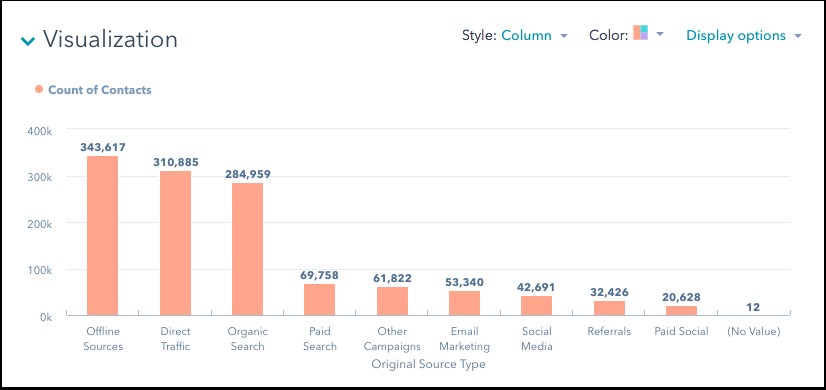
11.3 Website Analytics Reporting
Bar graphs in website analytics reports showcase the percentage of website traffic originating from various sources like organic search, direct traffic, social media, and referral links. This helps optimize marketing strategies by focusing on the most effective channels.
11.4 Inventory Management
For inventory management, bar graphs can compare the percentage of stock levels for different products, highlighting items that are overstocked or understocked. This ensures efficient inventory control and prevents stockouts.
11.5 Budget Allocation Analysis
Bar graphs are useful in budget allocation analysis, illustrating the percentage of funds allocated to different departments or projects within an organization. This helps in assessing whether resources are being distributed effectively and making necessary adjustments.
12. The Role of Color in Enhancing Bar Graph Clarity
12.1 Consistent Color Coding
Using consistent color coding for different categories throughout multiple bar graphs helps viewers quickly associate colors with specific data, enhancing comprehension and reducing cognitive load.
12.2 Strategic Use of Highlighting
Highlighting specific bars with contrasting colors can draw attention to significant data points or outliers, making key insights more prominent and memorable.
12.3 Avoiding Color Overload
Limiting the number of colors used in a bar graph prevents visual clutter and ensures that the graph remains easy to interpret. Using a muted color palette or varying shades of a single color can also improve clarity.
12.4 Addressing Color Blindness
When designing bar graphs, it is crucial to consider viewers with color blindness. Using colorblind-friendly palettes or incorporating patterns and labels can ensure that the information is accessible to everyone.
13. Integrating Bar Graphs with Other Visualization Techniques
13.1 Combining Bar Graphs with Line Charts
Combining bar graphs with line charts can provide a more comprehensive view of data trends. For example, a bar graph might show the percentage of sales from different product categories, while a line chart tracks the overall sales growth over time.
13.2 Using Bar Graphs with Pie Charts
Integrating bar graphs with pie charts allows for both detailed and holistic data representation. A pie chart can illustrate the overall distribution of percentages, while a bar graph provides a more granular comparison of individual categories.
13.3 Incorporating Bar Graphs in Dashboards
Incorporating bar graphs in dashboards alongside other visualizations like scatter plots and heatmaps provides a dynamic and interactive way to monitor key performance indicators and identify trends in real-time.
13.4 Complementing Bar Graphs with Tables
Complementing bar graphs with tables allows viewers to examine exact numerical values alongside visual representations. This combination provides a balance between quick insights and detailed data analysis.
14. How to Choose the Right Bar Graph Style for Your Data
14.1 Understanding the Purpose of Your Visualization
Clearly defining the purpose of your visualization helps determine the most appropriate bar graph style. Are you aiming to compare categories, show distribution, or highlight trends?
14.2 Assessing the Number of Categories
The number of categories you need to represent influences your choice of bar graph style. Simple bar graphs work best for a few categories, while grouped or stacked bar graphs are suitable for more complex datasets.
14.3 Considering the Complexity of Your Data
The complexity of your data, including the number of variables and subgroups, impacts the choice of bar graph style. Stacked bar graphs are effective for showing how a total is divided, while grouped bar graphs allow for comparing multiple variables within each category.
14.4 Accounting for Audience Needs
Tailoring the bar graph style to your audience’s level of expertise ensures that the visualization is accessible and easy to understand. Simplify complex graphs for general audiences and provide detailed analysis for technical audiences.
15. Optimizing Bar Graphs for Mobile Viewing
15.1 Responsive Design Principles
Implementing responsive design principles ensures that bar graphs adapt seamlessly to different screen sizes, providing an optimal viewing experience on mobile devices.
15.2 Simplified Visual Elements
Simplifying visual elements, such as reducing the number of categories and using clear labels, prevents clutter and enhances readability on smaller screens.
15.3 Interactive Features for Data Exploration
Incorporating interactive features, such as touch-enabled tooltips and zoom capabilities, allows mobile users to explore data in more detail without sacrificing usability.
15.4 Performance Optimization for Quick Loading
Optimizing bar graphs for performance, including minimizing file sizes and using efficient rendering techniques, ensures quick loading times and a smooth user experience on mobile devices.
16. Ethical Considerations When Presenting Data with Bar Graphs
16.1 Avoiding Data Manipulation
Presenting data accurately and avoiding manipulation, such as cherry-picking data points or using misleading scales, is crucial for maintaining transparency and credibility.
16.2 Providing Full Context
Providing full context, including data sources, methodologies, and potential limitations, helps viewers interpret the information correctly and make informed decisions.
16.3 Being Aware of Potential Biases
Being aware of potential biases in the data and acknowledging them transparently prevents misrepresentation and promotes objectivity.
16.4 Ensuring Accessibility and Inclusivity
Ensuring accessibility and inclusivity by using colorblind-friendly palettes and providing alternative text descriptions makes bar graphs usable for all viewers, regardless of their abilities.
17. The Impact of Data Storytelling on Bar Graph Effectiveness
17.1 Crafting a Clear Narrative
Crafting a clear narrative around your bar graph helps viewers understand the significance of the data and connect with the story you are telling.
17.2 Highlighting Key Insights
Highlighting key insights and takeaways using annotations and callouts makes the main message more memorable and actionable.
17.3 Engaging the Audience
Engaging the audience by using relatable examples and compelling visuals enhances their understanding and encourages them to explore the data further.
17.4 Using Data to Support Your Argument
Using data to support your argument and provide evidence-based insights strengthens your credibility and persuades viewers to accept your conclusions.
18. Measuring the Success of Your Bar Graphs
18.1 Tracking Engagement Metrics
Tracking engagement metrics, such as the number of views, shares, and comments, helps you assess the impact of your bar graphs and identify areas for improvement.
18.2 Gathering Feedback from Your Audience
Gathering feedback from your audience through surveys and discussions provides valuable insights into their understanding and satisfaction with your visualizations.
18.3 Assessing Data Accuracy and Reliability
Assessing data accuracy and reliability ensures that your bar graphs are based on solid foundations and provide trustworthy information.
18.4 Evaluating Actionable Insights
Evaluating whether your bar graphs lead to actionable insights and inform decision-making helps you measure their effectiveness and justify the investment in data visualization.
19. How to Use Bar Graphs to Identify Trends and Patterns
19.1 Analyzing Data Over Time
Analyzing data over time using bar graphs can reveal trends and patterns that are not immediately apparent. This is especially useful for tracking changes in sales, customer satisfaction, or website traffic.
19.2 Comparing Different Categories
Comparing different categories within a bar graph can highlight significant differences and similarities, helping you identify areas of strength and weakness.
19.3 Identifying Outliers
Identifying outliers, or data points that deviate significantly from the norm, can provide valuable insights into unusual events or anomalies that require further investigation.
19.4 Looking for Correlations
Looking for correlations between different variables in a bar graph can reveal relationships that might not be obvious. This can help you understand the underlying factors driving your data.
20. Maximizing the Impact of Bar Graphs in Presentations
20.1 Keeping It Simple
Keeping your bar graphs simple and uncluttered ensures that your audience can quickly grasp the key takeaways without being overwhelmed.
20.2 Using Clear and Concise Labels
Using clear and concise labels helps your audience understand the data without having to decipher complicated terminology.
20.3 Highlighting Key Findings
Highlighting key findings with annotations and callouts makes the most important information stand out and ensures that your audience remembers the main points.
20.4 Telling a Story
Telling a story with your bar graphs helps your audience connect with the data on an emotional level and makes your presentation more engaging and memorable.
21. Using Bar Graphs for Competitive Analysis
21.1 Comparing Market Share
Bar graphs are effective for comparing the market share of different companies or products, providing a clear visual representation of competitive positioning.
21.2 Analyzing Sales Performance
Analyzing sales performance using bar graphs allows you to compare your company’s results with those of your competitors, identifying areas where you are outperforming or underperforming.
21.3 Assessing Customer Satisfaction
Assessing customer satisfaction using bar graphs helps you compare your company’s satisfaction ratings with those of your competitors, identifying areas where you can improve customer service.
21.4 Benchmarking Key Metrics
Benchmarking key metrics using bar graphs allows you to compare your company’s performance against industry standards and identify areas where you can improve efficiency.
22. The Importance of Data Accuracy in Bar Graph Creation
22.1 Verifying Data Sources
Verifying data sources ensures that the information used to create bar graphs is accurate and reliable, preventing misleading visualizations.
22.2 Double-Checking Calculations
Double-checking calculations, such as percentages and averages, ensures that the data is correctly represented in the bar graph.
22.3 Avoiding Cherry-Picking Data
Avoiding cherry-picking data, or selectively choosing data points to support a particular argument, ensures that the bar graph presents a balanced and objective view of the information.
22.4 Ensuring Data Integrity
Ensuring data integrity throughout the bar graph creation process, from data collection to visualization, is crucial for maintaining credibility and making informed decisions.
23. Customizing Bar Graphs for Different Reporting Needs
23.1 Tailoring for Executive Summaries
Tailoring bar graphs for executive summaries involves simplifying the visualization and focusing on the most important takeaways, providing a quick and concise overview of the data.
23.2 Optimizing for Detailed Reports
Optimizing bar graphs for detailed reports involves providing more granular data and statistical analysis, allowing viewers to explore the information in depth.
23.3 Adapting for Presentations
Adapting bar graphs for presentations involves using clear labels, highlighting key findings, and telling a story with the data to engage and inform the audience.
23.4 Formatting for Online Publication
Formatting bar graphs for online publication involves ensuring that the visualizations are responsive, accessible, and optimized for quick loading, providing a seamless user experience.
24. The Role of Bar Graphs in Decision-Making Processes
24.1 Providing Visual Insights
Bar graphs provide visual insights into complex data, making it easier for decision-makers to understand trends, patterns, and relationships.
24.2 Supporting Data-Driven Decisions
Supporting data-driven decisions by providing evidence-based insights helps organizations make more informed and effective choices.
24.3 Facilitating Communication
Facilitating communication by providing clear and concise visualizations helps stakeholders understand the data and participate in the decision-making process.
24.4 Enabling Strategic Planning
Enabling strategic planning by providing insights into key performance indicators and market trends helps organizations develop effective strategies for achieving their goals.
25. Leveraging COMPARE.EDU.VN for Effective Data Visualization
At COMPARE.EDU.VN, we understand the power of effective data visualization in making informed decisions. Whether you’re comparing products, services, or ideas, presenting data clearly is crucial. Bar graphs are just one of the many tools we utilize to help you understand complex information at a glance.
25.1 Discovering Comprehensive Comparisons
COMPARE.EDU.VN offers comprehensive comparisons of various products and services, utilizing bar graphs to present data in a clear and accessible format. This enables users to easily compare features, prices, and customer reviews, empowering them to make well-informed decisions.
25.2 Utilizing Clear and Concise Visualizations
Our platform ensures that all bar graphs and visualizations are clear, concise, and easy to understand. We focus on presenting data in a way that is accessible to users of all backgrounds, regardless of their expertise in data analysis.
25.3 Accessing Expert Insights
COMPARE.EDU.VN provides access to expert insights and analysis, helping users interpret the data presented in our bar graphs and make informed decisions based on reliable information.
25.4 Empowering Informed Choices
By leveraging COMPARE.EDU.VN, you can empower yourself to make informed choices and optimize your decisions based on clear, concise, and reliable data visualizations.
Ready to make smarter decisions? Visit COMPARE.EDU.VN today to explore our comprehensive comparisons and discover how bar graphs and other visualizations can help you make the right choice.
Contact us:
Address: 333 Comparison Plaza, Choice City, CA 90210, United States
Whatsapp: +1 (626) 555-9090
Website: compare.edu.vn
FAQ: Using Bar Graphs to Compare Percentages
Q1: Can bar graphs effectively display percentages?
Yes, bar graphs are highly effective for displaying percentages. They provide a clear visual representation, making it easy to compare proportions across different categories. The length of each bar corresponds to the percentage value, offering an immediate understanding of relative sizes.
Q2: What is the difference between a simple and a stacked bar graph for percentages?
A simple bar graph represents each category with a single bar, suitable for basic comparisons. A stacked bar graph, on the other hand, divides each bar into segments, each representing a different percentage contribution to the total. Stacked bar graphs are useful for showing how a total percentage is broken down into its constituent parts.
Q3: When should I use a grouped bar graph instead of a stacked bar graph for percentages?
Use a grouped bar graph, also known as a clustered bar graph, when you want to compare multiple dimensions of percentage data across different categories. Grouped bar graphs display multiple bars side-by-side for each category, allowing for easy comparison of subgroups within each category.
Q4: How do I ensure my bar graph is not misleading when comparing percentages?
To avoid misleading interpretations, always start the y-axis at zero to prevent exaggerating differences between percentages. Clearly label all bars and axes with descriptive titles and units, and provide additional context or explanations to help viewers understand the key takeaways.
Q5: What software can I use to create bar graphs for percentage comparisons?
There are several software options available, including Microsoft Excel, Google Sheets, Tableau, and Power BI. Microsoft Excel and Google Sheets are versatile options for creating basic and intermediate-level bar graphs, while Tableau and Power BI offer advanced charting capabilities for more sophisticated visualizations.
Q6: How can I optimize my bar graph for mobile viewing?
To optimize bar graphs for mobile viewing, implement responsive design principles to ensure they adapt seamlessly to different screen sizes. Simplify visual elements, use interactive features like touch-enabled tooltips, and optimize performance for quick loading times.
Q7: What ethical considerations should I keep in mind when presenting data with bar graphs?
When presenting data with bar graphs, avoid data manipulation by presenting data accurately and avoiding selective data points. Provide full context, be aware of potential biases, and ensure accessibility by using colorblind-friendly palettes and providing alternative text descriptions.
Q8: How can data storytelling enhance the effectiveness of my bar graphs?
Data storytelling can enhance the effectiveness of your bar graphs by crafting a clear narrative around the data, highlighting key insights, engaging the audience with relatable examples, and using data to support your arguments, making the information more memorable and actionable.
Q9: How do I measure the success of my bar graphs in conveying information?
Measure the success of your bar graphs by tracking engagement metrics like views, shares, and comments, gathering feedback from your audience, assessing data accuracy and reliability, and evaluating whether the visualizations lead to actionable insights and inform decision-making.
Q10: Can I use bar graphs to compare percentages in competitive analysis?
Yes, bar graphs are highly effective for competitive analysis. They can be used to compare market share, analyze sales performance, assess customer satisfaction, and benchmark key metrics, providing a clear visual representation of competitive positioning.