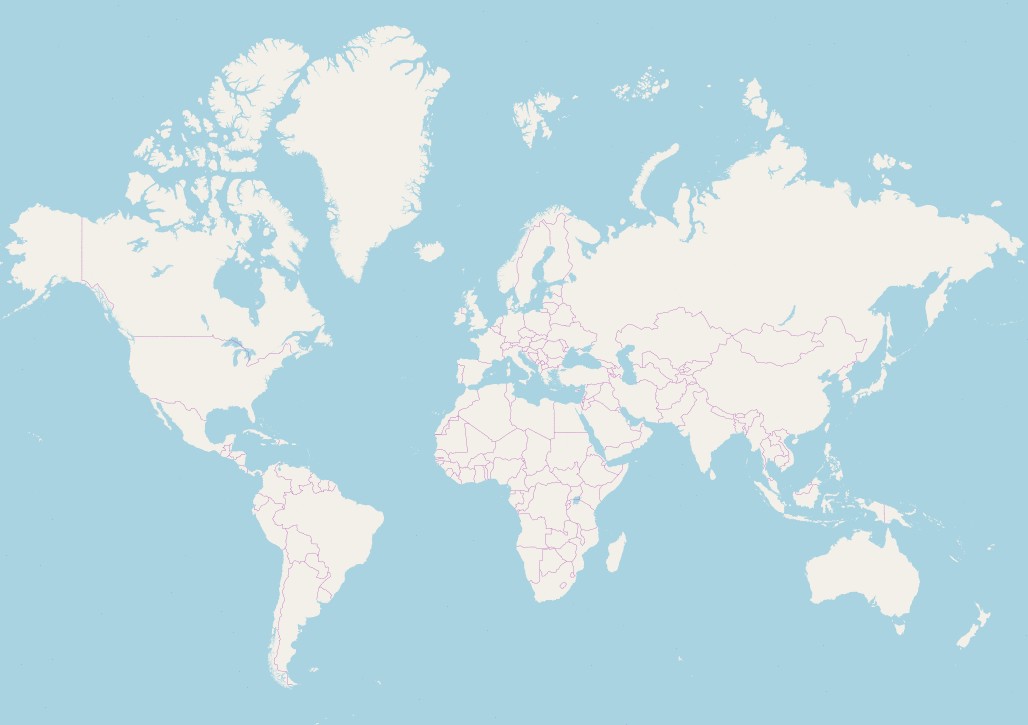
Have you ever looked at a standard world map and wondered about the real sizes of countries? Many maps visually suggest that Greenland and Africa are comparable in size, even appearing to have similar shapes. This common perception, however, drastically misrepresents reality. Which landmass is actually larger? The answer might surprise you and highlight the distortions inherent in typical world maps.
The truth is, Africa is vastly larger than Greenland. The African continent’s landmass is approximately 30,365,000 square kilometers, dwarfing the island of Greenland, which measures around 2,166,000 square kilometers. To put it into perspective, Africa is more than 14 times larger than Greenland! In fact, Africa’s expansive area exceeds the combined landmass of the United States, China, India, Japan, and Europe. The sheer scale of this difference is often lost when viewing traditional world maps.
To truly grasp the size disparity, visualizing Greenland superimposed onto Africa is incredibly effective. This comparison clearly illustrates the immense scale of the African continent and how relatively small Greenland is in reality.
The Map Deception: Understanding Mercator Projection
So, why does Greenland appear so large on many world maps? The culprit is the commonly used Mercator projection. This type of map projection, while useful for navigation due to its preservation of angles and shapes locally, significantly distorts areas, especially towards the poles. When projecting the spherical Earth onto a flat, two-dimensional surface, landmasses at higher latitudes, like Greenland, are stretched and exaggerated in size. This distortion leads to a misleading visual comparison of sizes, particularly when comparing regions at different latitudes.
Discovering True Sizes: Tools for Accurate Comparison
To gain a more accurate understanding of the true sizes of countries and continents, consider exploring alternative resources. Physical globes offer a spherical representation of the Earth, minimizing area distortion and providing a more faithful depiction of relative sizes. Digitally, Google Maps offers a “globe view” setting, which similarly presents a spherical perspective, correcting the distortions present in flat map projections.
Furthermore, websites like The True Size of are invaluable tools. These platforms allow you to drag and drop countries onto a map to see their true relative sizes, regardless of latitude. Experimenting with such tools can dramatically change your perception of global geography and provide a clearer understanding of the real scale of our world.
In conclusion, while world maps are essential tools, it’s crucial to recognize their inherent distortions. Greenland, though appearing substantial on Mercator projection maps, is dwarfed by the vast continent of Africa. By utilizing globes, Google Maps’ globe view, and resources like The True Size Of website, we can move beyond map-based misconceptions and appreciate the accurate proportions of our planet’s landmasses.