Comparing two dates in Tableau involves creating parameters, calculated fields, and utilizing date functions to analyze data across different time periods. COMPARE.EDU.VN provides comprehensive guides and resources to simplify this process, helping you gain meaningful insights. Master date comparisons in Tableau using parameters, calculated fields, and date functions for insightful data analysis, exploring comparative analytics and data visualization techniques to effectively present your findings.
1. Understanding the Need for Date Comparisons in Tableau
Date comparisons are vital for analyzing trends, performance, and changes over time. Whether you’re tracking sales growth, monitoring marketing campaign effectiveness, or evaluating operational efficiency, comparing dates allows you to identify patterns and make data-driven decisions.
1.1. Why Date Comparisons Matter
Date comparisons enable businesses to:
- Track Performance Trends: Identify increases or decreases in key metrics over specific periods.
- Evaluate Campaign Effectiveness: Determine the impact of marketing campaigns by comparing pre- and post-campaign data.
- Monitor Operational Efficiency: Assess improvements or declines in operational processes by comparing data across different timeframes.
- Forecast Future Performance: Use historical trends to predict future outcomes and plan accordingly.
- Identify Seasonal Patterns: Recognize recurring patterns that occur at specific times of the year.
1.2. Common Use Cases for Date Comparisons
- Sales Analysis: Comparing sales figures from this quarter to the previous quarter or the same quarter last year.
- Marketing Analytics: Evaluating the performance of a marketing campaign by comparing website traffic before and after its launch.
- Financial Reporting: Analyzing financial performance by comparing revenue, expenses, and profits across different periods.
- Customer Behavior Analysis: Understanding changes in customer behavior by comparing purchase patterns over time.
- Healthcare Analytics: Monitoring patient outcomes by comparing data from different treatment periods.
2. Setting Up Your Tableau Workspace
Before diving into date comparisons, ensure your Tableau workspace is properly set up with the necessary data and fields. This involves connecting to your data source, understanding your data structure, and creating the basic fields needed for date comparisons.
2.1. Connecting to Your Data Source
Tableau supports a wide range of data sources, including Excel spreadsheets, databases (SQL Server, MySQL, PostgreSQL), cloud services (Amazon Redshift, Google BigQuery), and more.
Steps to Connect:
- Open Tableau and select the desired data source from the “Connect” pane.
- Enter the necessary credentials and connection details.
- Choose the specific table or data source you want to analyze.
- Tableau will import the data, allowing you to view and manipulate the fields.
2.2. Understanding Your Data Structure
It’s crucial to understand the structure of your data, including the date fields, measures, and dimensions. Ensure your date fields are properly formatted and recognized as dates by Tableau.
Key Data Elements:
- Date Fields: Fields containing date information, such as order date, ship date, or transaction date.
- Measures: Numerical values that you want to analyze, such as sales, profit, or quantity.
- Dimensions: Categorical fields that provide context to your measures, such as product category, customer segment, or region.
2.3. Creating Basic Fields
Before performing date comparisons, create the necessary fields in Tableau. This may involve calculating new fields or transforming existing ones to facilitate the comparison process.
Example Fields:
- Sales Amount: A measure representing the total sales value.
- Order Date: A date field indicating when the order was placed.
- Product Category: A dimension categorizing the products being sold.
3. Using Parameters for Dynamic Date Selection
Parameters allow users to interactively select dates or date ranges for comparison, making your dashboards more flexible and user-friendly. This section covers creating and using parameters for dynamic date selection in Tableau.
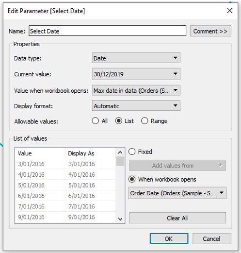
3.1. Creating a Date Parameter
To create a date parameter:
- In the “Data” pane, click the dropdown arrow and select “Create Parameter.”
- Name the parameter (e.g., “Select Date”).
- Set the data type to “Date.”
- Choose a default value or set the allowable values to “All,” “Range,” or “List.”
- Click “OK” to create the parameter.
3.2. Creating a Date Range Parameter
For comparing data between two dates, you’ll need two date parameters:
- Create a parameter for the start date (e.g., “Start Date”).
- Create another parameter for the end date (e.g., “End Date”).
- Set both data types to “Date.”
- Configure the allowable values as needed.
3.3. Displaying the Parameter Control
To enable users to interact with the parameter:
- Right-click on the parameter in the “Data” pane.
- Select “Show Parameter Control.”
- The parameter control will appear on the view, allowing users to select a date.
3.4. Using the Parameter in a Calculated Field
You can use the date parameter in a calculated field to filter data based on the user’s selection.
Example Calculation:
[Order Date] = [Select Date]This calculation returns “True” if the order date matches the selected date and “False” otherwise. You can then use this field to filter your data.
4. Creating Calculated Fields for Date Comparisons
Calculated fields are essential for performing date comparisons in Tableau. They allow you to create custom logic for comparing dates and deriving meaningful insights.
4.1. Comparing Dates to a Fixed Date
To compare dates to a fixed date:
- Create a calculated field.
- Use the
IFfunction to compare the date field to the fixed date.
Example Calculation:
IF [Order Date] <= #2023-12-31# THEN "Before 2024" ELSE "After 2023" ENDThis calculation categorizes orders as “Before 2024” or “After 2023” based on their order date.
4.2. Comparing Dates to a Parameter Date
To compare dates to a date selected by a parameter:
- Create a calculated field.
- Use the
IFfunction to compare the date field to the parameter date.
Example Calculation:
IF [Order Date] <= [Select Date] THEN "Before Selected Date" ELSE "After Selected Date" ENDThis calculation categorizes orders based on whether they occurred before or after the date selected in the “Select Date” parameter.
4.3. Comparing Dates Within a Date Range
To compare dates within a specified date range:
- Create a calculated field.
- Use the
ANDoperator to ensure the date falls within the start and end dates.
Example Calculation:
IF [Order Date] >= [Start Date] AND [Order Date] <= [End Date] THEN "Within Range" ELSE "Outside Range" ENDThis calculation identifies orders that fall within the date range specified by the “Start Date” and “End Date” parameters.
5. Using Date Functions for Advanced Comparisons
Tableau provides a variety of date functions that enable you to perform advanced date comparisons and calculations. These functions allow you to extract specific parts of a date, calculate date differences, and perform other date-related operations.
5.1. Extracting Date Parts
The DATEPART function extracts a specific part of a date, such as the year, month, day, or quarter.
Example:
DATEPART('year', [Order Date])This calculation extracts the year from the “Order Date” field.
Use Cases:
- Analyzing Trends by Year: Extract the year to analyze sales trends over multiple years.
- Grouping Data by Month: Extract the month to group data and compare monthly performance.
- Identifying Day of Week Patterns: Extract the day of the week to identify patterns in customer behavior.
5.2. Calculating Date Differences
The DATEDIFF function calculates the difference between two dates in a specified unit, such as days, weeks, months, or years.
Example:
DATEDIFF('day', [Order Date], TODAY())This calculation determines the number of days between the “Order Date” and the current date.
Use Cases:
- Measuring Time to Delivery: Calculate the difference between the order date and the delivery date to measure delivery time.
- Tracking Customer Engagement: Calculate the time since a customer’s last purchase to track engagement.
- Analyzing Project Timelines: Calculate the difference between project start and end dates to analyze project timelines.
5.3. Adding or Subtracting Dates
The DATEADD function adds a specified interval to a date.
Example:
DATEADD('month', 3, [Order Date])This calculation adds three months to the “Order Date.”
Use Cases:
- Projecting Future Dates: Add time to a start date to project future deadlines.
- Calculating Renewal Dates: Add a year to a contract date to calculate renewal dates.
- Analyzing Trends Over Time: Shift dates to compare trends from different periods.
5.4. Truncating Dates
The DATETRUNC function truncates a date to a specified level of detail, such as year, quarter, month, or day.
Example:
DATETRUNC('month', [Order Date])This calculation truncates the “Order Date” to the beginning of the month.
Use Cases:
- Grouping Data by Time Period: Truncate dates to group data by month, quarter, or year.
- Comparing Data Across Periods: Truncate dates to compare performance across different time periods.
- Creating Time Series Analysis: Truncate dates to create a time series for analyzing trends over time.
6. Advanced Date Comparison Techniques
Beyond basic date comparisons, Tableau offers advanced techniques to handle more complex scenarios. This section explores techniques such as comparing to previous periods, calculating running totals, and creating cohort analyses.
6.1. Comparing to Previous Periods
Comparing data to the previous period (e.g., previous month, quarter, or year) is a common requirement for performance analysis.
Steps:
- Create a calculated field to determine the date for the previous period.
- Use the
LOOKUPfunction to retrieve the value from the previous period. - Calculate the difference or percentage change between the current and previous periods.
Example Calculation:
LOOKUP(SUM([Sales]), -1)This calculation retrieves the sales value from the previous period.
6.2. Calculating Running Totals
Running totals, also known as cumulative sums, are useful for visualizing the accumulation of a measure over time.
Steps:
- Drag the measure to the view.
- Right-click on the measure and select “Add Table Calculation.”
- Choose “Running Total” as the calculation type.
- Configure the calculation to restart at the desired level of detail.
Use Cases:
- Tracking Cumulative Sales: Visualize the total sales accumulated over time.
- Monitoring Project Progress: Track the cumulative progress of a project.
- Analyzing Customer Growth: Monitor the cumulative number of new customers acquired over time.
6.3. Creating Cohort Analyses
Cohort analysis involves grouping customers or users based on a shared characteristic, such as the month they joined or made their first purchase, and then tracking their behavior over time.
Steps:
- Create a calculated field to determine the cohort for each customer or user.
- Create a calculated field to determine the time since the cohort’s start date.
- Visualize the behavior of each cohort over time.
Use Cases:
- Analyzing Customer Retention: Track the percentage of customers who continue to make purchases over time.
- Evaluating Marketing Campaign Performance: Compare the behavior of customers acquired through different marketing campaigns.
- Understanding Product Adoption: Analyze how users adopt and use a product over time.
7. Visualizing Date Comparisons
Effective visualizations are crucial for communicating the insights derived from date comparisons. This section explores various visualization techniques to present your findings clearly and concisely.
7.1. Line Charts
Line charts are ideal for visualizing trends over time. They allow you to easily compare data across different periods and identify patterns and fluctuations.
Best Practices:
- Use clear and descriptive axis labels.
- Highlight key data points with annotations.
- Use different colors to distinguish between different series.
- Keep the chart clean and uncluttered.
7.2. Bar Charts
Bar charts are useful for comparing values across different categories or time periods. They provide a clear and straightforward way to present data.
Best Practices:
- Use consistent colors for the bars.
- Sort the bars to highlight the most important values.
- Add data labels to provide precise values.
- Use horizontal bar charts for long category labels.
7.3. Area Charts
Area charts are similar to line charts but fill the area below the line, making it easier to visualize the magnitude of the values over time.
Best Practices:
- Use transparent colors to avoid obscuring data.
- Stack area charts to show the composition of the data.
- Use a baseline to provide context for the values.
7.4. Heatmaps
Heatmaps use color to represent the magnitude of values in a matrix, making them useful for identifying patterns and correlations in large datasets.
Best Practices:
- Use a color scale that is easy to interpret.
- Use a limited number of colors to avoid overwhelming the viewer.
- Sort the rows and columns to highlight patterns.
7.5. Bullet Graphs
Bullet graphs are a variation of bar charts that provide additional context by displaying a target value and a performance range.
Best Practices:
- Use a clear and concise design.
- Use colors to represent different performance ranges.
- Add a marker to indicate the current value.
8. Best Practices for Date Comparisons in Tableau
To ensure accurate and meaningful date comparisons in Tableau, follow these best practices:
- Ensure Data Quality: Verify that your date fields are properly formatted and consistent.
- Use Parameters for Flexibility: Allow users to interactively select dates or date ranges.
- Create Clear and Concise Calculations: Use descriptive names for calculated fields and comments to explain the logic.
- Choose Appropriate Visualizations: Select visualizations that effectively communicate the insights derived from the date comparisons.
- Test and Validate Your Results: Ensure that your calculations and visualizations are accurate and reliable.
- Optimize Performance: Use efficient calculations and data filtering techniques to optimize dashboard performance.
9. Troubleshooting Common Issues
While performing date comparisons in Tableau, you may encounter common issues such as incorrect date formats, unexpected results, or performance problems. This section provides troubleshooting tips to address these issues.
9.1. Incorrect Date Formats
If your date fields are not recognized as dates by Tableau, you may need to change their data type or format.
Solutions:
- Right-click on the date field in the “Data” pane.
- Select “Change Data Type” and choose “Date” or “Date & Time.”
- If the date format is not recognized, use the
DATEPARSEfunction to convert it to a valid date format.
9.2. Unexpected Results
If your date comparisons are not producing the expected results, double-check your calculations and filters.
Solutions:
- Review the logic of your calculated fields to ensure they are correct.
- Verify that your filters are applied correctly and are not excluding data.
- Use the “View Data” option to inspect the underlying data and identify any discrepancies.
9.3. Performance Problems
If your dashboards are running slowly, optimize your calculations and data filtering techniques.
Solutions:
- Use efficient calculations and avoid complex formulas.
- Filter your data to reduce the amount of data being processed.
- Use extracts to improve performance.
- Optimize your data source to improve query performance.
10. Case Studies: Real-World Date Comparison Examples
To illustrate the practical applications of date comparisons in Tableau, this section presents real-world case studies from various industries.
10.1. Sales Performance Analysis
A retail company uses Tableau to compare sales performance across different quarters and years. By creating parameters for date selection and using calculated fields to compare sales figures, the company can identify trends, track growth, and evaluate the effectiveness of marketing campaigns.
Key Visualizations:
- Line charts showing sales trends over time.
- Bar charts comparing sales across different product categories.
- Area charts visualizing the composition of sales by region.
10.2. Marketing Campaign Evaluation
A marketing agency uses Tableau to evaluate the performance of its campaigns by comparing website traffic before and after the launch. By creating date range parameters and using calculated fields to measure the change in traffic, the agency can determine the impact of its campaigns and optimize its strategies.
Key Visualizations:
- Line charts showing website traffic over time.
- Bar charts comparing traffic from different sources.
- Heatmaps identifying patterns in user behavior.
10.3. Financial Reporting
A financial institution uses Tableau to analyze its financial performance by comparing revenue, expenses, and profits across different periods. By creating calculated fields to perform year-over-year comparisons and using visualizations to present the results, the institution can gain insights into its financial health and make informed decisions.
Key Visualizations:
- Line charts showing revenue, expenses, and profits over time.
- Bar charts comparing financial performance across different business units.
- Bullet graphs displaying key performance indicators (KPIs).
11. Frequently Asked Questions (FAQ)
Q1: How do I compare sales from this month to last month in Tableau?
Create a calculated field using the DATEADD and SUM functions to compare the current month’s sales to the previous month’s sales. Use DATEADD('month', -1, TODAY()) to get last month’s date and compare sales using an IF statement.
Q2: Can I compare two different date fields in Tableau?
Yes, you can compare two different date fields using calculated fields. For instance, you can calculate the difference between the “Order Date” and “Ship Date” using the DATEDIFF function to measure shipping time.
Q3: How do I create a dynamic date range filter in Tableau?
Use parameters for the start and end dates, then create a calculated field that checks if a date falls within the parameter range. Show the parameter controls to allow users to adjust the date range dynamically.
Q4: What is the best way to visualize year-over-year growth in Tableau?
Use a line chart to plot sales for each year, then add a calculated field to show the year-over-year growth percentage. Color-code the lines to differentiate between years and highlight growth patterns.
Q5: How can I calculate the number of days between two dates in Tableau?
Use the DATEDIFF function with the ‘day’ parameter. For example, DATEDIFF('day', [Start Date], [End Date]) will return the number of days between the two dates.
Q6: How do I compare a selected date to the same date last year?
Create a parameter for the selected date, then use DATEADD('year', -1, [Selected Date Parameter]) in a calculated field to get the corresponding date from the previous year. Compare the values using an IF statement.
Q7: What date functions are available in Tableau?
Tableau offers a variety of date functions, including DATEPART, DATEDIFF, DATEADD, DATETRUNC, TODAY, NOW, and more. These functions allow you to manipulate and compare dates in various ways.
Q8: How do I group data by month in Tableau?
Use the DATETRUNC function to truncate the date to the month level. For example, DATETRUNC('month', [Order Date]) will group all orders by their respective months.
Q9: How can I handle null values when comparing dates in Tableau?
Use the IFNULL or ZN functions to handle null values. For instance, IFNULL([Date Field], TODAY()) will replace any null date values with the current date.
Q10: How do I optimize date calculations for large datasets in Tableau?
Use extracts, reduce the complexity of your calculations, and ensure your data types are correctly set. Indexing your date fields in the data source can also improve performance.
12. Resources and Further Learning
To deepen your understanding of date comparisons in Tableau, explore these resources:
- Tableau Help Documentation: Official documentation with detailed explanations and examples.
- Tableau Community Forums: Online forums where you can ask questions and share knowledge.
- Tableau Training Videos: Video tutorials covering various aspects of Tableau.
- COMPARE.EDU.VN: Comprehensive guides and resources for mastering Tableau and data analysis.
13. Conclusion: Mastering Date Comparisons in Tableau
Date comparisons are a fundamental aspect of data analysis in Tableau, enabling you to track trends, evaluate performance, and make data-driven decisions. By mastering the techniques and best practices outlined in this guide, you can unlock the full potential of Tableau and gain valuable insights from your data. Remember to leverage parameters, calculated fields, and date functions to perform advanced comparisons and visualize your findings effectively.
Ready to take your data analysis skills to the next level? Visit COMPARE.EDU.VN today to discover more comprehensive guides, resources, and tools for mastering Tableau and data analysis. Make informed decisions with confidence, backed by the power of insightful date comparisons and effective data visualization. Contact us at 333 Comparison Plaza, Choice City, CA 90210, United States, Whatsapp: +1 (626) 555-9090.
By utilizing the resources at compare.edu.vn, you can ensure that you are well-equipped to handle any data comparison challenge.