Data visualization is a crucial skill in today’s data-driven world. Choosing the right chart type can significantly impact how effectively you communicate insights. A type of chart used to compare data allows you to discern patterns, trends, and relationships within your datasets, leading to better decision-making. COMPARE.EDU.VN aims to provide you with a deep understanding of these charts and how to leverage them for maximum impact, offering a comprehensive exploration of comparison charts, data analysis and visual representation for better data insights.
1. Understanding the Essence of Data Visualization Charts
Data visualization charts translate raw data into visual representations, making complex information more accessible and understandable. They help identify trends, outliers, and relationships that might be missed in tabular data.
1.1 The Significance of Choosing the Right Chart
Selecting the appropriate chart type is critical. A well-chosen chart can clearly communicate insights, while an unsuitable one can obscure the data and mislead the audience.
1.2 Key Elements of Effective Data Visualization
Effective data visualization charts share common characteristics:
- Clarity: They are easy to understand and interpret.
- Accuracy: They accurately represent the underlying data.
- Efficiency: They convey information quickly and effectively.
- Relevance: They focus on the most important insights.
- Aesthetics: They are visually appealing and engaging.
2. Exploring Chart Types for Data Comparison
Several chart types are particularly effective for comparing data. Each has strengths and weaknesses, making them suitable for different scenarios.
2.1 Bar Charts: A Staple for Comparison
Bar charts are among the most versatile and widely used comparison charts. They display data as rectangular bars, with the length of each bar proportional to the value it represents.
- Vertical Bar Charts (Column Charts): Ideal for comparing values across different categories.
- Horizontal Bar Charts: Best suited for comparing categories with long names or when there are many categories.
- Stacked Bar Charts: Useful for showing the composition of each category while still allowing for comparison.
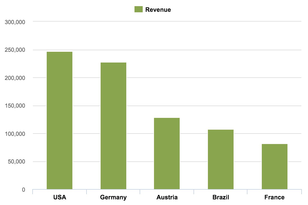 Vertical Bar Charts for comparison
2.2 Line Charts: Unveiling Trends Over Time
Line charts are excellent for visualizing trends and changes in data over a continuous period. They connect data points with lines, making it easy to see patterns and fluctuations.
- Single Line Charts: Show the trend of a single variable over time.
- Multiple Line Charts: Compare the trends of multiple variables over the same period.
2.3 Scatter Plots: Revealing Relationships Between Variables
Scatter plots display data points on a two-dimensional plane, with each point representing the values of two variables. They are useful for identifying correlations and clusters in data.
- Positive Correlation: Points tend to cluster along a line that slopes upward.
- Negative Correlation: Points tend to cluster along a line that slopes downward.
- No Correlation: Points are randomly scattered with no clear pattern.
2.4 Bubble Charts: Adding a Third Dimension
Bubble charts are similar to scatter plots, but they add a third dimension by varying the size of the data points (bubbles). This allows you to compare three variables simultaneously.
2.5 Radar Charts: Comparing Multiple Characteristics
Radar charts (also known as spider charts or star charts) display multiple variables on axes radiating from a central point. They are useful for comparing the characteristics of different items.
2.6 Box Plots: Summarizing Data Distribution
Box plots (also known as box-and-whisker plots) provide a concise summary of the distribution of a dataset, including the median, quartiles, and outliers. They are useful for comparing the distributions of different groups.
2.7 Area Charts: Highlighting Magnitude Over Time
Area charts are similar to line charts, but they fill the area between the line and the axis, emphasizing the magnitude of the values over time.
- Stacked Area Charts: Show the contribution of different components to the total value over time.
3. Practical Applications of Comparison Charts
Comparison charts are used across various domains to analyze and present data effectively.
3.1 Business and Finance
In business, comparison charts help analyze sales trends, compare market share, track financial performance, and evaluate marketing campaigns.
3.2 Science and Research
Scientists use comparison charts to analyze experimental data, compare treatment effects, and visualize research findings.
3.3 Education
Educators use comparison charts to present student performance data, compare teaching methods, and visualize survey results.
3.4 Sports Analytics
Sports analysts use comparison charts to compare player statistics, analyze team performance, and visualize game outcomes.
3.5 Healthcare
Healthcare professionals use comparison charts to track patient outcomes, compare treatment effectiveness, and visualize disease trends.
4. Advanced Techniques for Creating Effective Comparison Charts
To create impactful comparison charts, consider these advanced techniques:
4.1 Choosing the Right Scale
The scale of the axes can significantly affect the perception of the data. Choose a scale that accurately represents the data and avoids distortion.
4.2 Using Color Effectively
Color can be used to highlight important data points, distinguish between categories, and create visual appeal. However, use color judiciously to avoid overwhelming the audience.
4.3 Adding Trend Lines
Trend lines can help highlight patterns and relationships in data. They can be added to line charts, scatter plots, and other chart types.
4.4 Incorporating Annotations
Annotations (text labels, arrows, etc.) can be used to draw attention to specific data points or insights.
4.5 Using Interactive Elements
Interactive elements (tooltips, zoom, etc.) can enhance the user experience and allow for deeper exploration of the data.
5. Tools for Creating Comparison Charts
Several tools are available for creating comparison charts, ranging from simple spreadsheet programs to advanced data visualization platforms.
5.1 Microsoft Excel
Excel is a widely used spreadsheet program that offers basic charting capabilities. It is suitable for creating simple comparison charts.
5.2 Google Sheets
Google Sheets is a free, web-based spreadsheet program that offers similar charting capabilities to Excel.
5.3 Tableau
Tableau is a powerful data visualization platform that allows you to create interactive and visually appealing charts.
5.4 Power BI
Power BI is another popular data visualization platform that offers a wide range of charting options and data analysis capabilities.
5.5 Python Libraries (Matplotlib, Seaborn)
Python libraries like Matplotlib and Seaborn provide extensive charting capabilities for data analysis and visualization.
6. Common Mistakes to Avoid When Creating Comparison Charts
Avoid these common mistakes to ensure your comparison charts are effective:
- Clutter: Too much data, too many colors, or too many labels can make a chart difficult to understand.
- Distortion: Using inappropriate scales or chart types can distort the data and mislead the audience.
- Lack of Context: Failing to provide sufficient context can make it difficult for the audience to interpret the data.
- Misleading Visuals: Using 3D charts or other visual effects can distort the data and make it difficult to compare values accurately.
- Ignoring Accessibility: Failing to consider the needs of users with disabilities can make your charts inaccessible.
7. The Future of Data Visualization
Data visualization is a rapidly evolving field. Emerging trends include:
- Artificial Intelligence (AI): AI is being used to automate chart selection, generate insights, and create personalized visualizations.
- Virtual Reality (VR) and Augmented Reality (AR): VR and AR are being used to create immersive data visualization experiences.
- Interactive Data Storytelling: Data storytelling combines data visualization with narrative techniques to create engaging and persuasive presentations.
- Real-Time Data Visualization: Real-time data visualization allows you to monitor data as it changes, providing immediate insights and enabling faster decision-making.
8. Case Studies: Successful Use of Comparison Charts
8.1 Improving Sales Performance with Bar Charts
A company used bar charts to compare sales performance across different regions. The charts revealed that one region was significantly underperforming. By investigating the reasons for the underperformance and implementing corrective measures, the company was able to improve sales in that region.
8.2 Identifying Market Trends with Line Charts
A marketing firm used line charts to track changes in consumer preferences over time. The charts revealed a growing interest in sustainable products. The firm advised its clients to develop and market sustainable products, which led to increased sales and market share.
8.3 Optimizing Marketing Spend with Scatter Plots
A retailer used scatter plots to analyze the relationship between marketing spend and revenue. The charts revealed that certain marketing channels were more effective than others. By reallocating marketing spend to the most effective channels, the retailer was able to increase revenue and improve return on investment.
9. Optimizing Your Content for Search Engines (SEO)
To ensure your content reaches the widest possible audience, it’s essential to optimize it for search engines.
9.1 Keyword Research
Identify relevant keywords that people are using to search for information on data visualization and comparison charts.
9.2 On-Page Optimization
- Use your target keywords in your title, headings, and body text.
- Write clear and concise content that is easy to read and understand.
- Use images and videos to break up the text and make your content more engaging.
- Optimize your images with descriptive alt text.
- Ensure your website is mobile-friendly.
9.3 Off-Page Optimization
- Build high-quality backlinks from other websites.
- Promote your content on social media.
- Engage with your audience in online communities.
10. Frequently Asked Questions (FAQs) about Comparison Charts
Q1: What is the best chart type for comparing data?
The best chart type depends on the specific data and the insights you want to communicate. Bar charts are generally effective for comparing values across different categories, while line charts are best for visualizing trends over time.
Q2: How can I avoid misleading my audience with comparison charts?
Use appropriate scales, avoid distortion, provide sufficient context, and avoid using misleading visuals.
Q3: What are some common mistakes to avoid when creating comparison charts?
Avoid clutter, distortion, lack of context, misleading visuals, and ignoring accessibility.
Q4: What tools can I use to create comparison charts?
Microsoft Excel, Google Sheets, Tableau, Power BI, and Python libraries like Matplotlib and Seaborn are all popular options.
Q5: How can I make my comparison charts more engaging?
Use color effectively, add trend lines, incorporate annotations, and use interactive elements.
Q6: What are some emerging trends in data visualization?
Artificial Intelligence (AI), Virtual Reality (VR) and Augmented Reality (AR), Interactive Data Storytelling, and Real-Time Data Visualization are all emerging trends.
Q7: How can I optimize my content for search engines?
Conduct keyword research, optimize your on-page content, and build high-quality backlinks from other websites.
Q8: What is the data-ink ratio?
The data-ink ratio is the proportion of ink used in a chart that directly represents data. Maximize the data-ink ratio by removing any excess information, lines, colors, and text that does not add value.
Q9: How do I choose colors for my charts?
Use a limited number of colors, choose colors that are easy to distinguish, and consider the needs of users with color vision deficiencies.
Q10: What is the importance of accessibility in data visualization?
Accessibility ensures that your charts can be understood by everyone, including users with disabilities. Use alt text for images, provide text descriptions of charts, and ensure that your charts are compatible with assistive technologies.
11. Conclusion: Leveraging Comparison Charts for Data-Driven Decisions
Understanding and utilizing a type of chart used to compare data is essential for anyone working with data. By choosing the right chart type, applying effective design principles, and avoiding common mistakes, you can create impactful visualizations that communicate insights clearly and drive data-driven decisions. Visit COMPARE.EDU.VN today to explore more resources and tools for creating compelling data comparisons. Our platform offers comprehensive guides and expert insights to help you master the art of data visualization.
Struggling to compare different products, services, or ideas? Visit COMPARE.EDU.VN to access our extensive library of detailed and objective comparisons. Make informed decisions with confidence. Our services provide clear, concise comparisons tailored to your needs. Contact us at 333 Comparison Plaza, Choice City, CA 90210, United States. Whatsapp: +1 (626) 555-9090. Trang web: compare.edu.vn.